Restructuring the digital experience for DeBeers
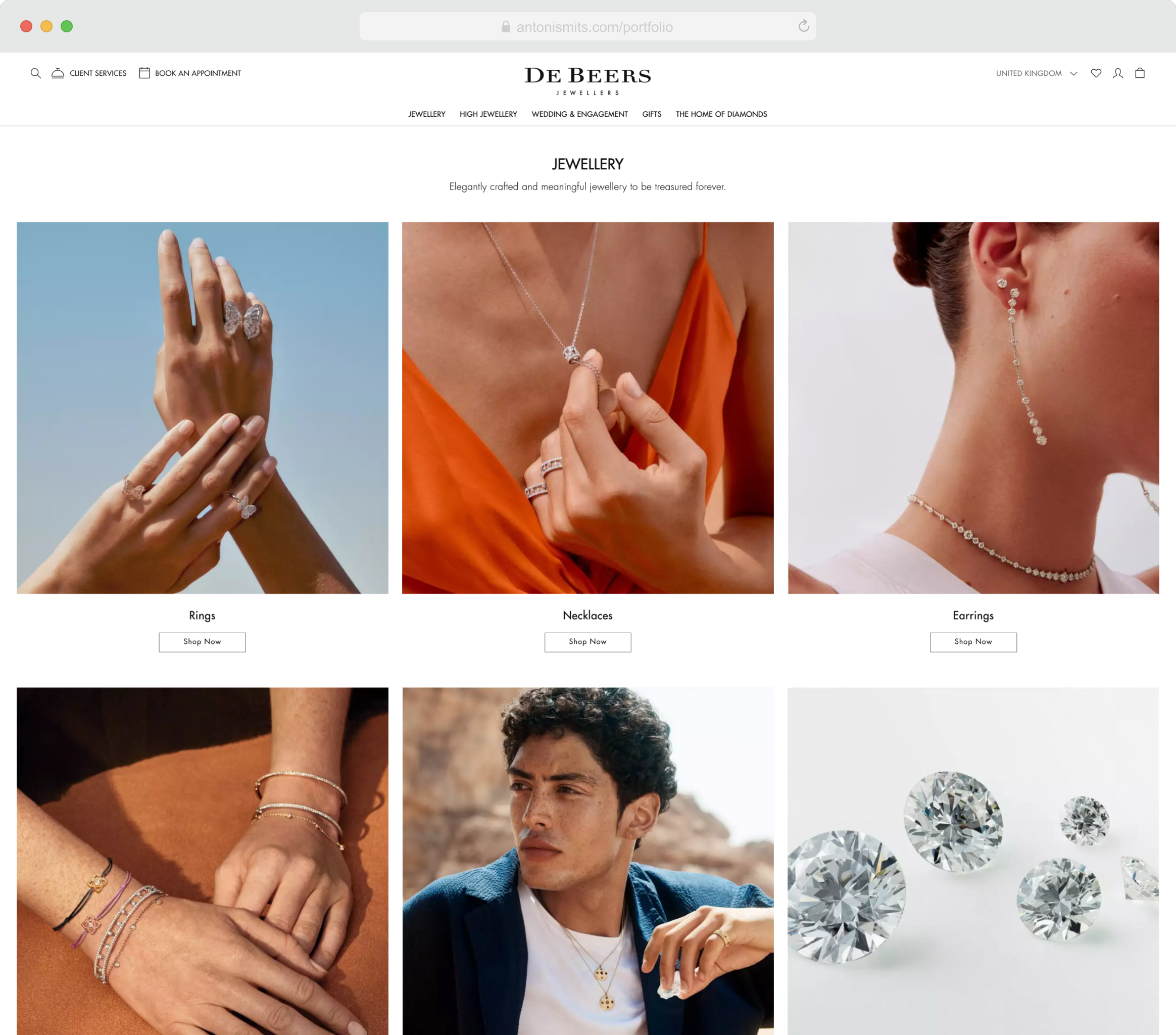
De Beers set out to evolve from a mining and trading company into a consumer-facing brand that markets its own products. My role was to design a new structure that brought all De Beers sub-brands together under one unified digital platform.
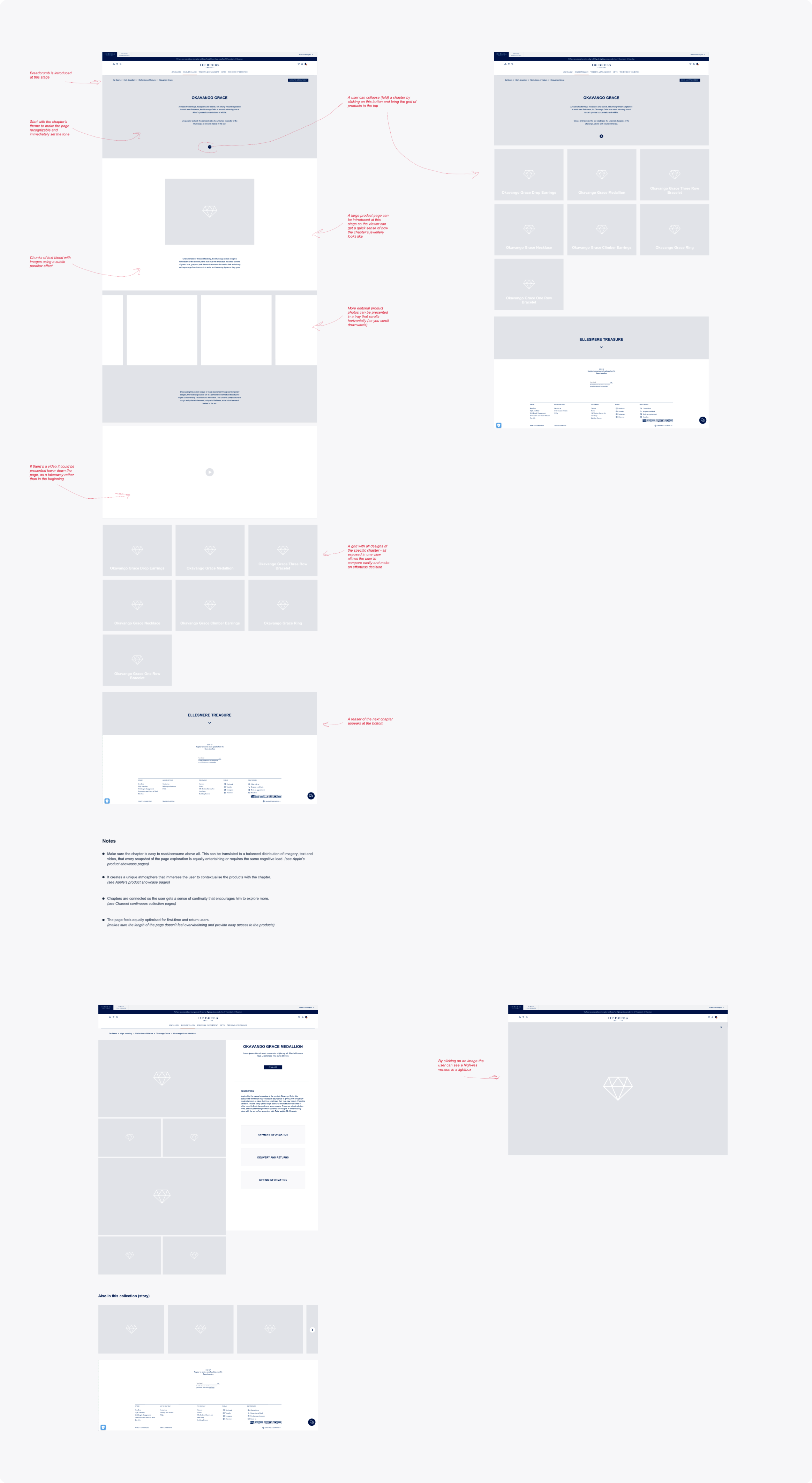
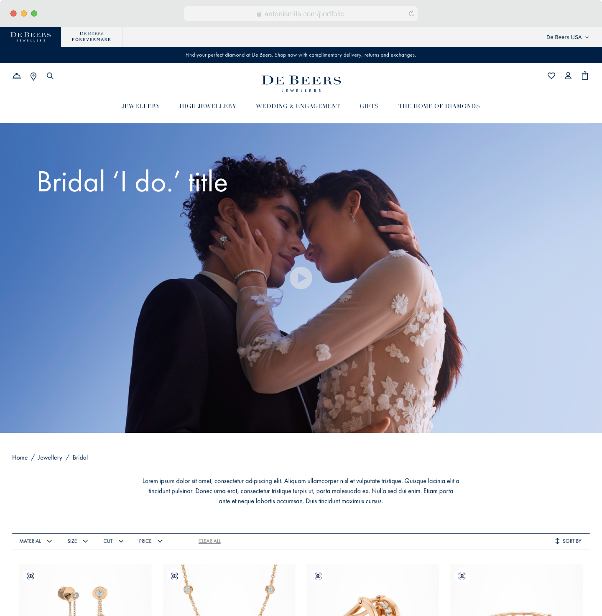
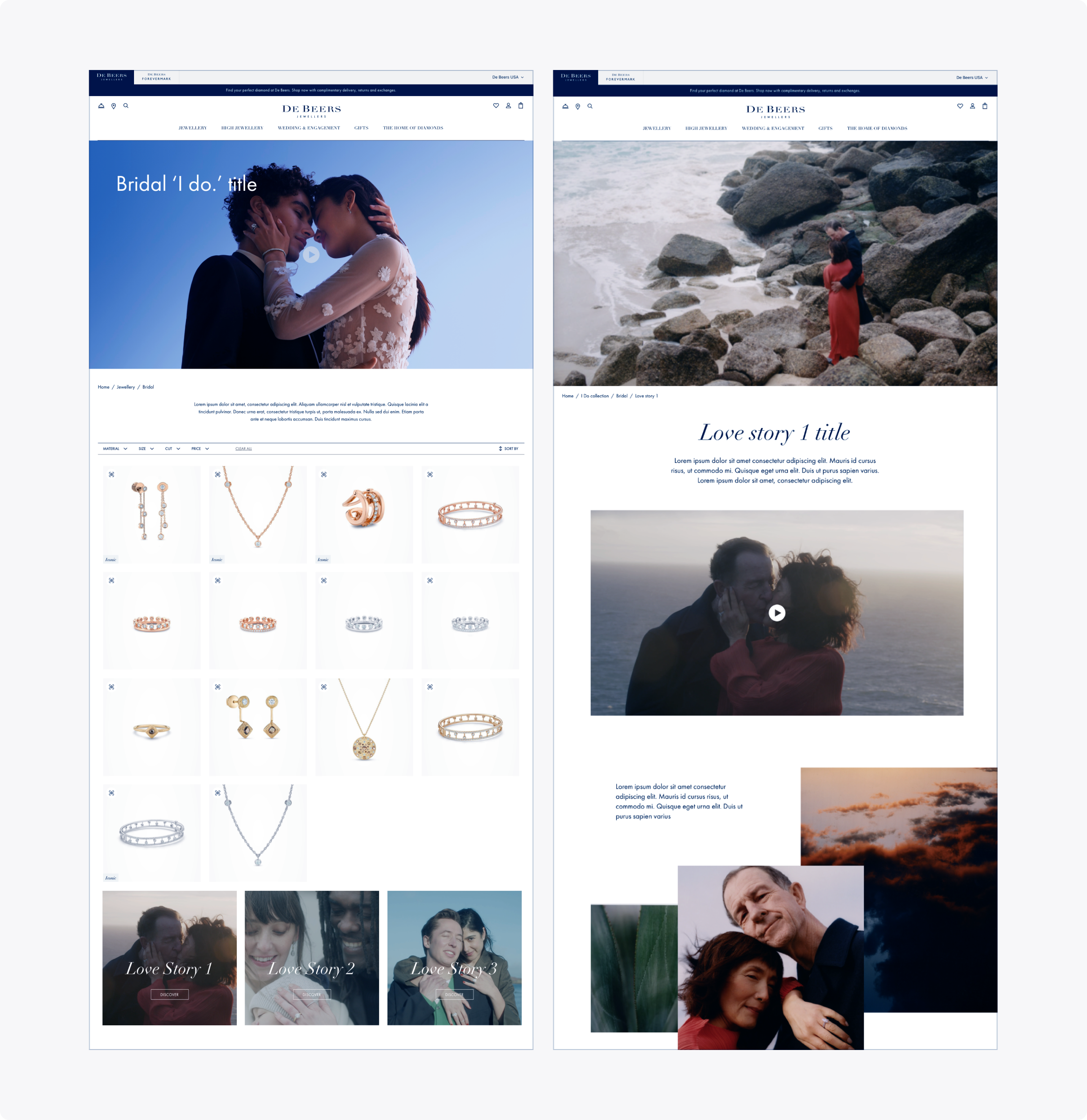
A key goal of this transformation was to support multiple marketing campaigns running at the same time. Each campaign needed its own unique identity while contributing to a consistent overall brand experience. To achieve this, we collaborated with product and marketing teams to design a flexible structure that made campaigns distinct yet easy to navigate between. The result was an information architecture that encouraged discovery and guided users toward relevant collections and shopping opportunities.
Revamping and optimizing the DeBeers online store
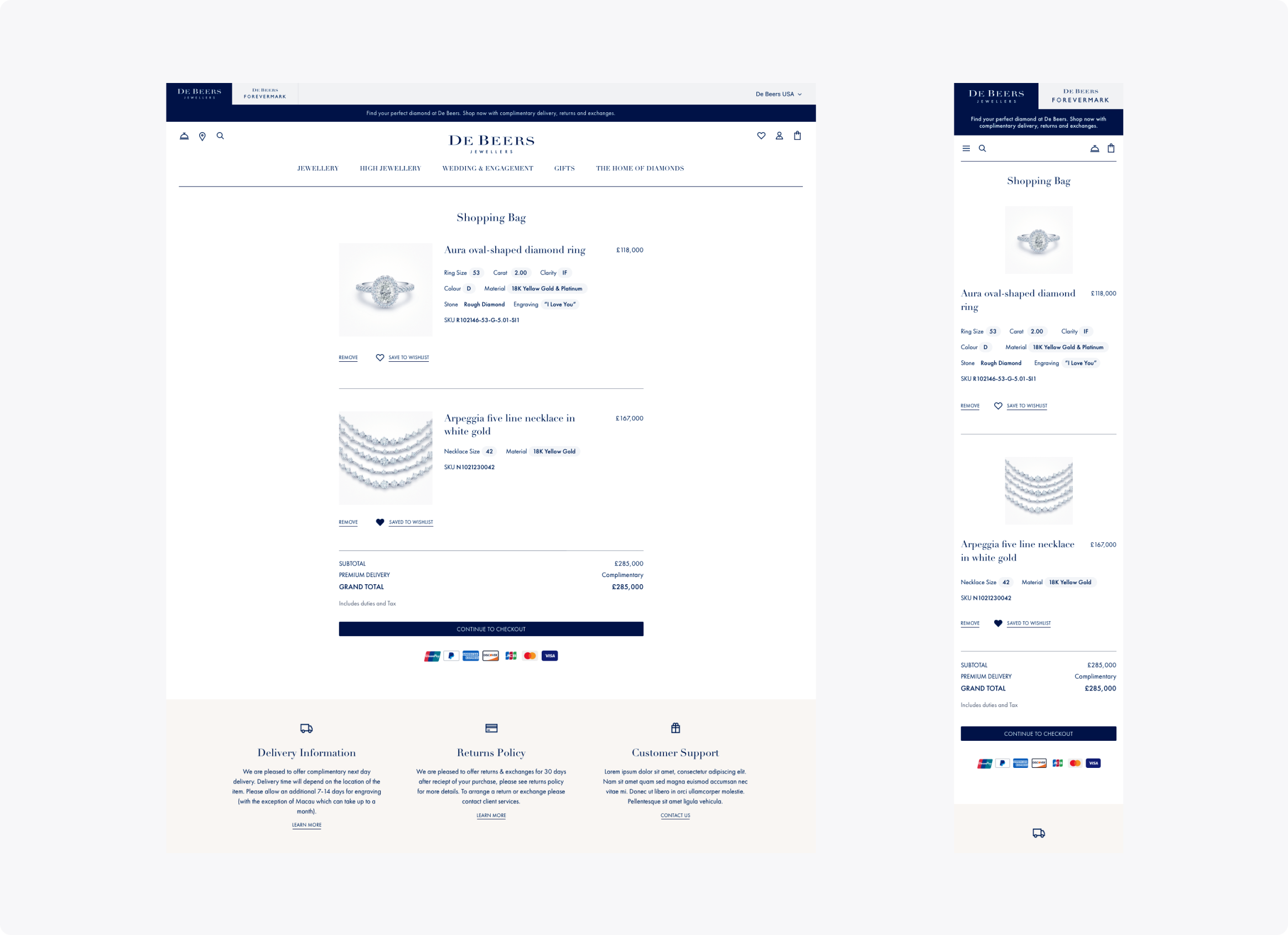
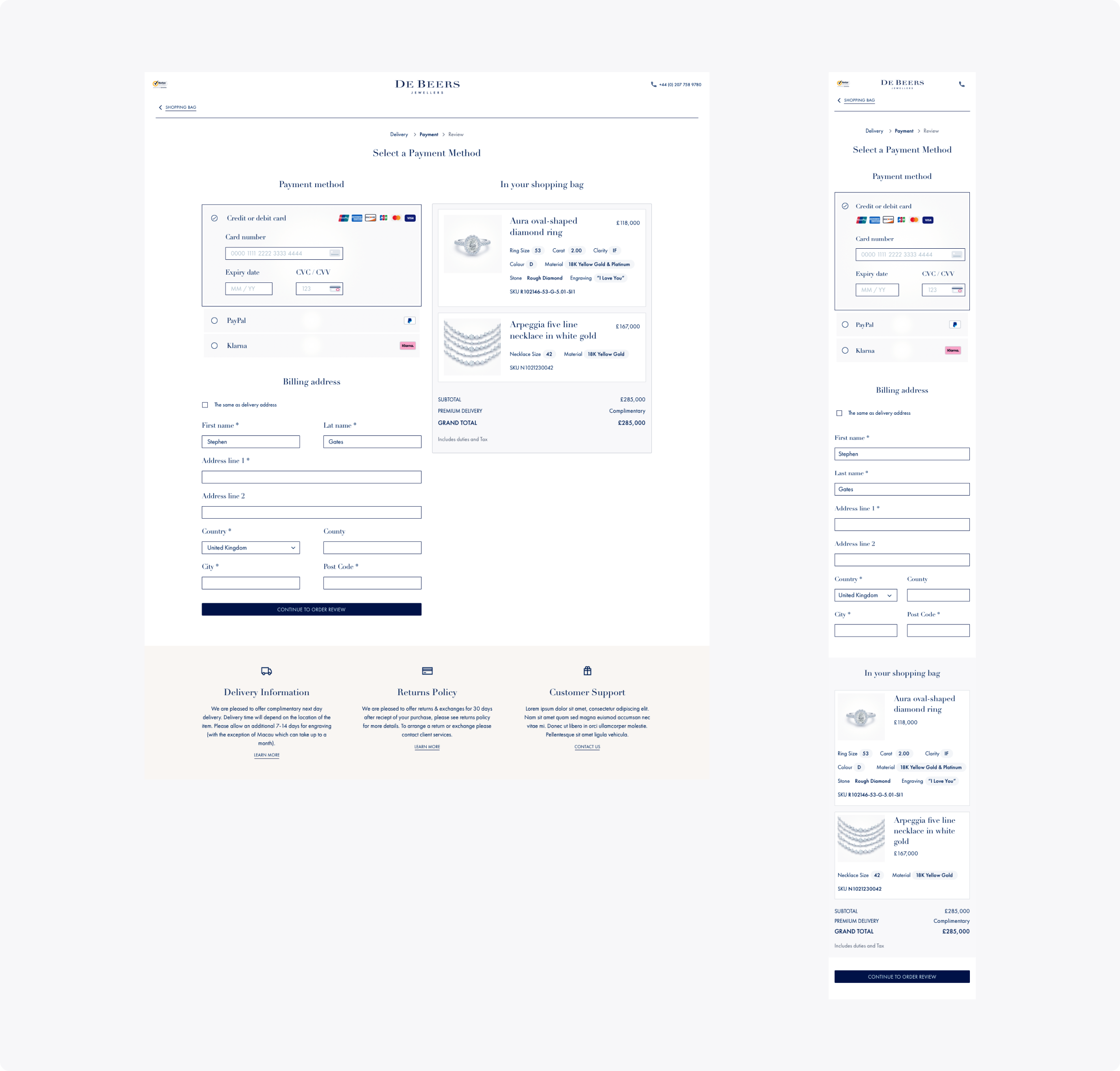
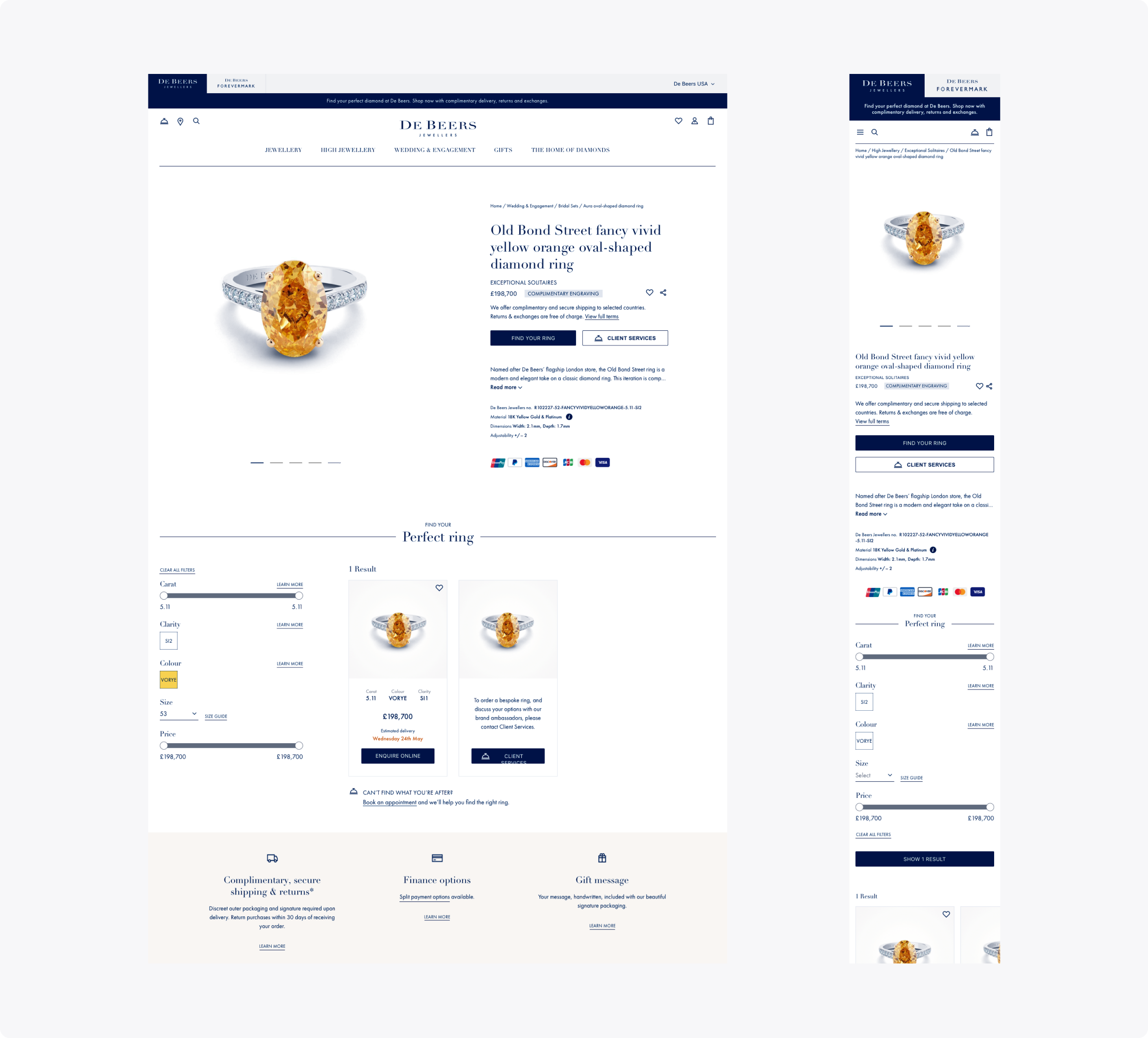
The De Beers website faced several performance and usability issues that affected the shopping experience. The checkout process was fragmented and confusing, with unclear messaging that caused users to lose trust and abandon their purchase. Some modules made it difficult for customers to filter or choose jewelry, while unclear delivery details created additional friction. Our first step was to audit the experience and review existing research to identify the main problem areas. The goal was to design a new, simplified UX that reduced friction and improved the mobile experience from end to end.
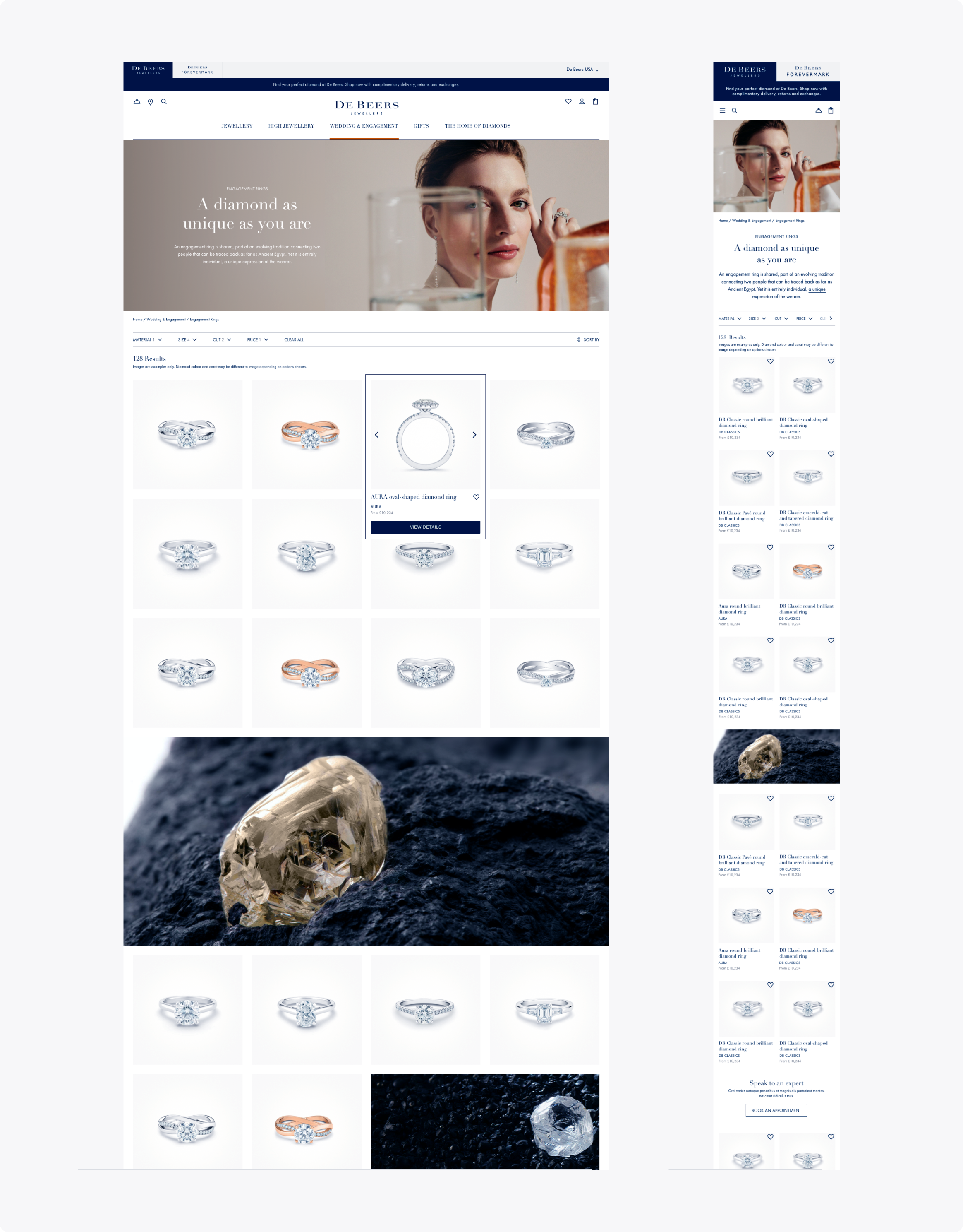
Throughout this process, our focus was on ensuring that users could easily adopt the improvements we introduced. To do this, we prioritized functional fixes over aesthetic redesigns. This approach allowed us to test ideas early in real-world conditions and use feedback to guide further refinements.
Accessibility was another important focus. The legal team required full compliance with WCAG 2.1 standards after past accessibility-related issues. To meet this, we worked with a specialist who reviewed and approved all designs and front-end code before launch, ensuring the website was inclusive and compliant.
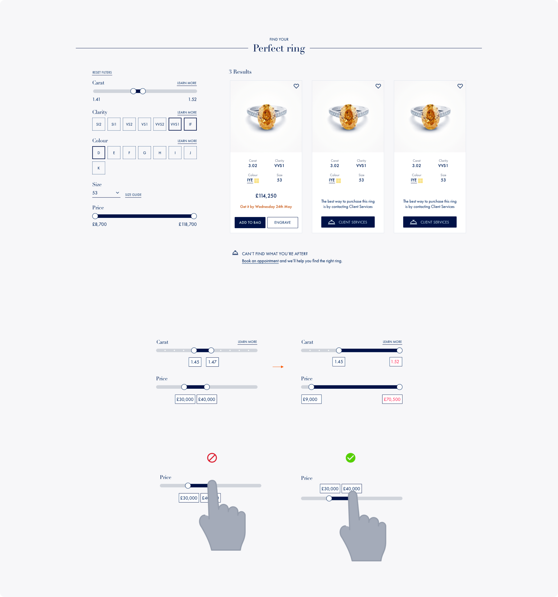
Unlike typical checkout flows that focus on speed, our goal was to slow things down where it mattered. We helped users confirm details such as ring size and color, and provided clarity around international purchases and post-checkout steps. This approach built confidence and reduced last-minute hesitation.