Restructuring the content experience for Here Technologies
Here Technologies was going through a major content restructuring to address several UX challenges. The main website had unclear user journeys, inconsistent tone across sections, and content that didn’t feel relevant or deep enough for its audience. My role was to work with the client to design a new information architecture and UX pattern library to solve these problems. The goal was to create a structure that recognized each visitor’s intent and delivered content suited to their needs. We identified three main user types — customers, developers, and C-level executives — and adapted the language, structure, and calls to action for each audience.
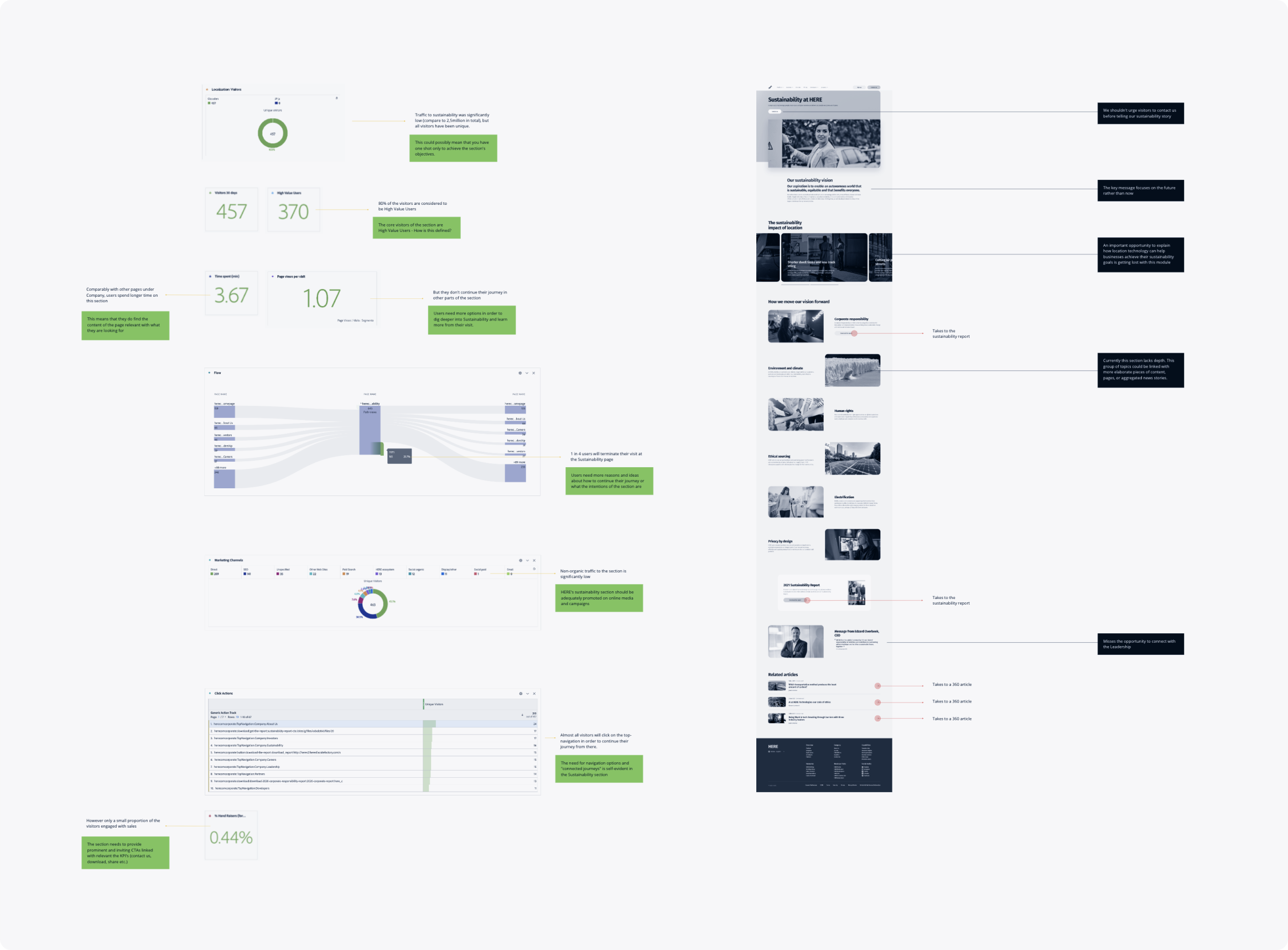
The first step in shaping a narrative for these three groups was interviewing key stakeholders. These conversations gave us an overview of the main issues and opportunities to explore further. While the team already had insights about logged-in users, many of their needs were still not being met. We also analyzed behavioral data to uncover usage patterns and gauge how serious the problems were. The data revealed what users were doing, but not necessarily how influential they were — an important factor in B2B, where one user’s behavior can affect another’s buying decision.
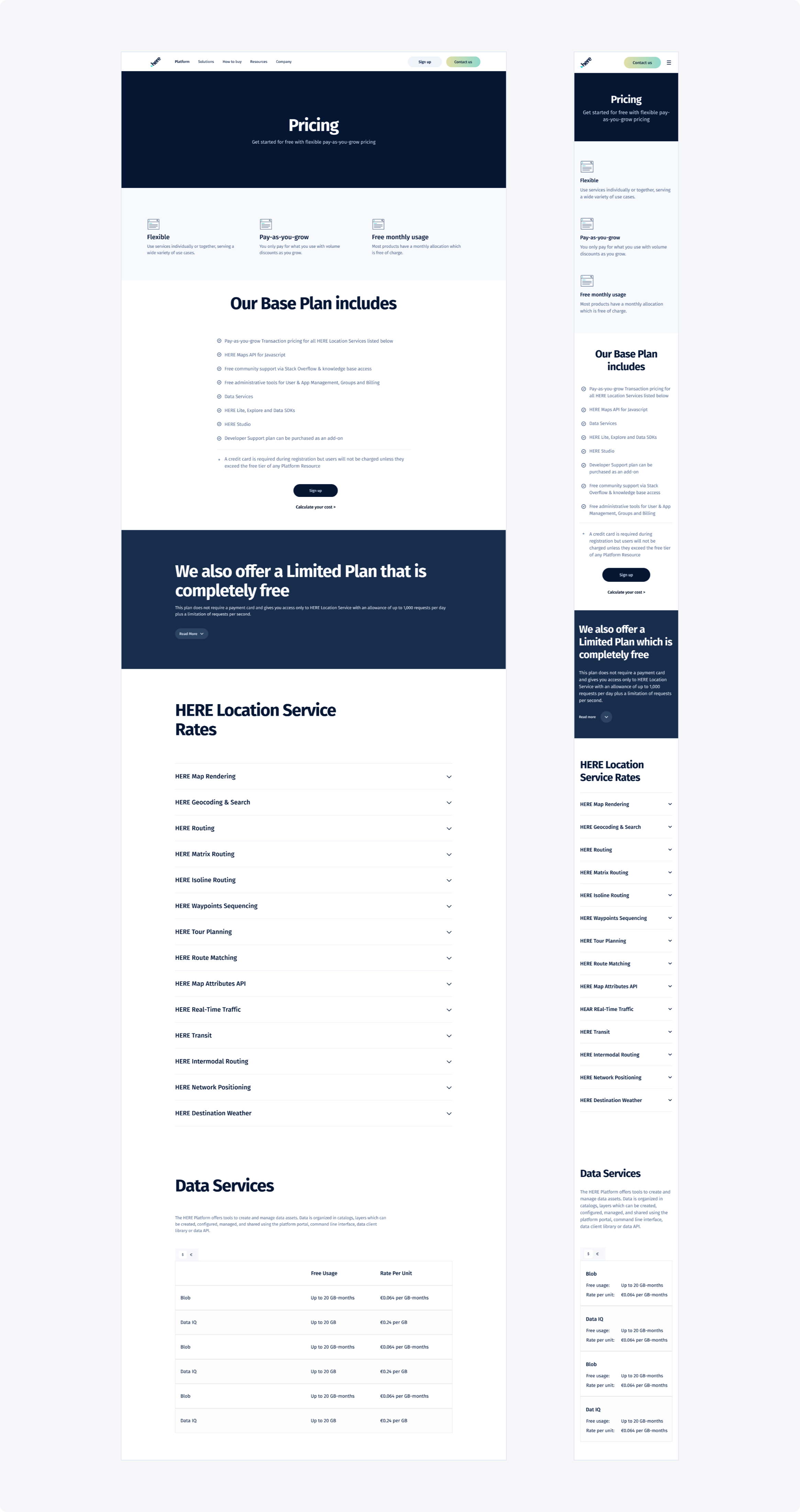
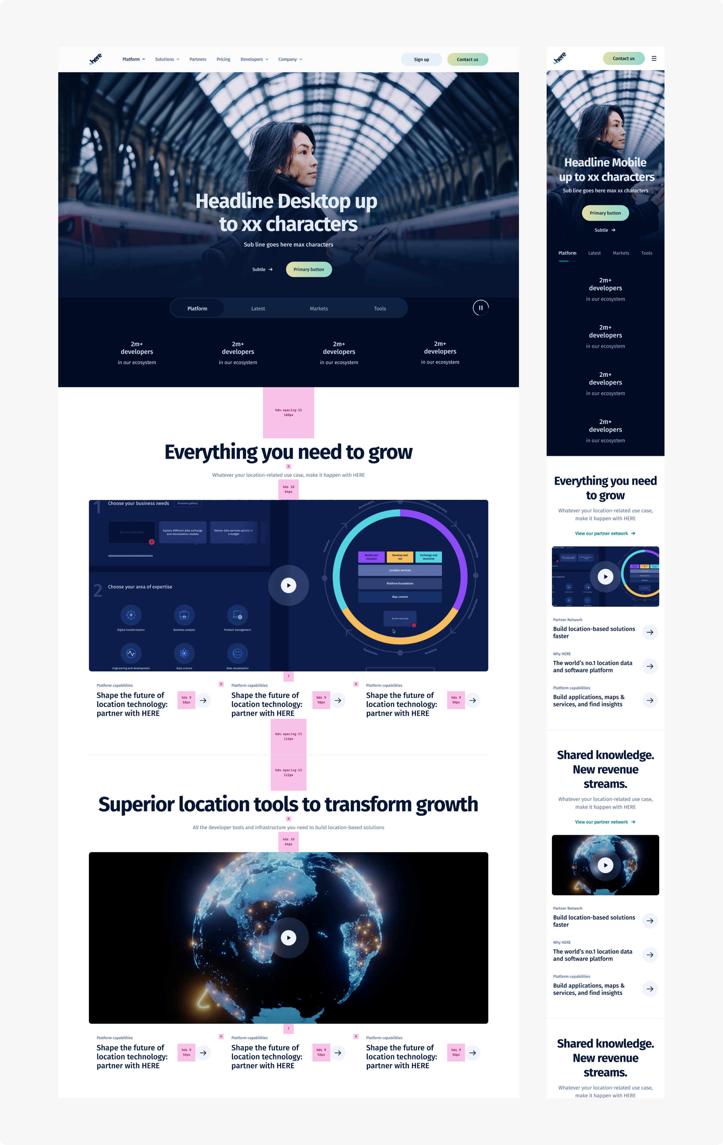
Each page was designed to reflect its specific purpose and priorities. The challenge was to maintain visual consistency and flow while avoiding a one-size-fits-all layout. An SEO audit helped us align with search-friendly practices, improving both structure and visibility.
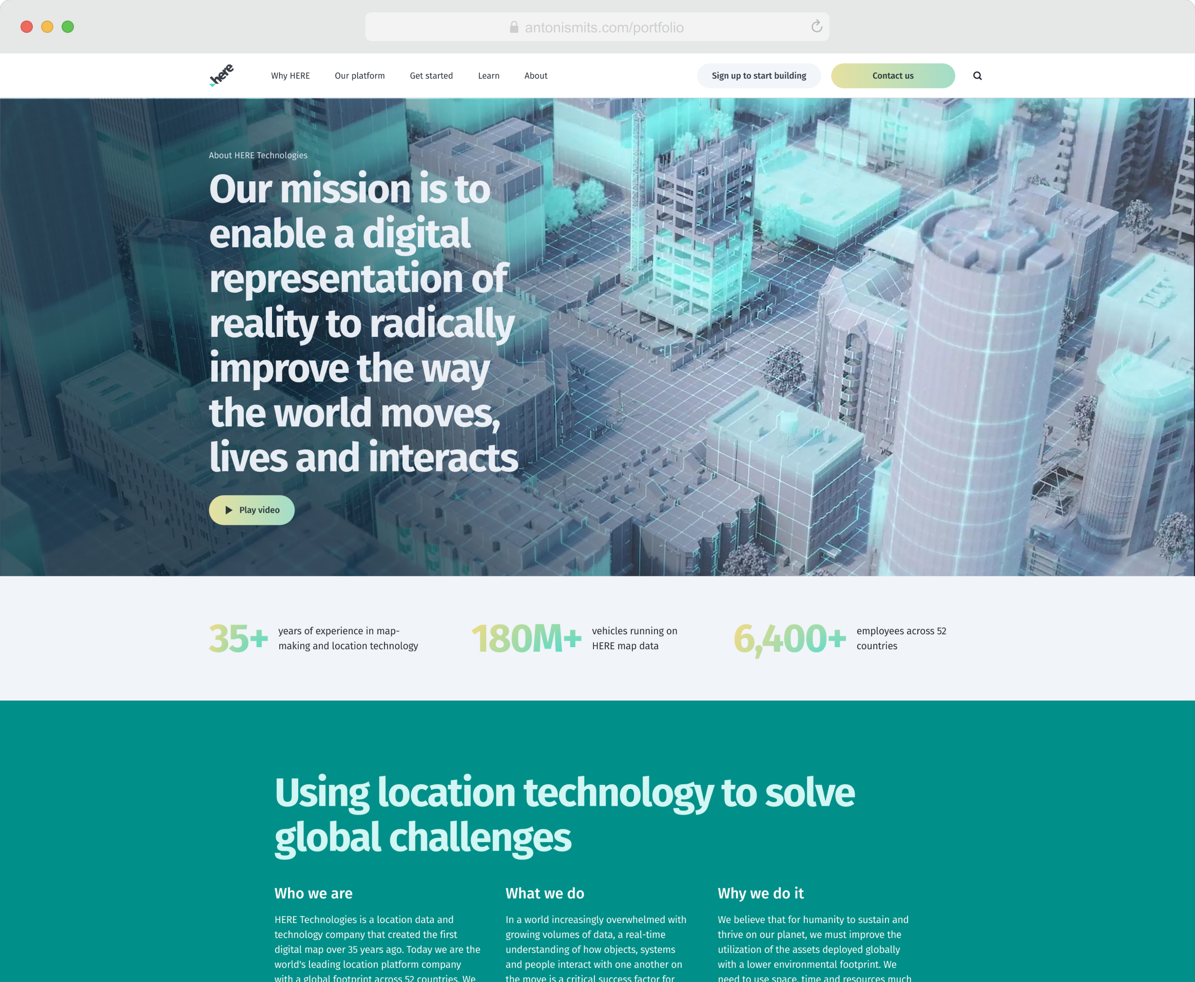
The restructuring guidelines called for content that would strengthen the brand’s credibility and establish thought leadership in spatial data. The narrative focused on identifying key problems, showing how Here solved them, and highlighting results through clear case studies and benefits. To get each page’s information architecture approved, we backed every decision with analytics, user research, and SEO insights, supported by a clear explanation of the narrative flow and intended outcomes. We also added a lead generation banner at the bottom of each page to track performance and engagement.
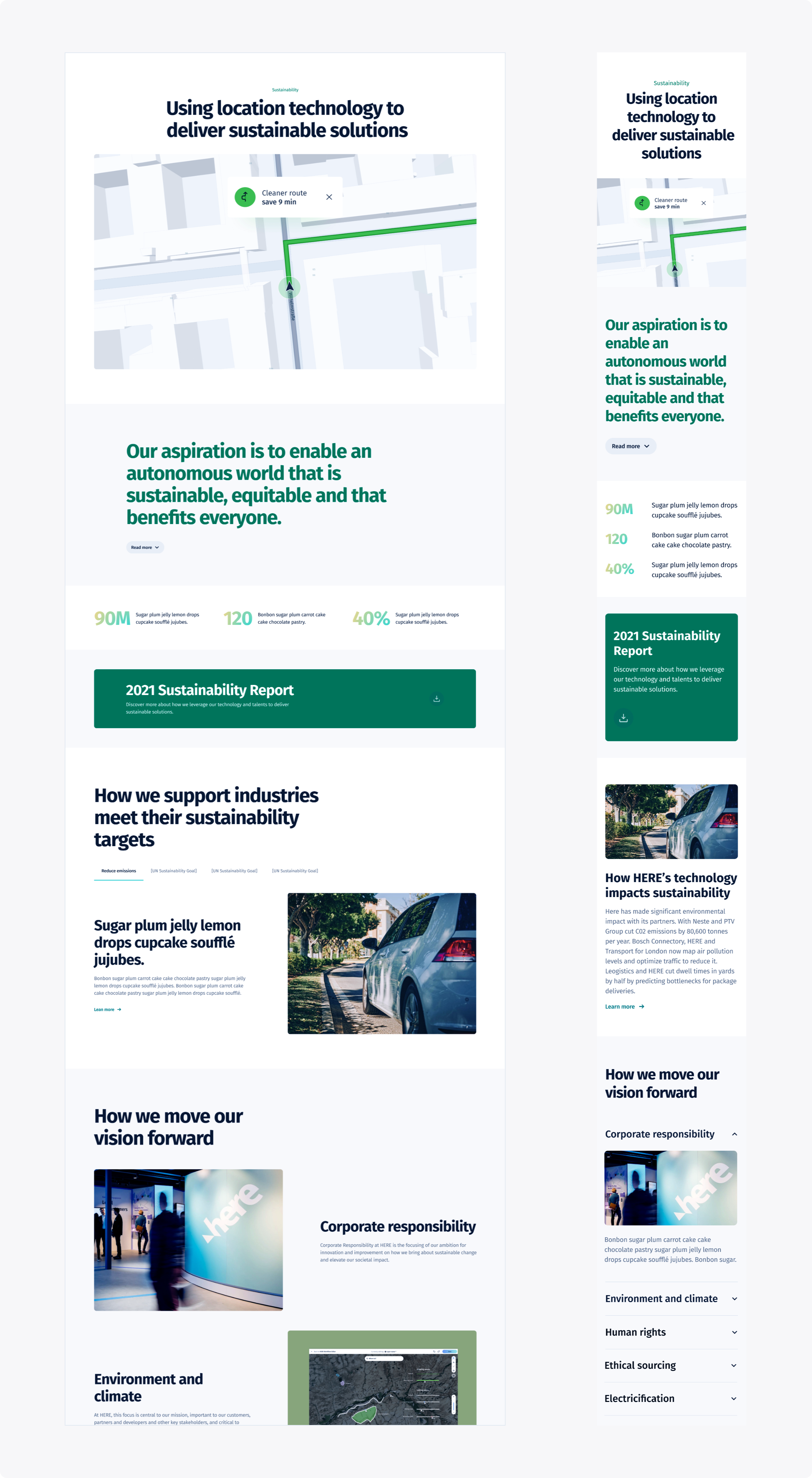
One of the key challenges was finding the right balance of information. The content needed enough depth to be meaningful without overwhelming readers. To achieve this, we divided each page into clearly defined sections with well-paced information, generous whitespace, and a clear hierarchy. This made it easier for users to scan, understand, and act on what they saw.