Building a data-driven platform to empower private markets
Floww set out with an ambitious goal — to create a private market where founders, investors, and venture capitalists could trade shares of startups and scaleups. The venture aimed to solve a long-standing issue in private markets, particularly in Europe, where access to capital often felt complex and opaque. Backed by the London Stock Exchange, Floww offered a credible and promising solution. I joined the team shortly after their first funding round to help lead UX design and reach a key milestone: completing the first private fundraising transaction within six months.
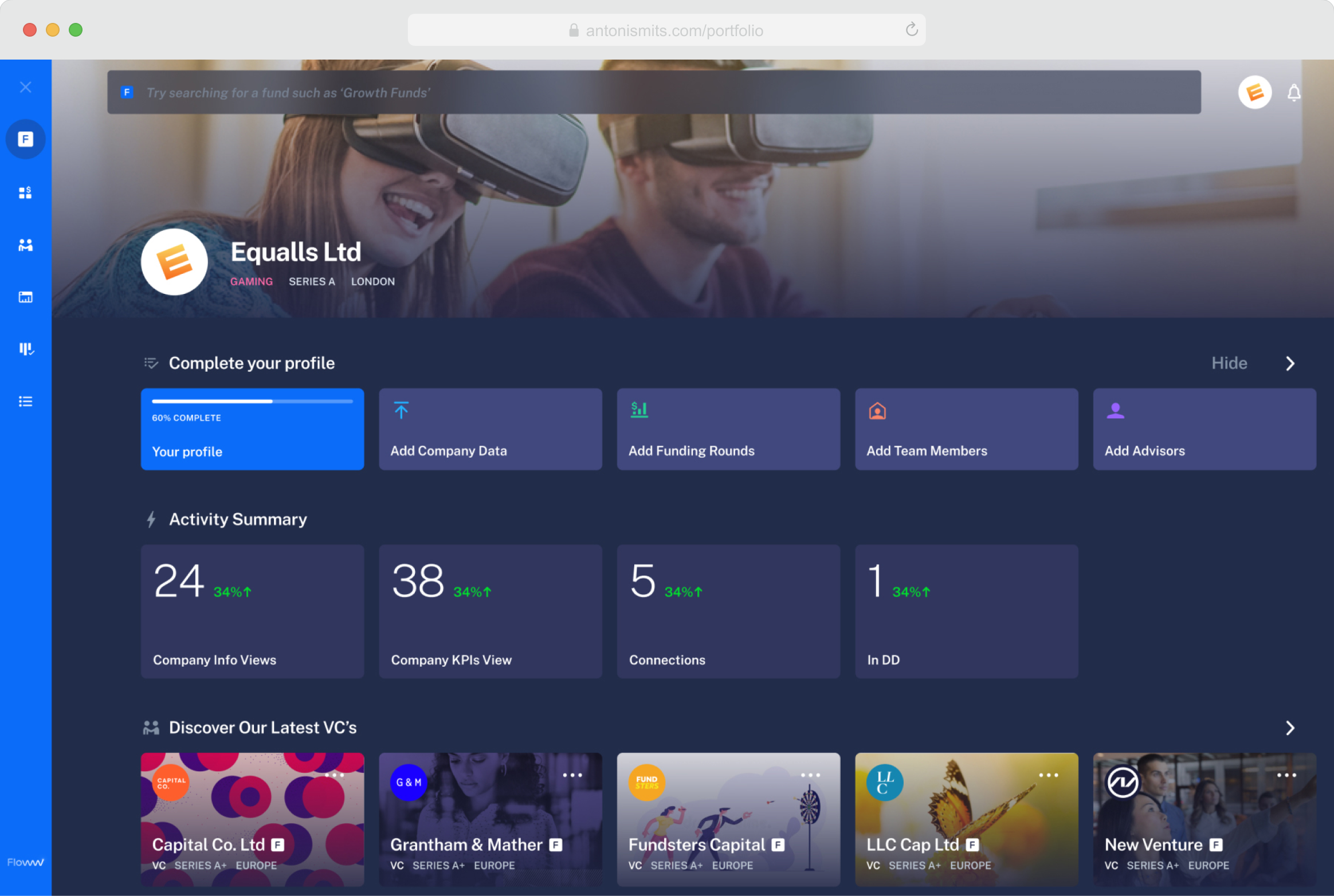
Floww’s main objective was to attract startups and help them start their fundraising journey. The business team envisioned a complete ecosystem of financial tools — from portfolio management and deal discovery to legal support, data rooms, and pitch creation. At this early stage, however, our focus was on building the transaction environment — engaging potential investors, inviting them to commit, and facilitating share allocation before finalizing a fundraise.
Gathering requirements was one of the biggest challenges, as often happens in cross-functional projects. Research insights were limited because the market was still emerging. While we had some understanding of existing private market users, our knowledge of non-users — the audience we needed most — was thin. In this kind of environment, structure helps, but so does a mindset of healthy skepticism. Every assumption and requirement had to be challenged and validated. This approach led to frequent discovery workshops and backlog discussions that helped the team refine priorities and stay aligned.
Designing a product for an unfamiliar and complex domain requires more than design expertise — it takes curiosity and a willingness to learn deeply. I spent time reading, talking with experts, and exploring real-world perspectives on private markets. This helped shape a clearer understanding of the product’s challenges and allowed me to approach design discussions with informed ideas and thoughtful reasoning. It also helped strengthen trust within the team, showing that our design choices were grounded in evidence and exploration rather than assumption.
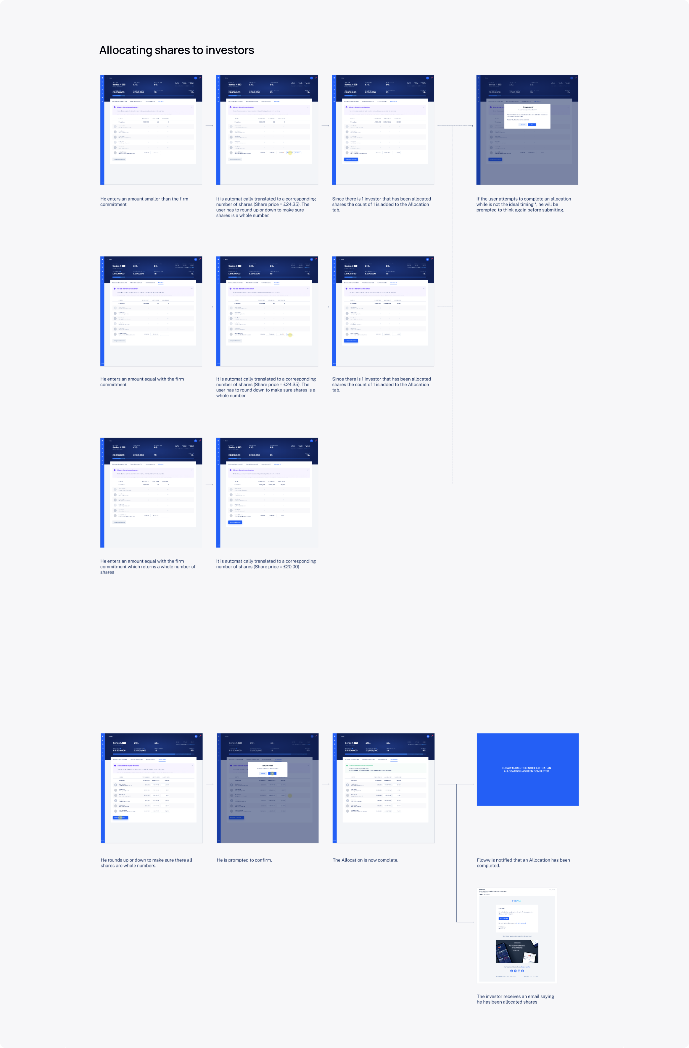
Private markets have been slow to adopt new technologies. Many users were used to handling complex tasks with spreadsheets or manual tools. Encouraging them to change required more than good design — it required empathy. Our approach was to mirror familiar workflows while introducing smart, assistive features that simplified tasks. For example, in the allocation process, users could see in real time how changes to one investor’s share affected the entire cap table, along with intelligent recommendations to keep things balanced.
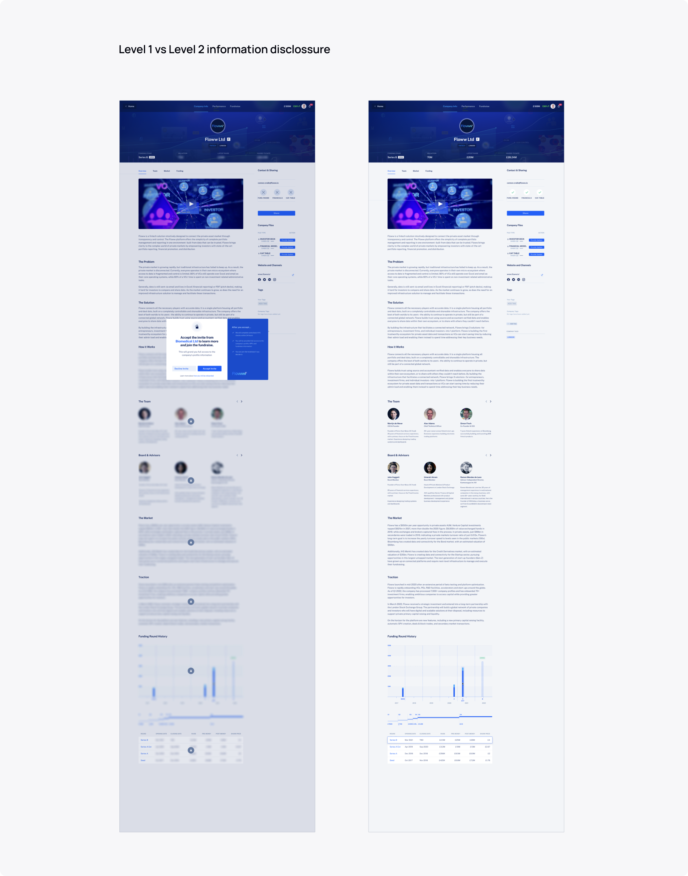
Each company’s presence on the platform followed strict rules. What users saw depended on their profile, the company’s funding stage, and disclosure settings. To manage this, we designed a flexible templated system with multiple profile views. Content would unlock progressively as permissions and regulations allowed. This structure balanced clarity and compliance while keeping the interface simple and cohesive. Working closely with regulators, though sometimes challenging, gave us valuable insights into designing for transparency and trust.
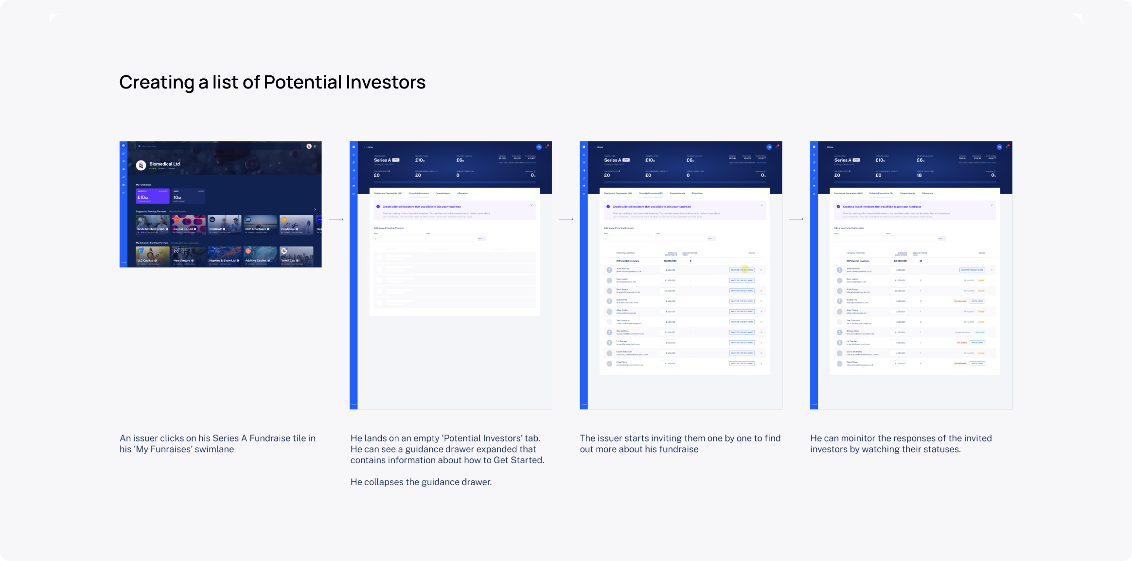
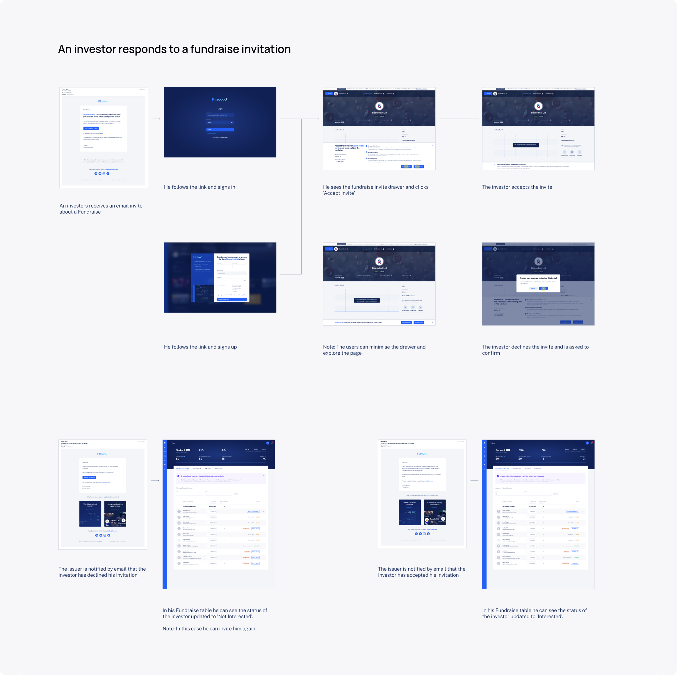
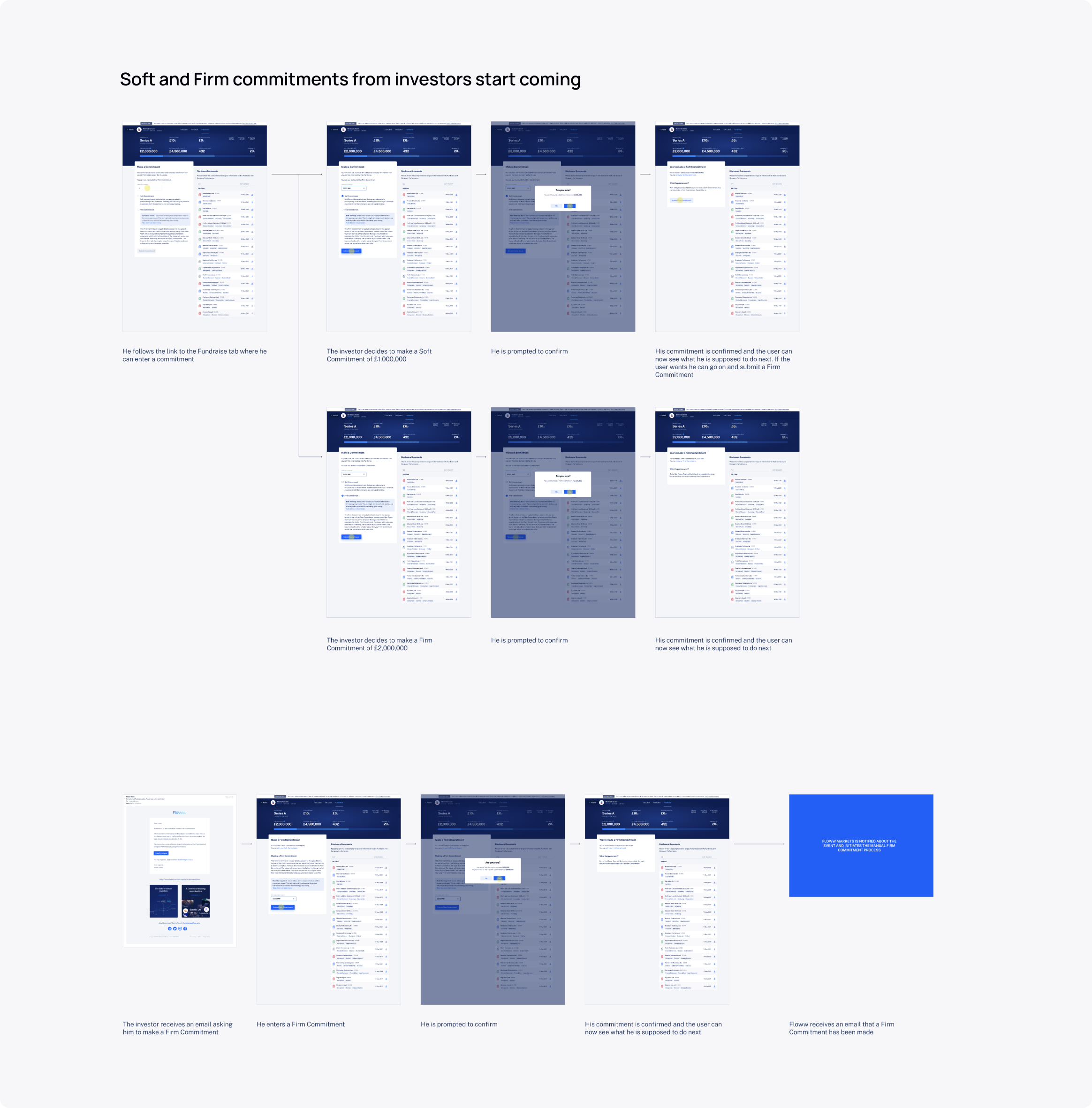
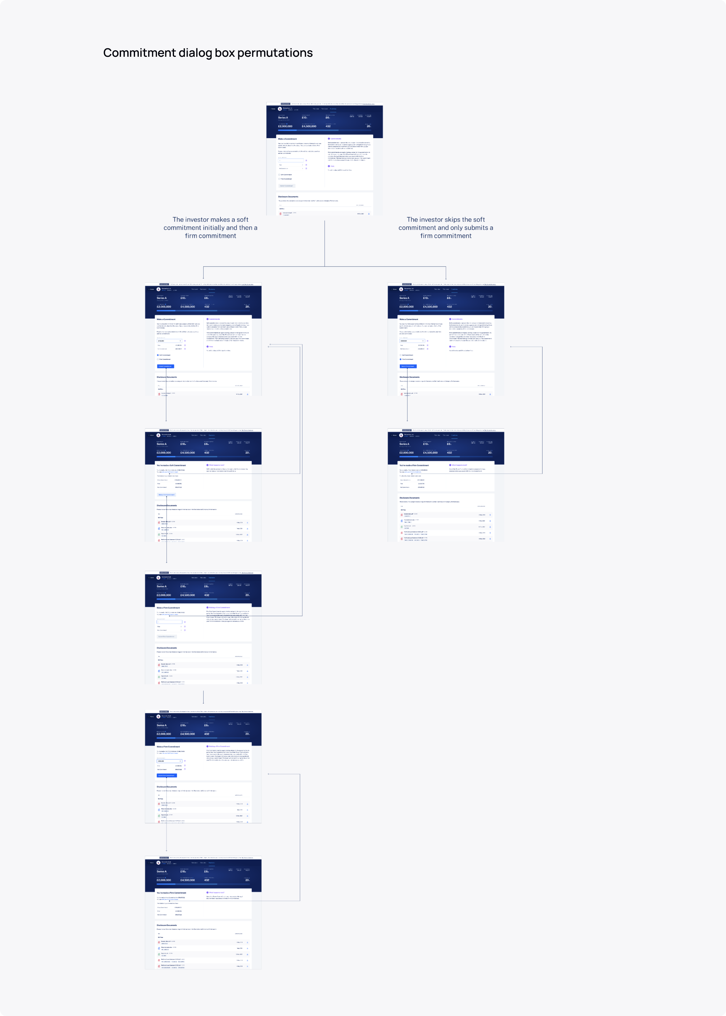
The invitation for investors to make a commitment was a key moment in the experience. By entering the amount they wished to invest, users initiated a legally binding agreement and triggered the eligibility checks needed to finalize the transaction. To make this step clear and reassuring, we designed a dedicated page that guided investors through the process while explaining terms, fees, and documentation in simple, transparent language.
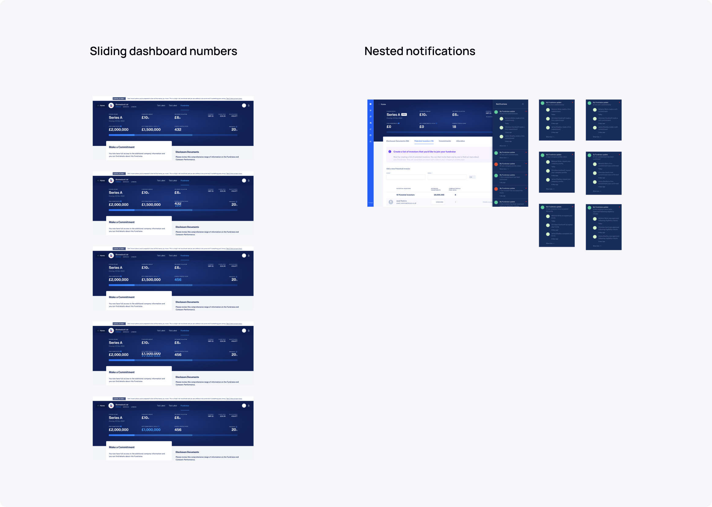
One of the most rewarding parts of this project was shaping shared design principles and interaction patterns that unified the product’s experience. Regular cross-team reviews helped us stay consistent and collaborative. Among the ideas we explored were sliding data cells — dashboard elements that flip to reveal more details without overwhelming the view — and nested notifications, which provided layered updates that could expand for more context when needed.