Designing a seamless online shopping journey for Versace
As global e-commerce surged during the Covid-19 pandemic, Versace aimed to create a modern, high-end shopping experience that reflected its brand standards. The existing site lacked engaging content and the checkout process felt outdated. I joined the team to help redesign the experience and align it with Versace’s premium image.
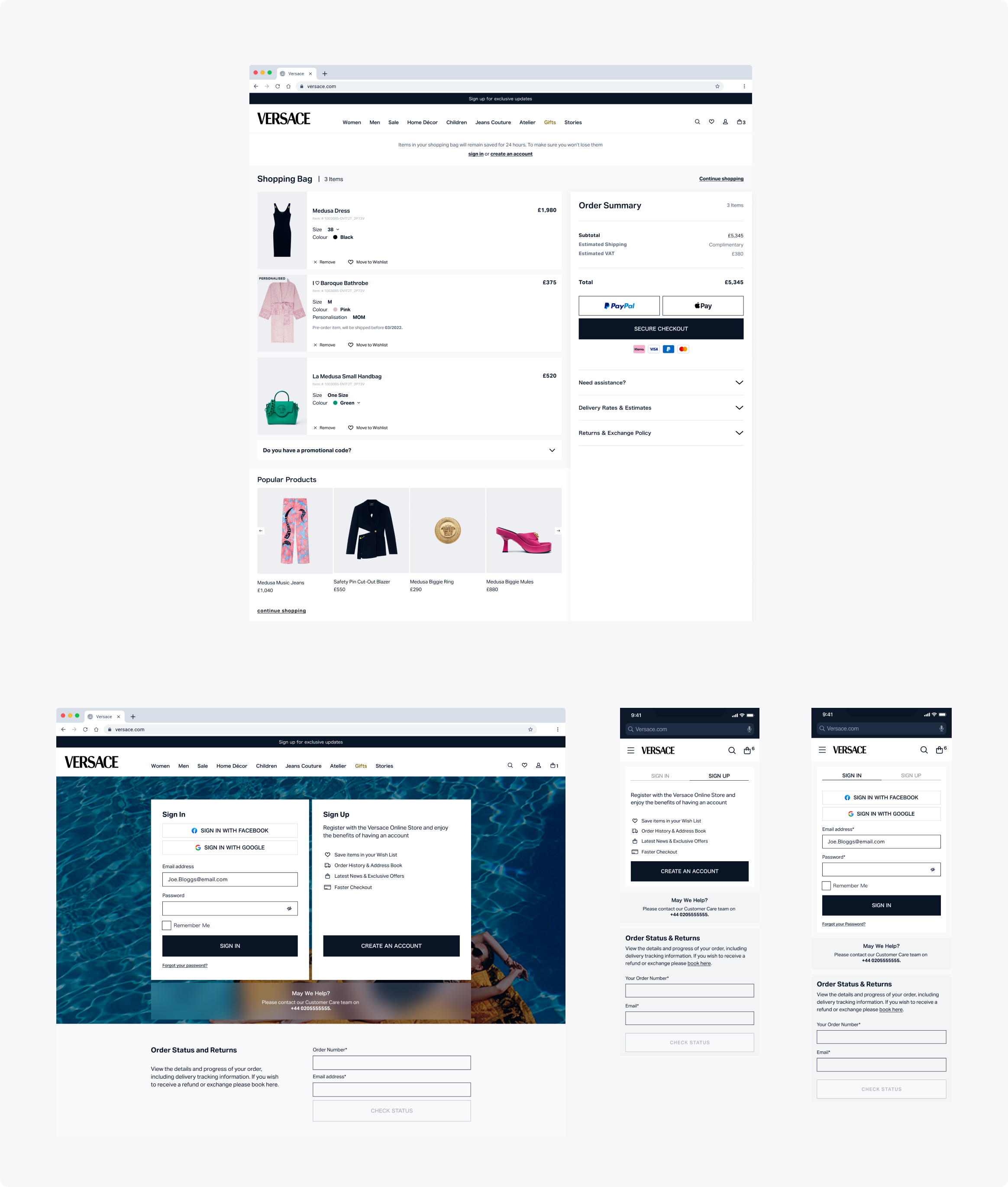
We started by improving the checkout flow, as data showed a high drop-off rate. We mapped out problem areas such as confusing messaging, unnecessary friction, and missed opportunities to build trust and engagement throughout the process.
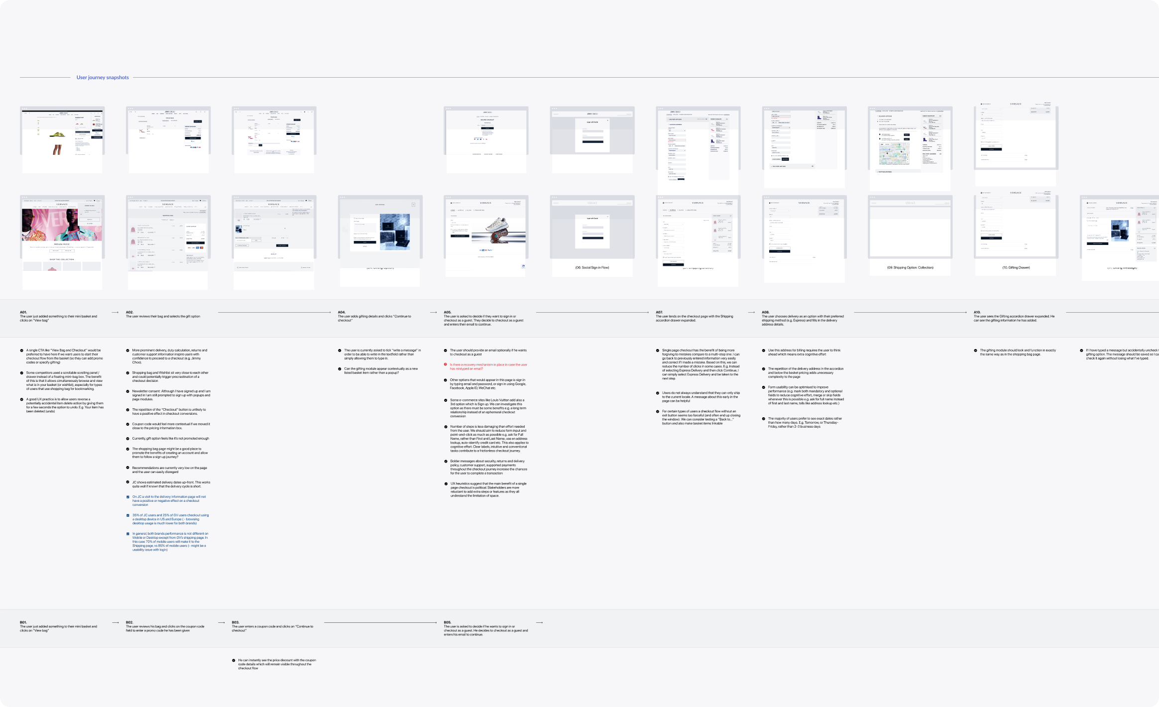
After researching e-commerce trends, usability best practices, and behavioral insights, we brainstormed ideas to make checkout as smooth and intuitive as possible. The goal was to help users add to their basket naturally, without pressure or distraction. We kept Versace’s distinct look and tone at the center of the experience, using a mobile-first approach as our guiding principle.
Working under the constraints of legacy systems required quick, practical decisions. We often relied on thumb heuristics for mobile optimization and kept collaboration open and flexible to move quickly and stay aligned.
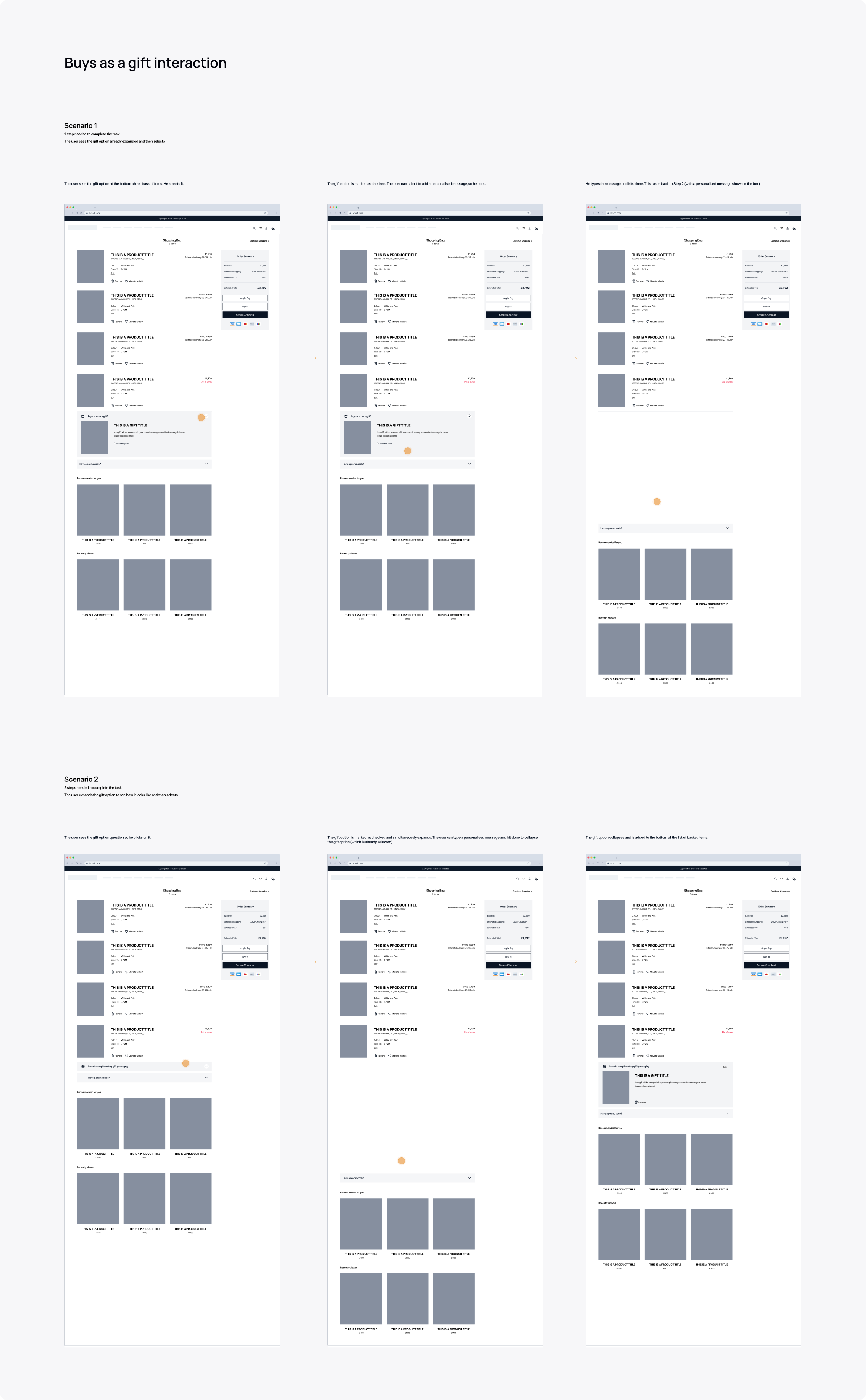
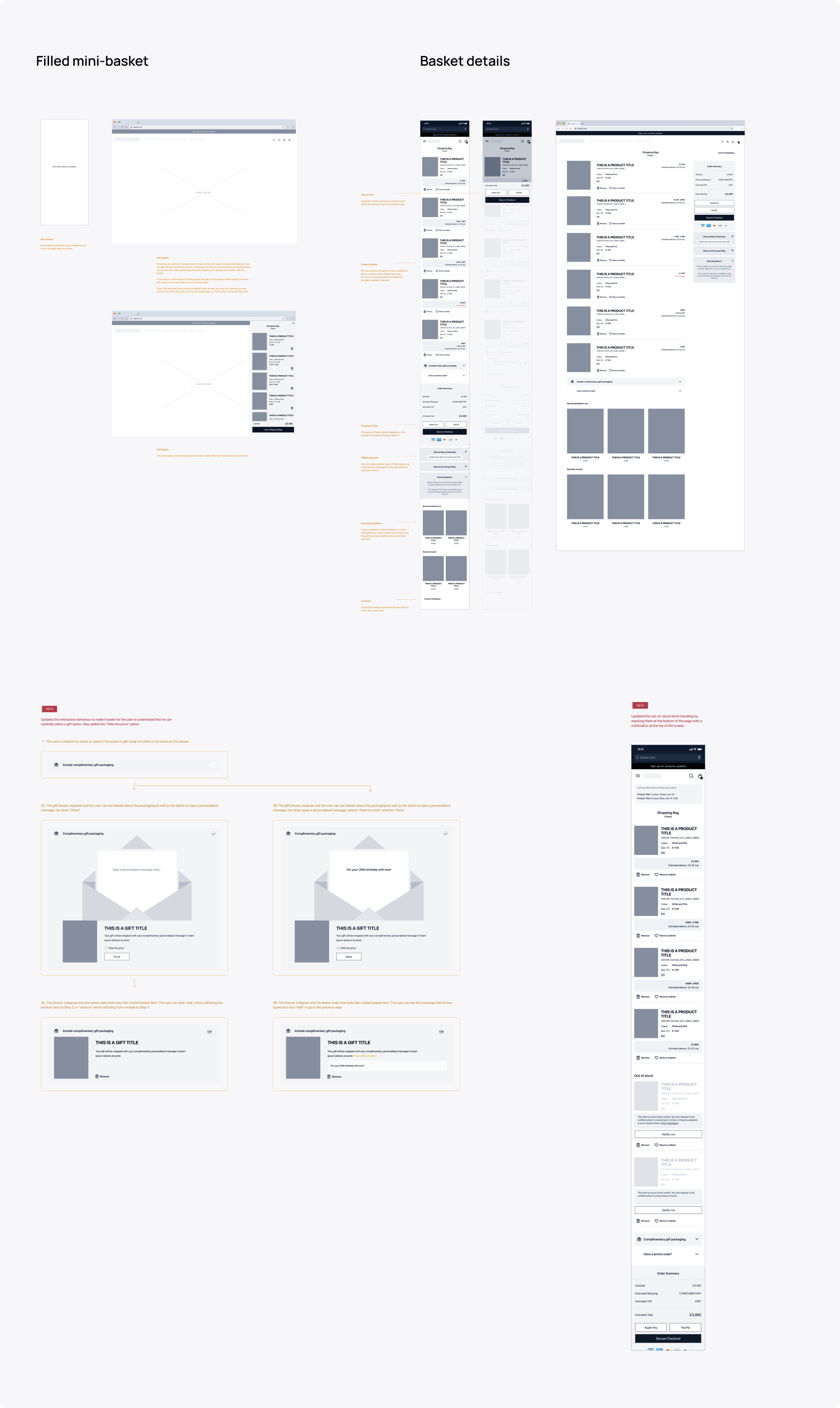
Many users abandon their carts not because they change their minds, but because they procrastinate. Something interrupts the process, and they never return. To reduce this, we removed unnecessary distractions and kept the design clean, focused, and easy to follow. Simple, clear copy helped guide users through each step with confidence.
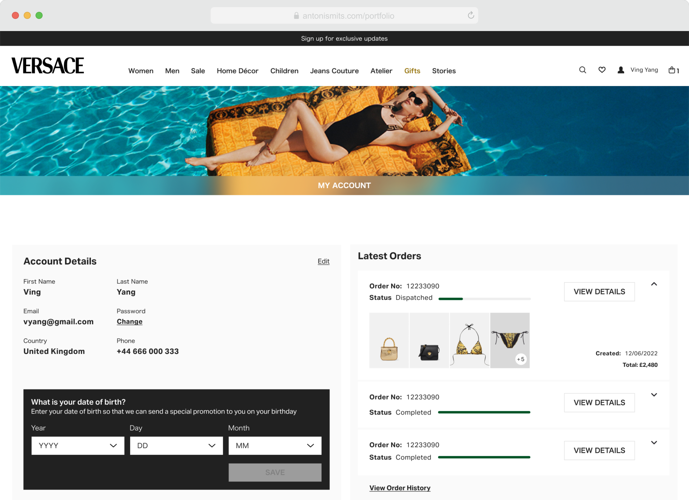
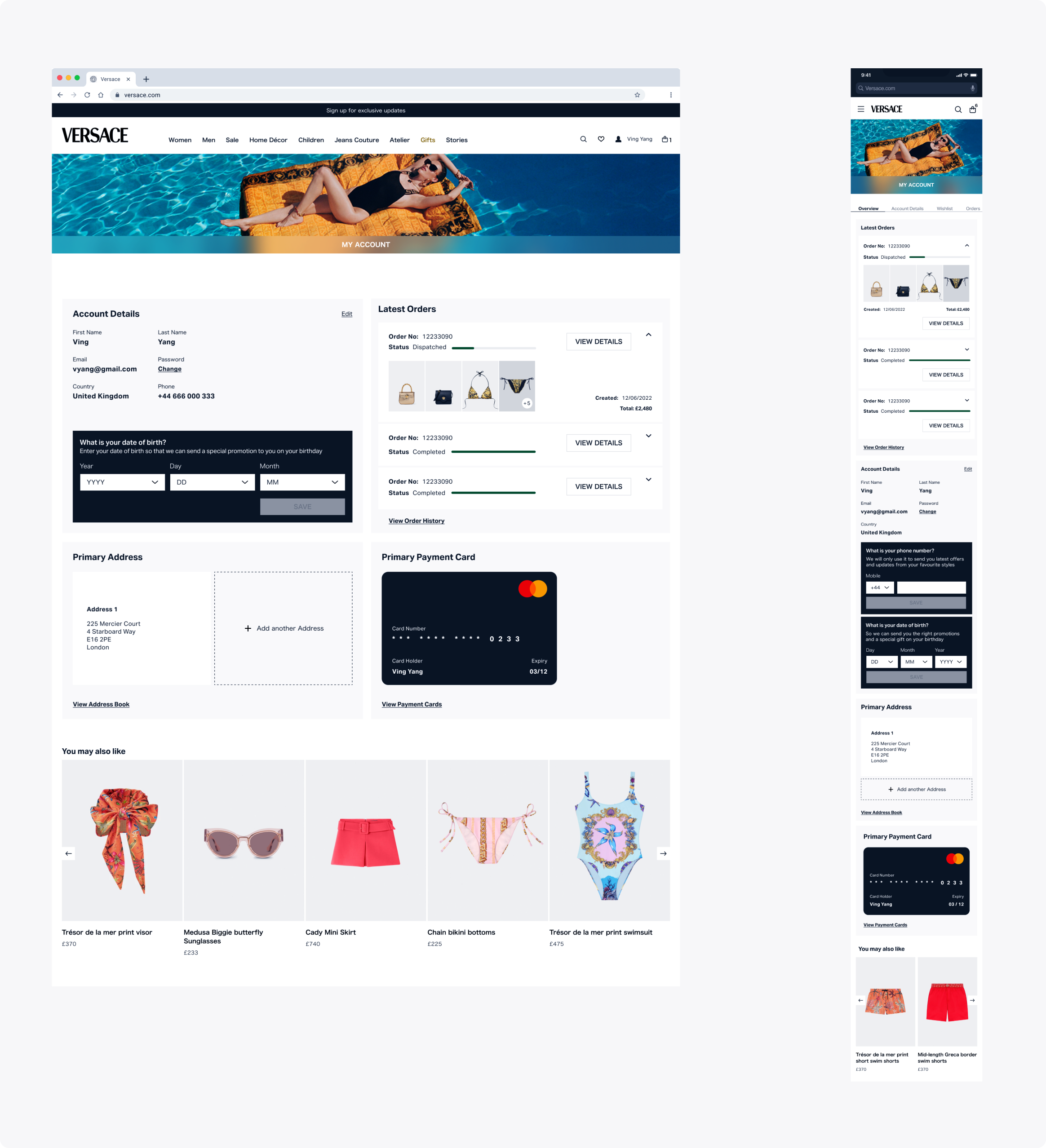
To align with Versace’s focus on personalized, customer-driven experiences, we also explored enhancements for the user account area. Beyond order tracking and settings, we proposed a membership program with tiers offering credits, exclusive offers, and event invitations — all designed to reward loyalty and strengthen engagement.
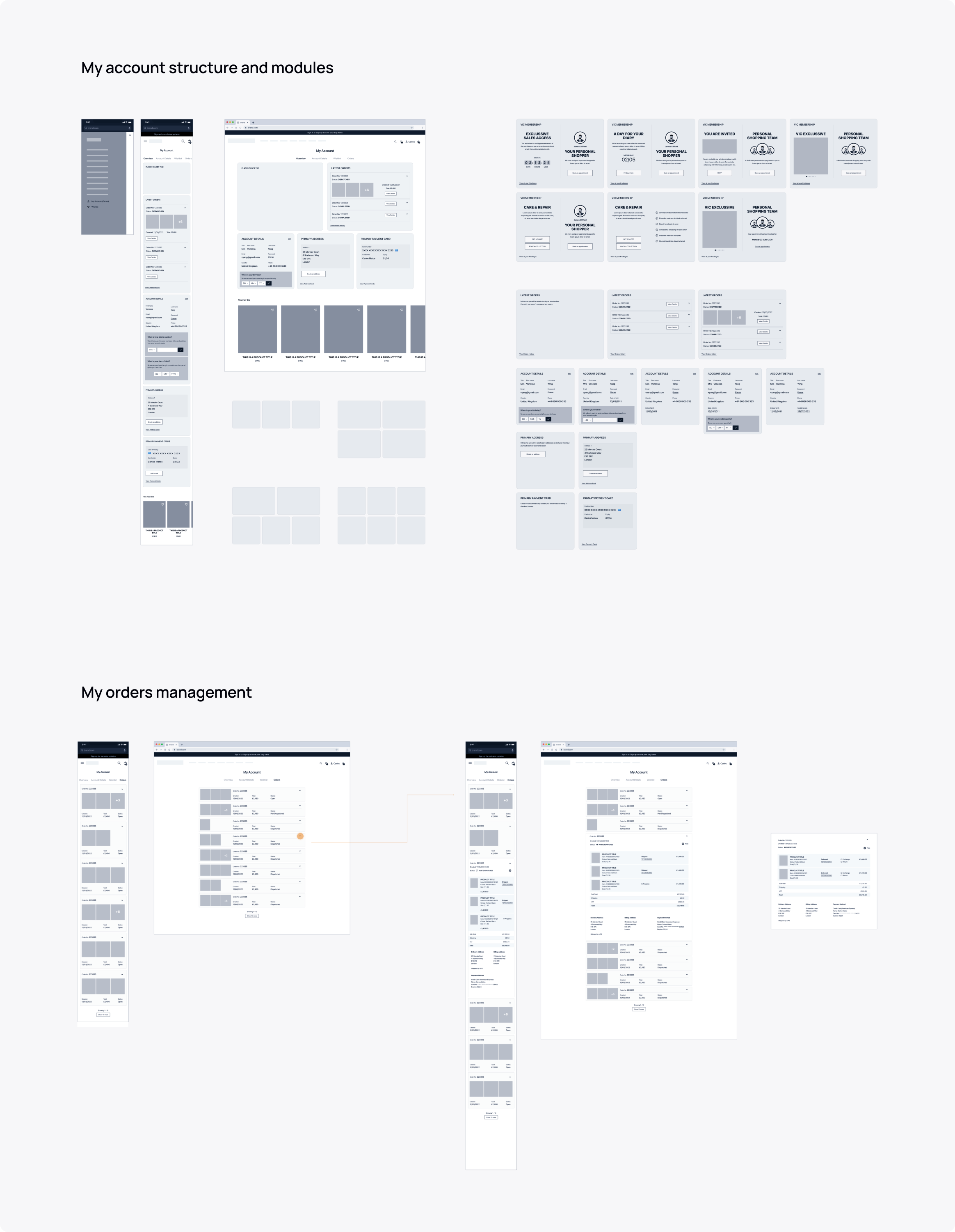
To gradually build richer customer profiles, we introduced a progressive questionnaire. During each visit, users were gently prompted — with consent — to share additional preferences. Over time, this allowed for more personalized recommendations and updates that felt relevant and timely.
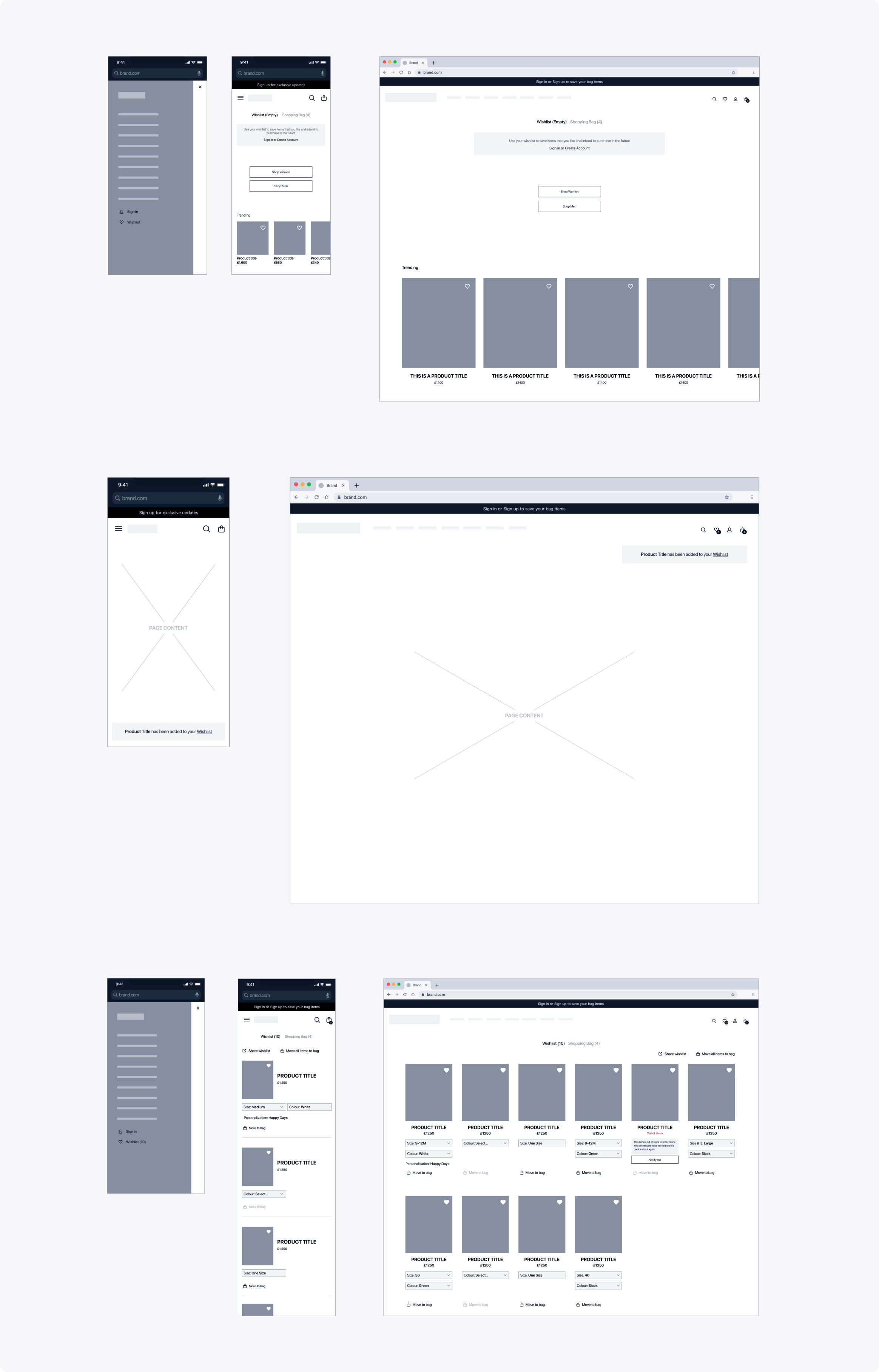
Research also showed that many users treated their basket like a wishlist, which created confusion when they were ready to buy. To solve this, we made the Wishlist more visible and easier to use, allowing customers to move items between it and the basket. We also required users to sign up to access it, helping create a more tailored shopping experience.
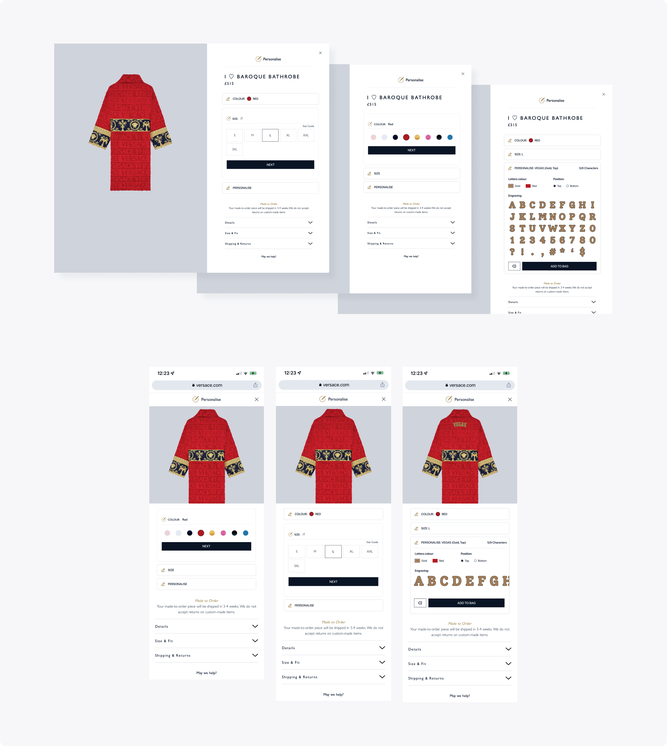
To further enrich the experience, we worked with the marketing team to create an engraving feature for select garments. Users could personalize their items in three easy steps, with a live preview of the result. To maintain quality, input was limited to available characters, ensuring a smooth and consistent experience across devices.