Redesigning the Sky web experience around real users
When I joined Sky as a contractor, the company was in the middle of a major digital redesign. My focus was on fixing one of the core problems: a complex and confusing structure that frustrated many customers. I led the information architecture workstream, working to rebuild the sitemap for Sky’s entire digital ecosystem with a clear, customer-first approach. I also helped define a set of interaction patterns to make the experience more consistent, intuitive, and enjoyable across all platforms.
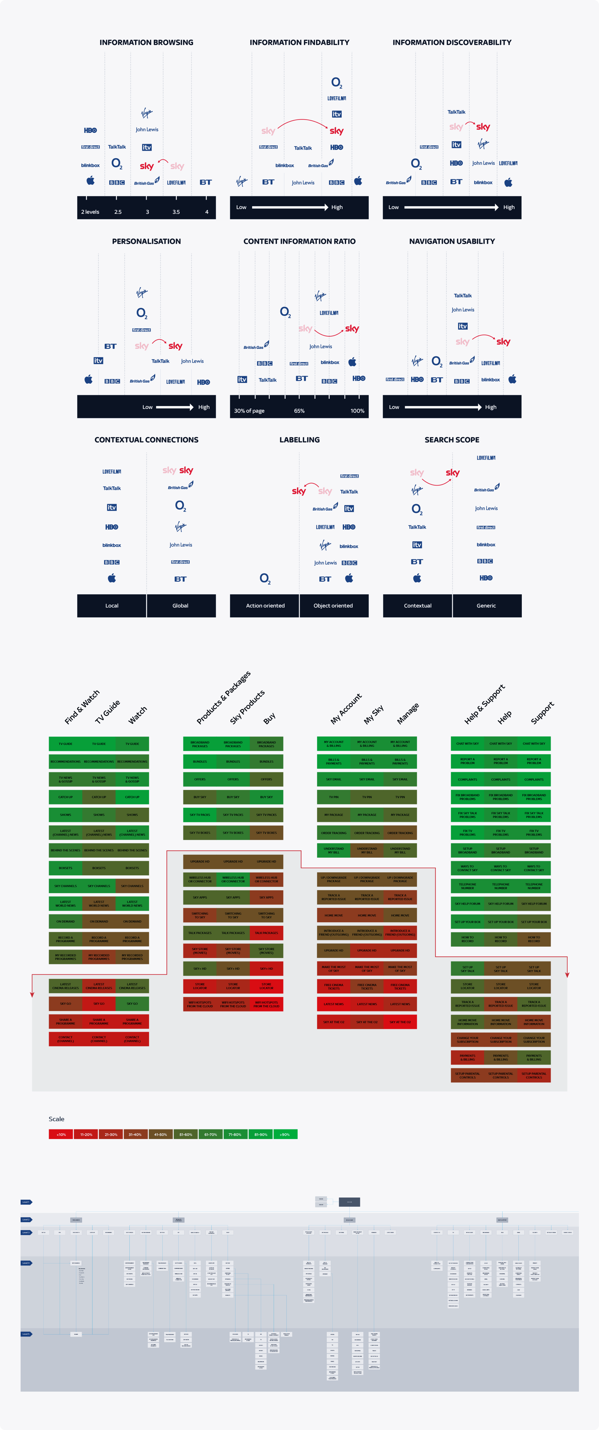
To move forward, we first needed stakeholder alignment. We carried out a benchmark analysis, comparing Sky’s website to key competitors. This revealed several usability gaps and structural weaknesses. Using those insights, we built a set of clear, actionable recommendations to strengthen our position. The main findings were summarised in the slide below.
We ran a range of user research activities — interviews, online surveys, card sorting, and remote task-based testing — to find a structure that made sense to customers. This process led to a completely new sitemap, reviewed and approved by all departments within a few months.
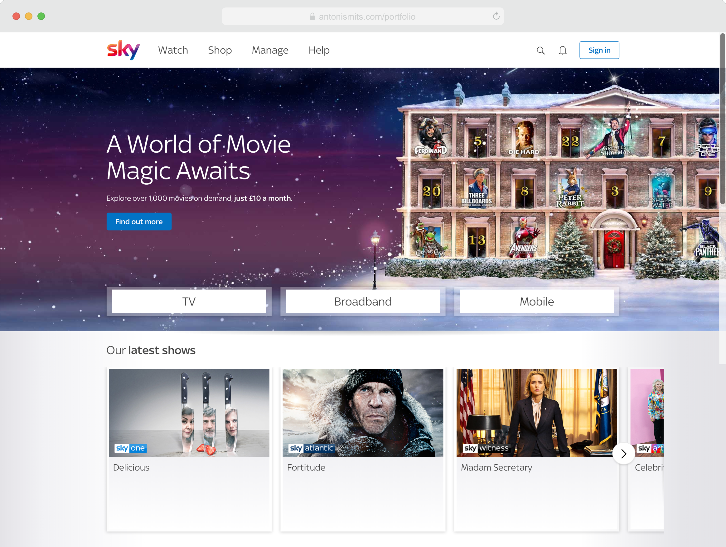
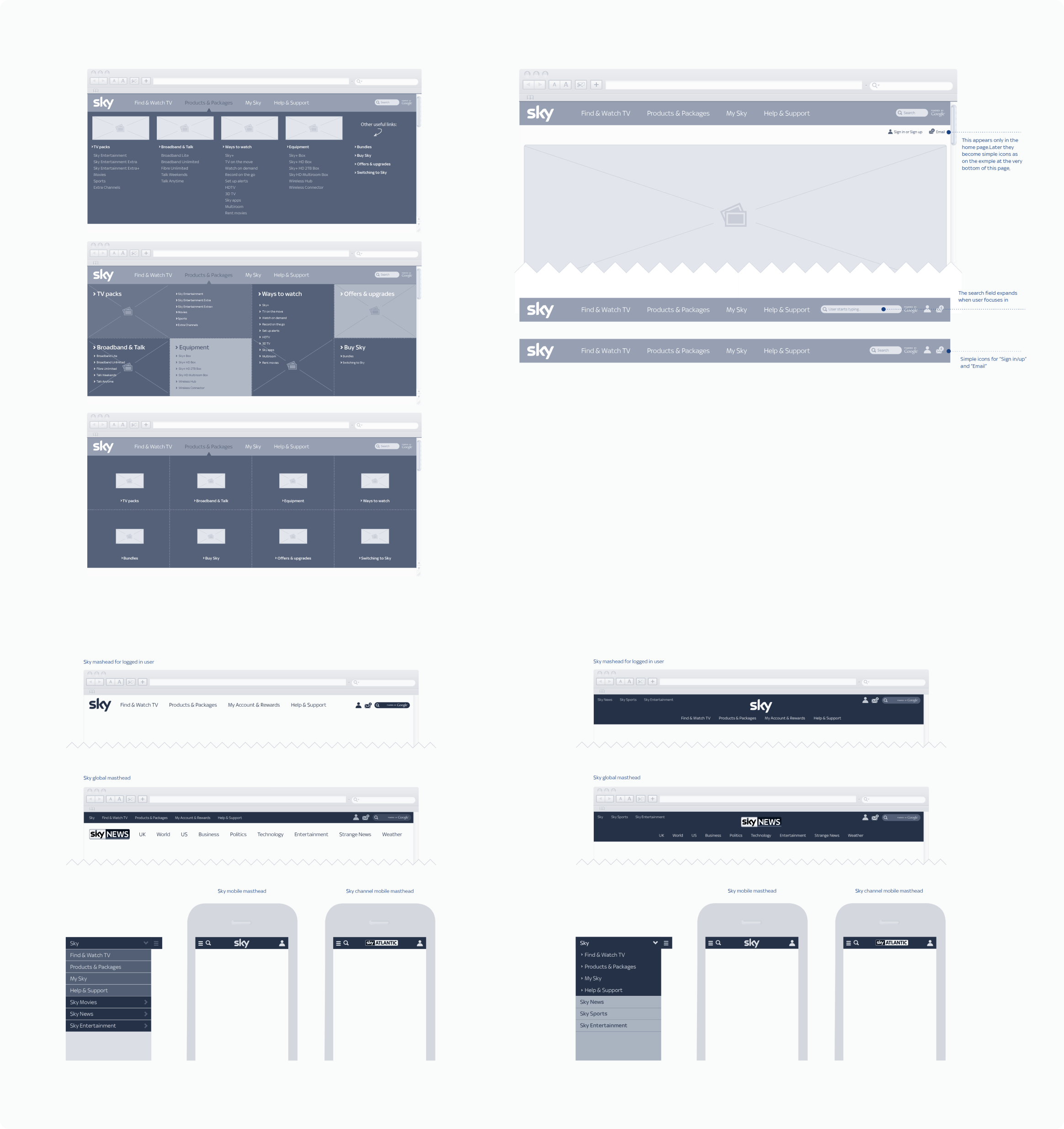
The first elements to be redesigned were the header and navigation, optimised for all web-enabled devices. We tested different versions through usability sessions, live experiments, and A/B testing until we reached the right balance of clarity and performance. Our approach was fast-paced and exploratory, trying bold ideas early to learn quickly, instead of spending time perfecting small details too soon.
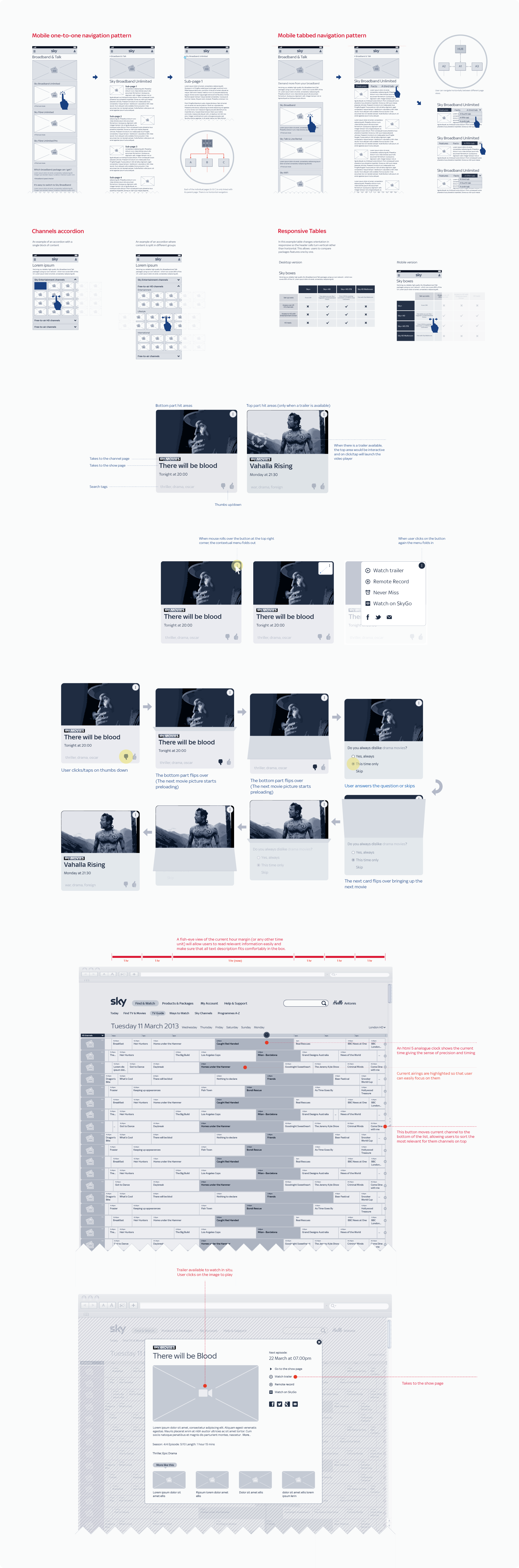
The next step was to design a consistent set of interaction patterns that could be used across all Sky websites. These patterns needed to meet the highest standards of usability and accessibility for a broad audience. We spent time understanding both user and business needs, keeping an eye on market trends, and testing our ideas through multiple iterations until they were proven to work.