Creating the my Canal+ launch experience for Apple TV
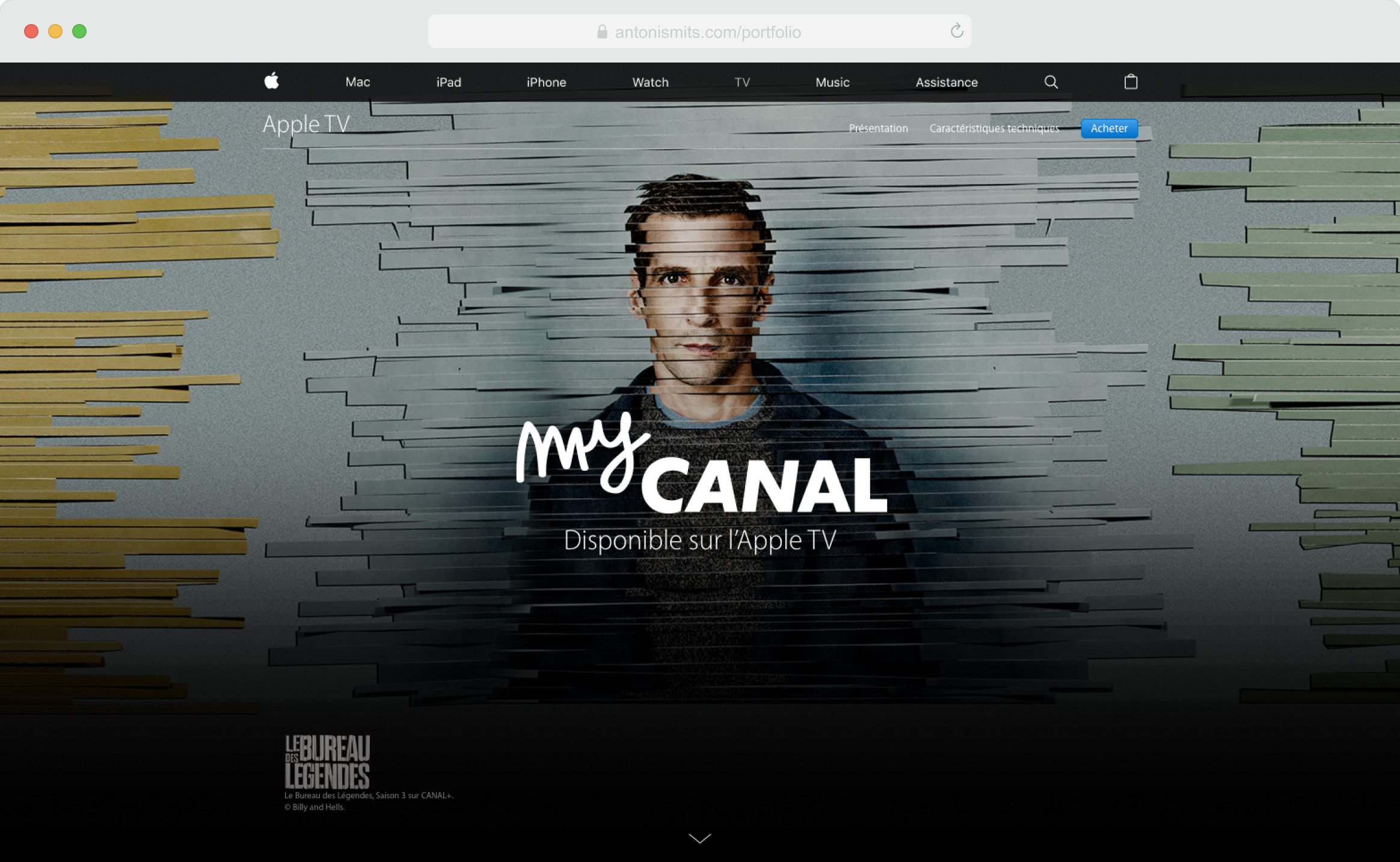
The French broadcaster My CANAL was preparing to launch an app for Apple TV, and Apple wanted to celebrate the milestone with a dedicated page on their main website. I was asked to lead the UX design, working closely with creatives and copywriters to craft an interactive story that reflected Apple’s high standards and attention to detail.
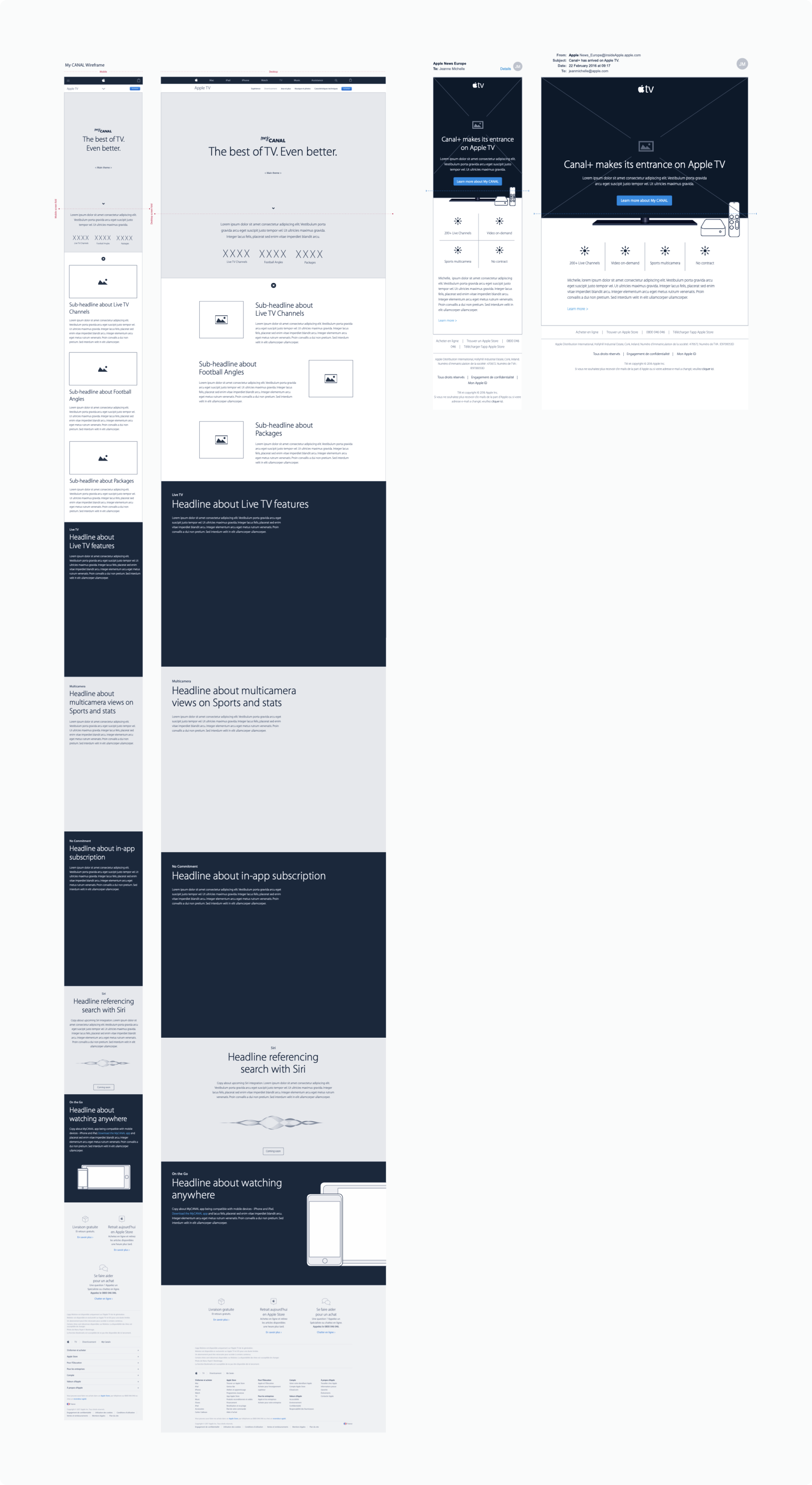
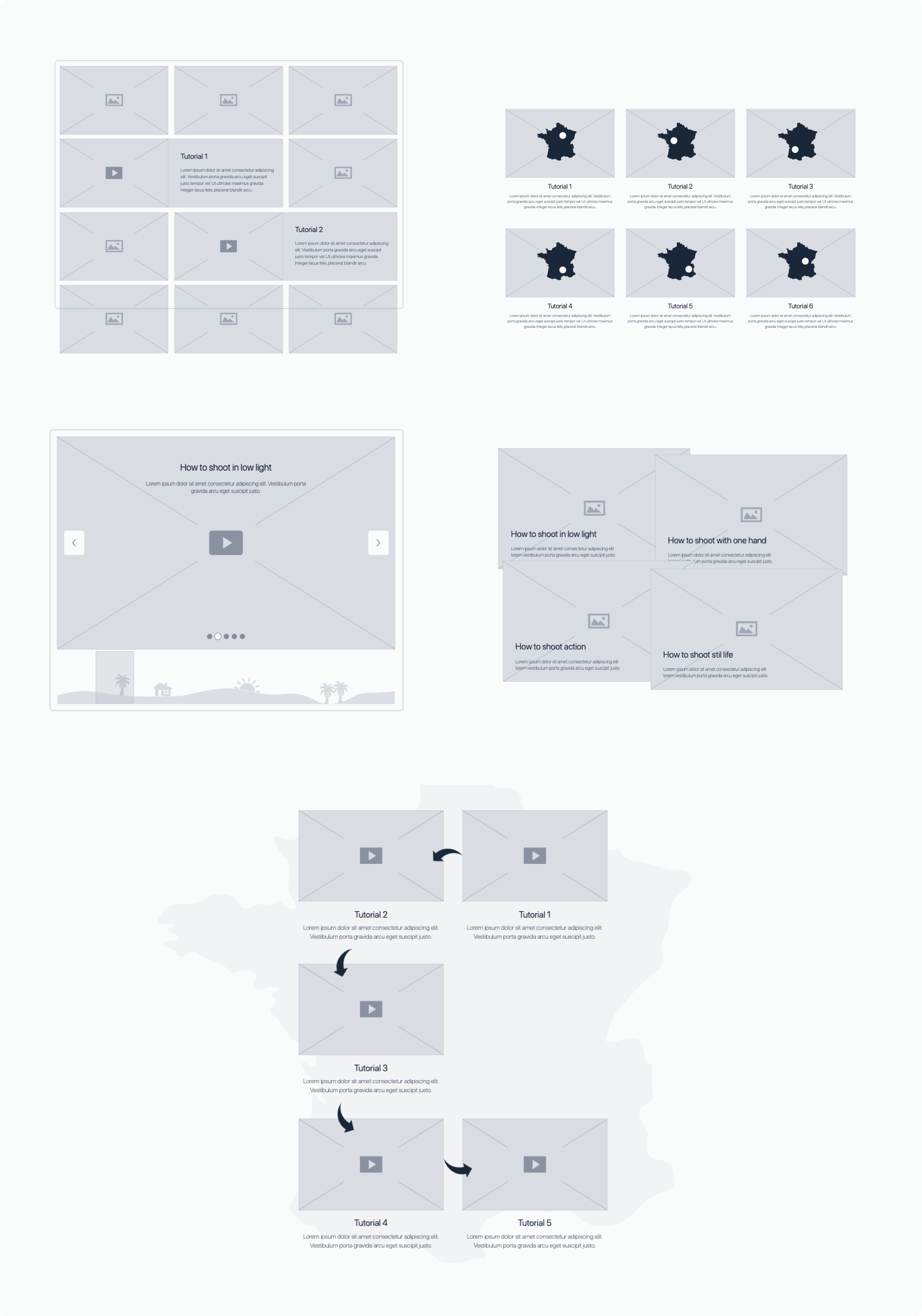
As a cross-functional team, we explored several directions, guided mostly by intuition and early feedback, since much of the project had to stay confidential. The design needed to be responsive and aligned with Apple’s brand personality. Because the content was not final until late in the process, we focused first on building a flexible framework that could tell the story clearly, no matter how the final content evolved. Below is an early wireframe from that stage.
iPhone campaign inspired by Michel Gondry’s short film
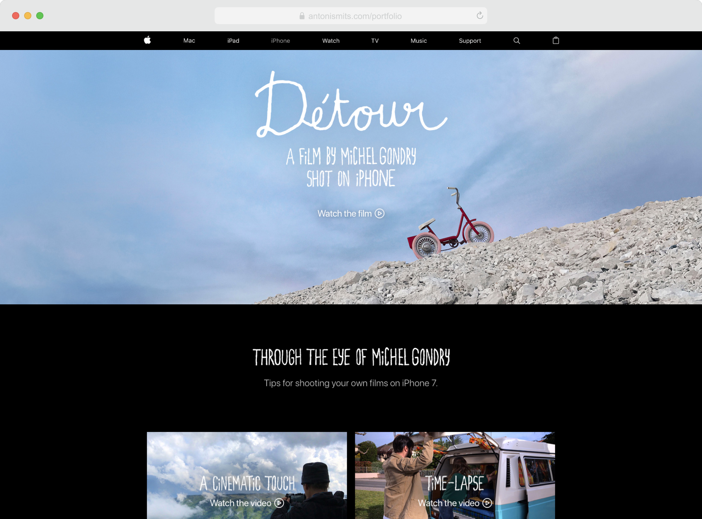
To promote the new iPhone, Apple collaborated with French director Michel Gondry, who created a film shot entirely on the device. My role was to design the user experience for the campaign’s microsite. At first, the site shared updates about the film’s progress, and later became the main hub where users could watch the final piece and explore a series of behind-the-scenes videos.
We began by exploring visual directions inspired by Gondry’s playful and imaginative style. Known for his simple but clever visual tricks, we wanted the site to capture that tone in a subtle, modern way.
The final design evolved from those early ideas into something much simpler and more content-driven. We decided that the film itself should take center stage, so we designed a clean, intuitive layout that felt familiar and easy to use. From there, we focused on refining details and transitions to create a smooth and engaging experience.
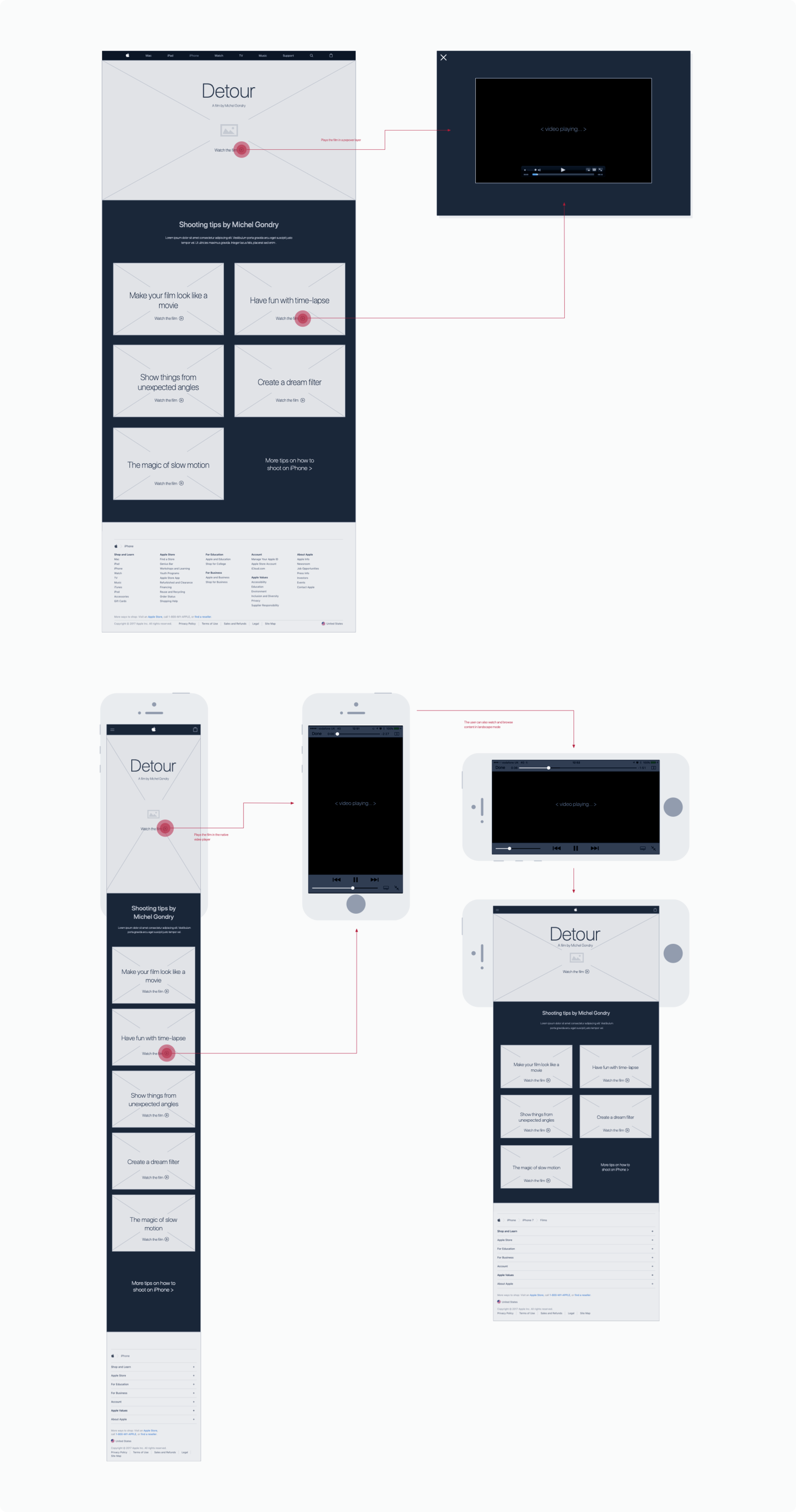
We also explored ways to extend the Michel Gondry campaign by integrating it with Apple’s key third-party partners and media channels.
Introducing the Plaza Liberty Apple store in Milan
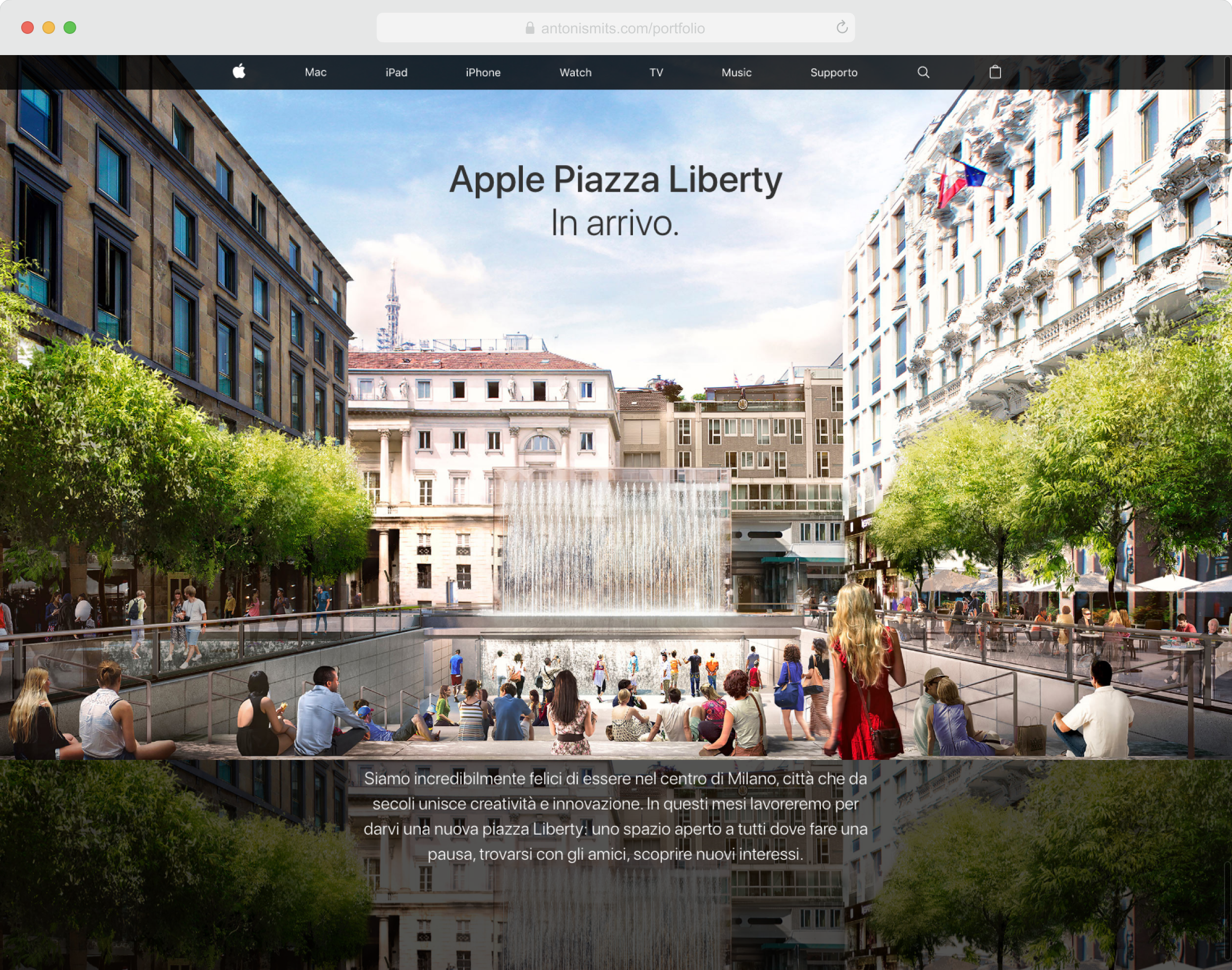
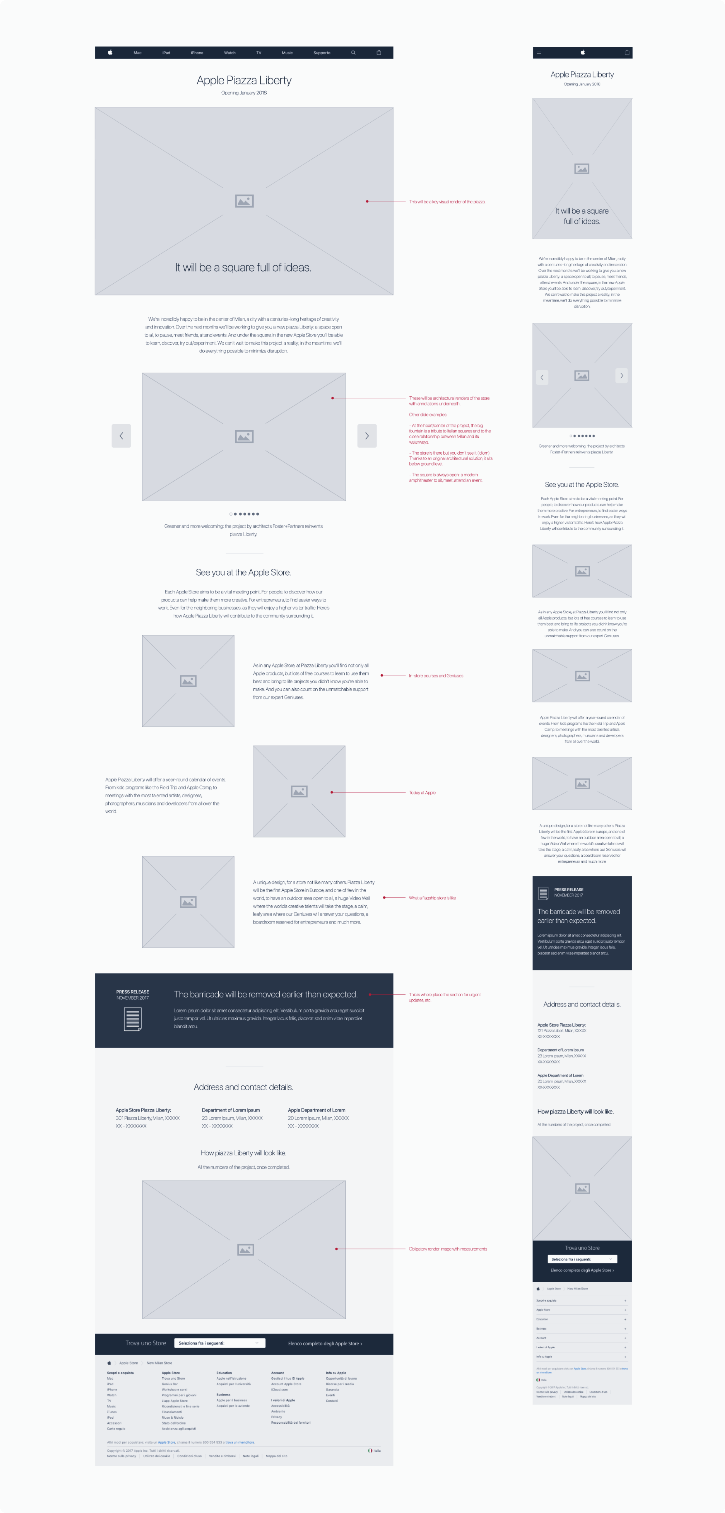
Apple Retail needed a dedicated webpage for the upcoming Plaza Liberty store in Milan—an iconic project that combined architecture, culture, and brand presence. The site had to evolve with the building’s progress, starting as an informational page about the construction and its vision, and later becoming a full-featured Apple Store page.
We explored several design directions to find the right balance between storytelling and practical information. One of the early wireframes is shown below.
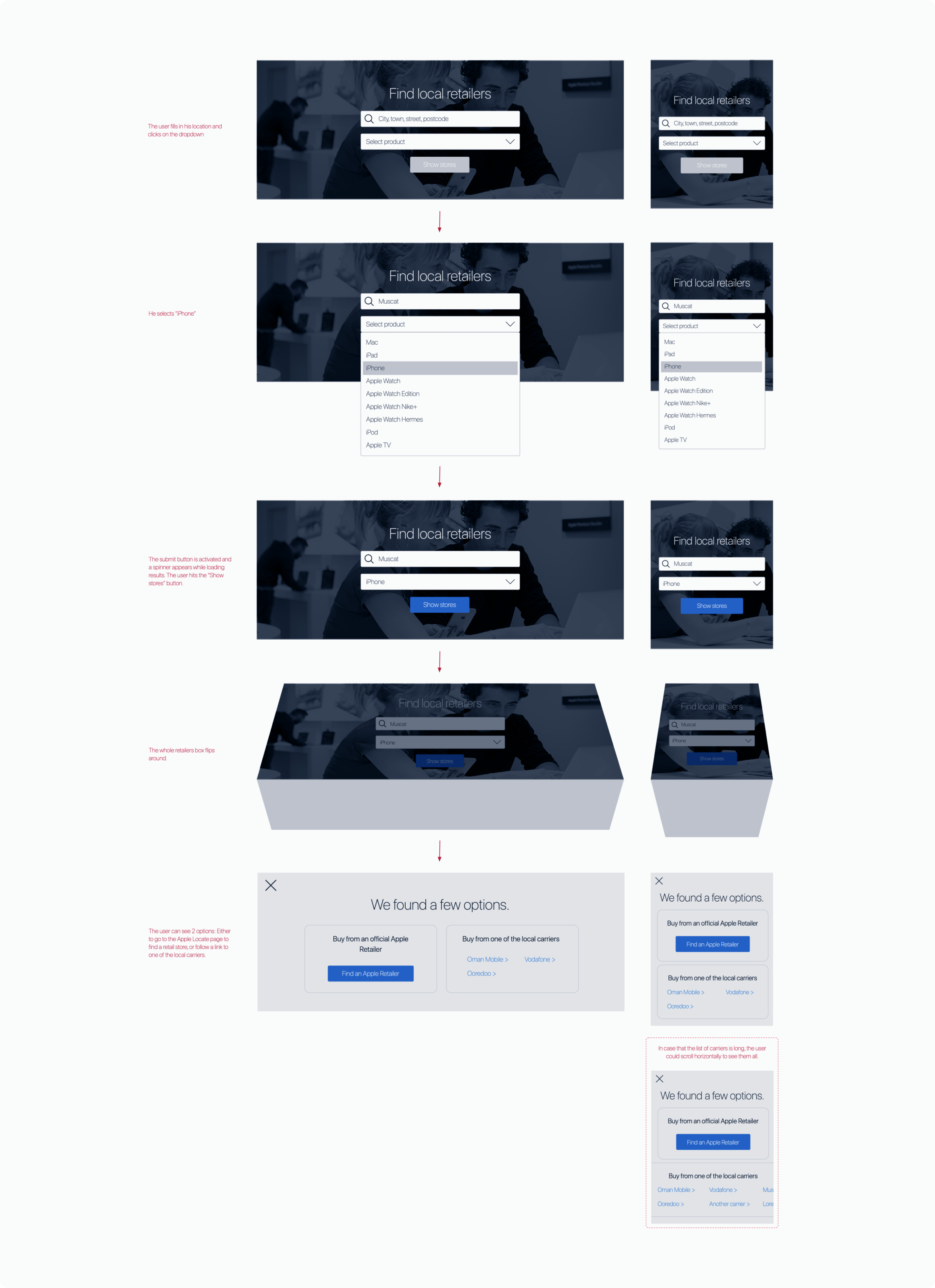
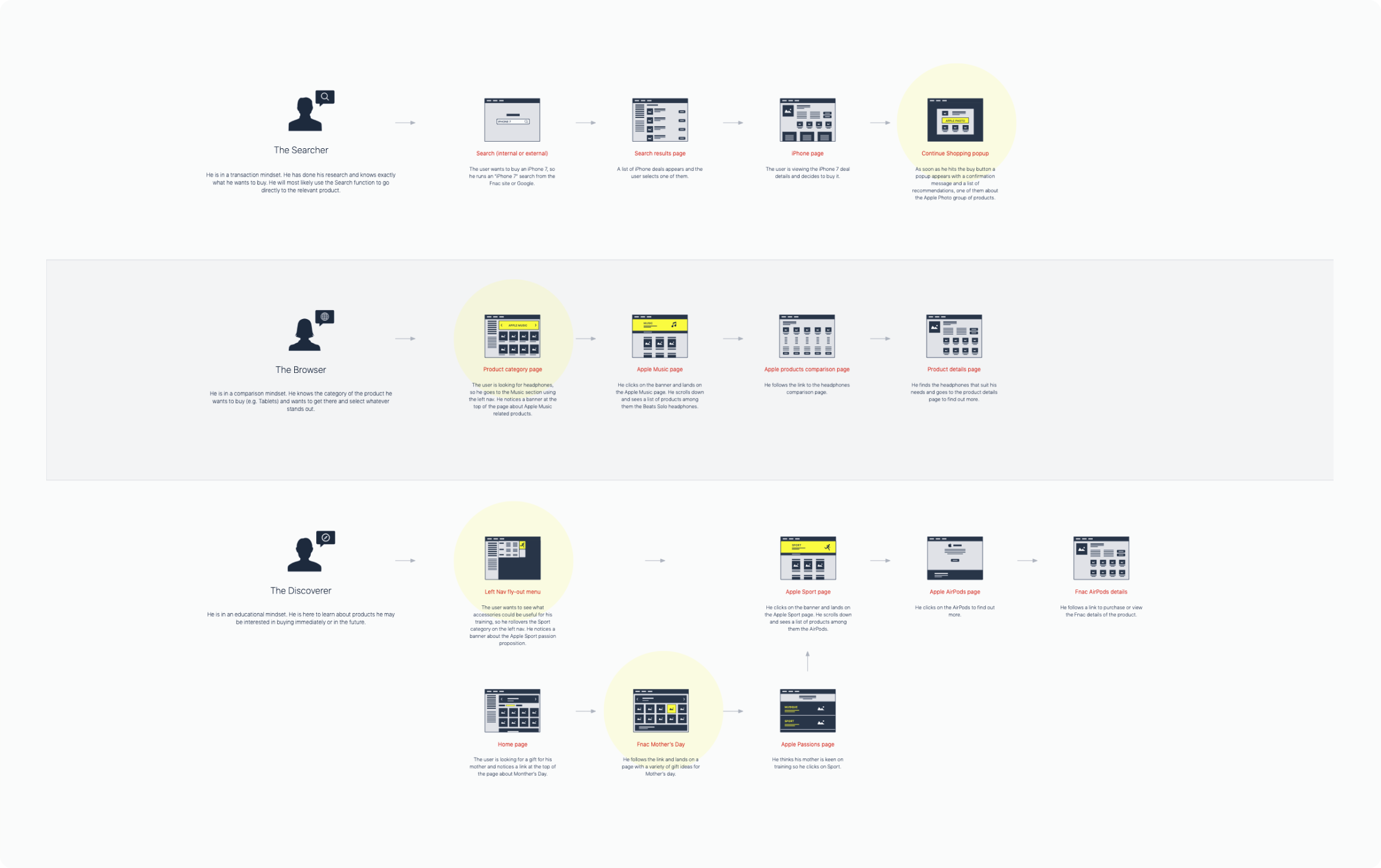
During this project, we were often asked to design features tailored to different regions. One such feature was an interactive tool that helped users find iPhone plans and local carrier partners based on their location.