Bringing the Nike Training Club app to life
Nike set out to become a leader in the training market by launching a game-changing digital service. The goal was to connect training professionals and fitness enthusiasts, offering both networking opportunities and valuable training resources. This vision became reality through a mobile app that allowed users to create and follow personalized training plans designed by Nike athletes. Users could track their performance, follow progress, and stay motivated with features like followers, upvotes, messaging, and personalized feeds. A companion wearable device captured precise effort data, turning workouts into meaningful insights.
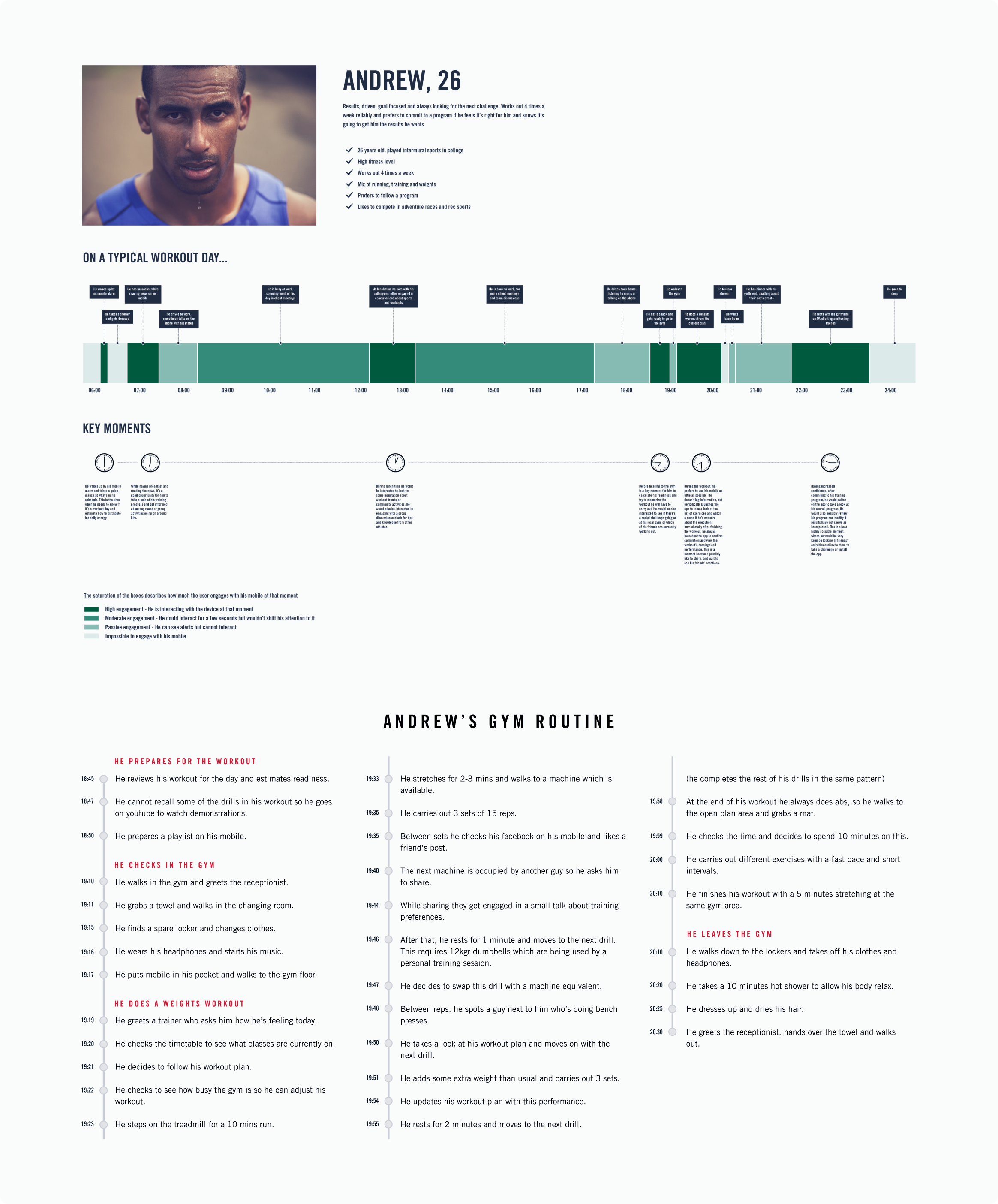
Since the product was still in its early stages, we spent time getting to know the training market in depth. We spoke with both professional and amateur trainers to understand their needs, motivations, and challenges. Our research included market analysis, field observations, focus groups, interviews, and workshops. From these, we identified actionable insights that shaped the product. Working with the marketing team, we created personas and “day-in-the-life” diagrams that mapped out key moments in users’ routines. These helped us identify when to send motivational notifications, ensuring messages reached users when they needed them most. An example is shown below.
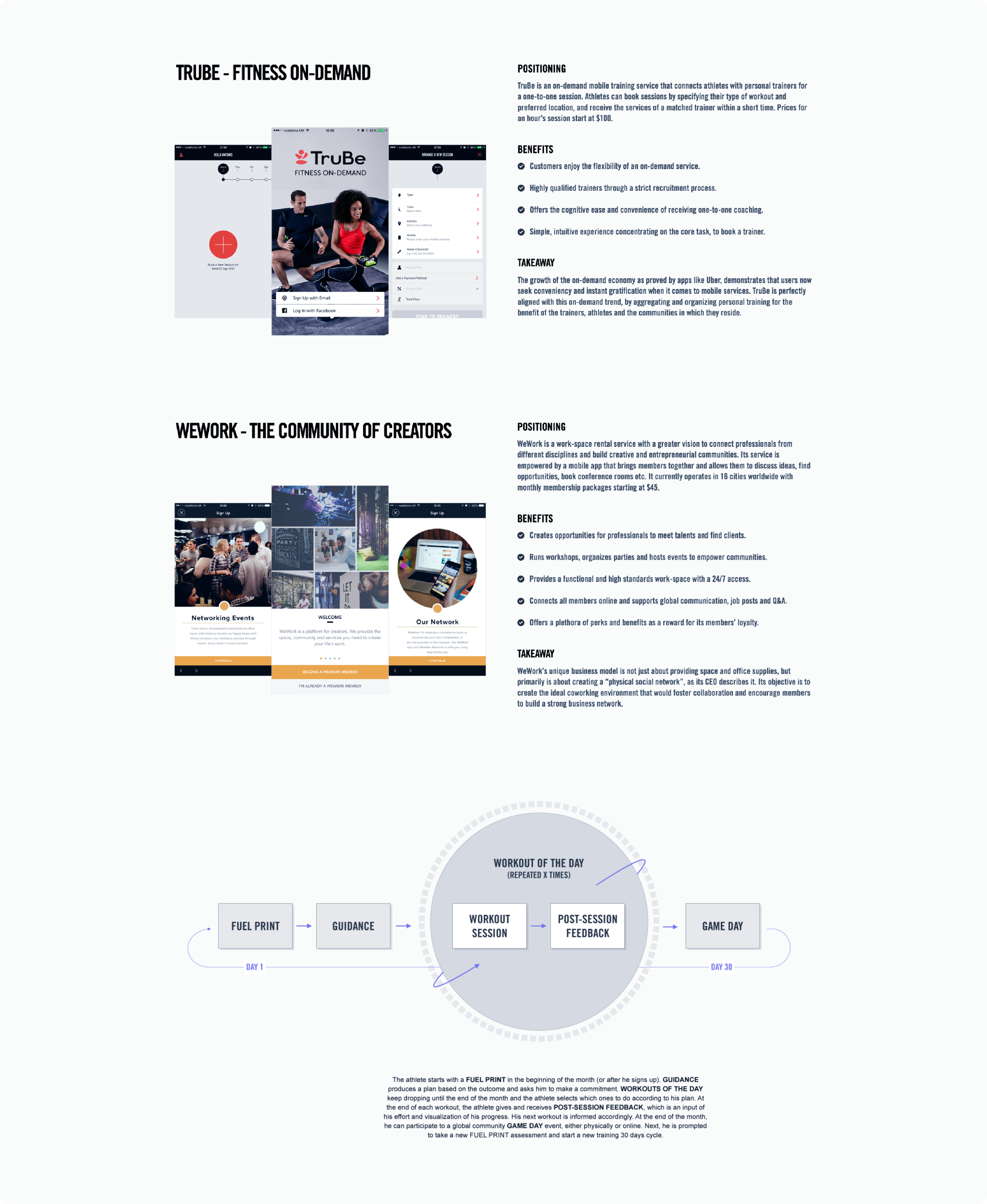
During the product definition phase, we continued monitoring market trends to stay aligned with the latest digital fitness practices. These insights helped us refine our strategy and focus on key touchpoints across the user journey.
With a strong understanding of the market and user needs, we established design principles to guide our decisions and ensure a cohesive experience from start to finish.
With the product direction set, we began exploring design ideas for key user moments. This included an onboarding flow with self-assessment, a workout plan builder, and real-time coaching during sessions. Trainers were deeply involved, co-creating flows and interfaces that worked best for their clients. Drawing insights from multiple sports, we built a framework structured around four key dimensions: strength, endurance, mobility, and athleticism.
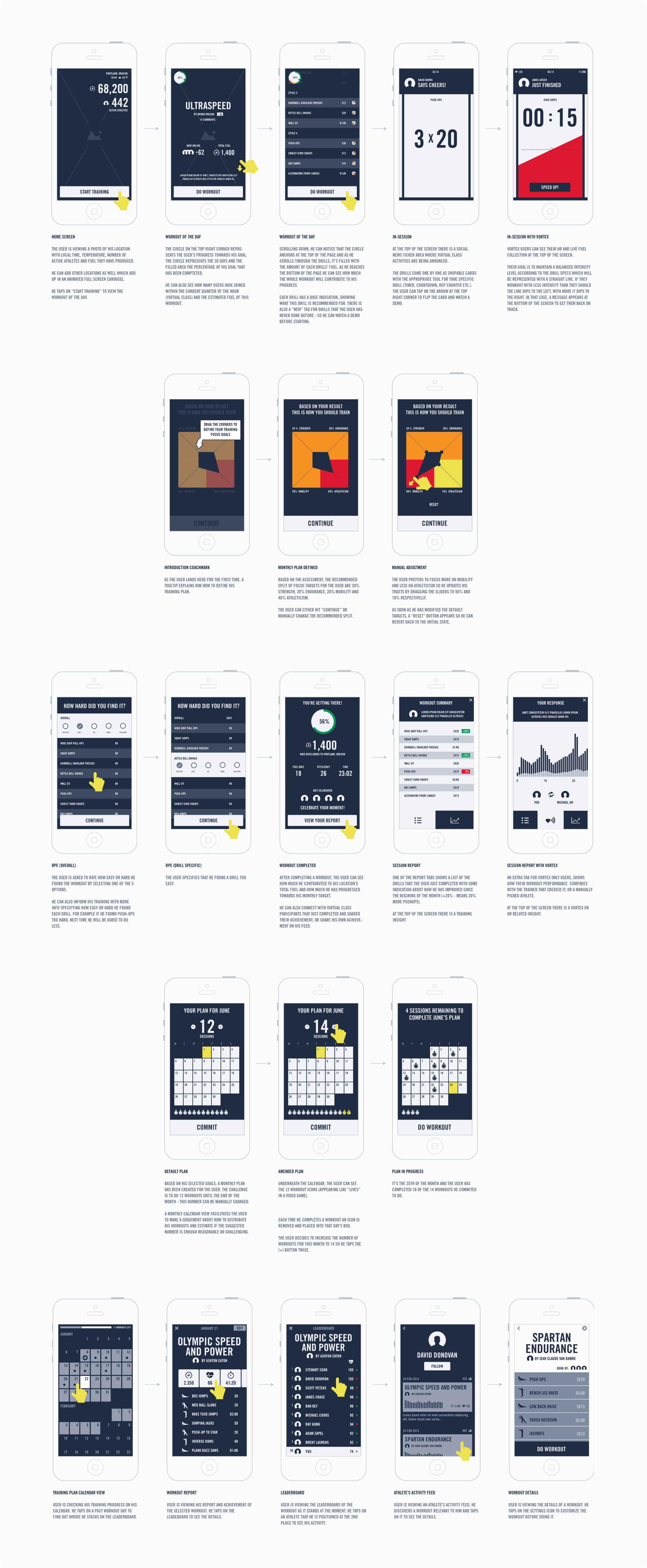
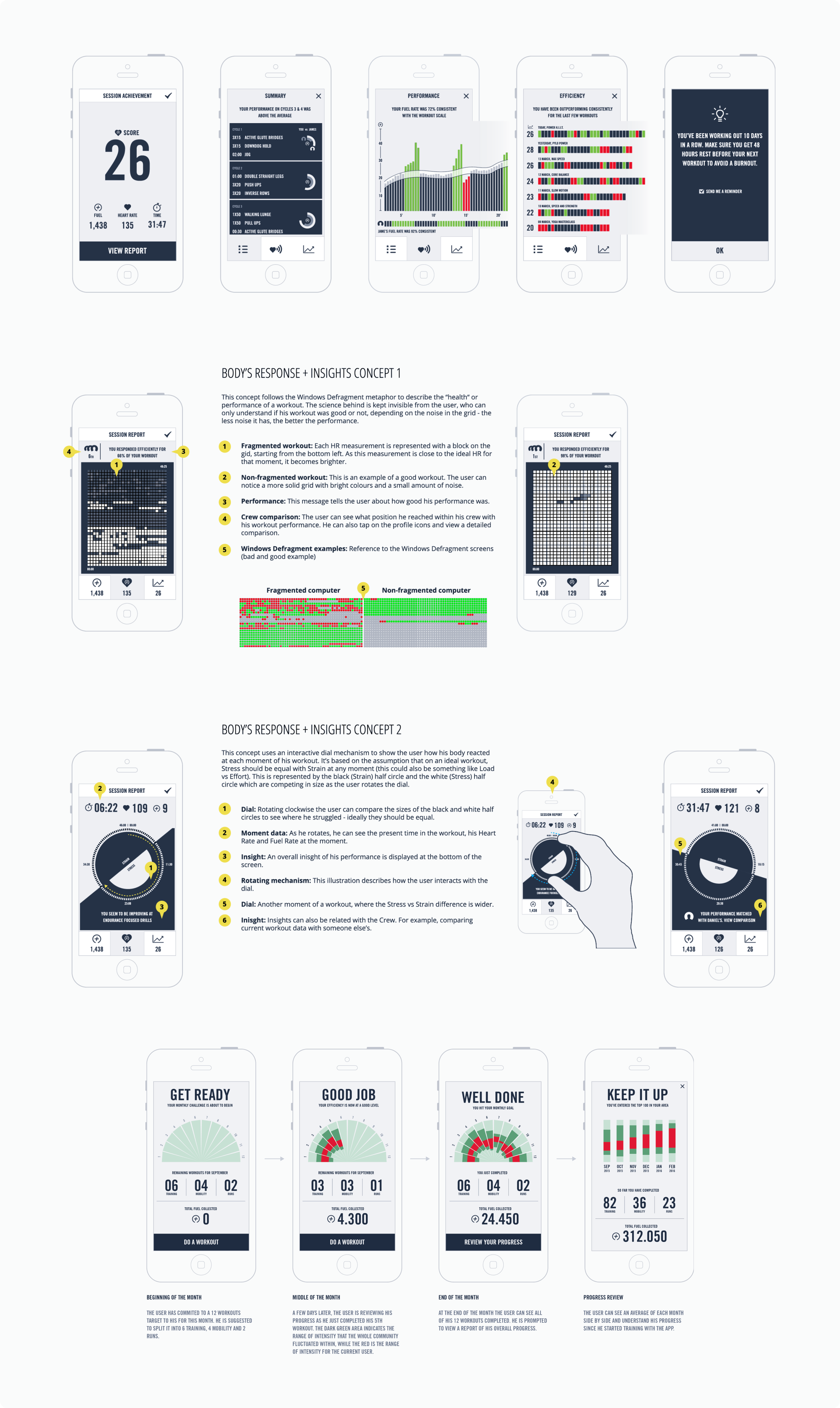
One challenge was how to visualize workout results and progress in a way that was both simple and motivating. We wanted data from wearables or manual input to feel easy to understand, not technical or overwhelming. This led to visually rich, intuitive progress summaries that blended clarity with aesthetic appeal, helping Nike stand out from competitors through design and tone.
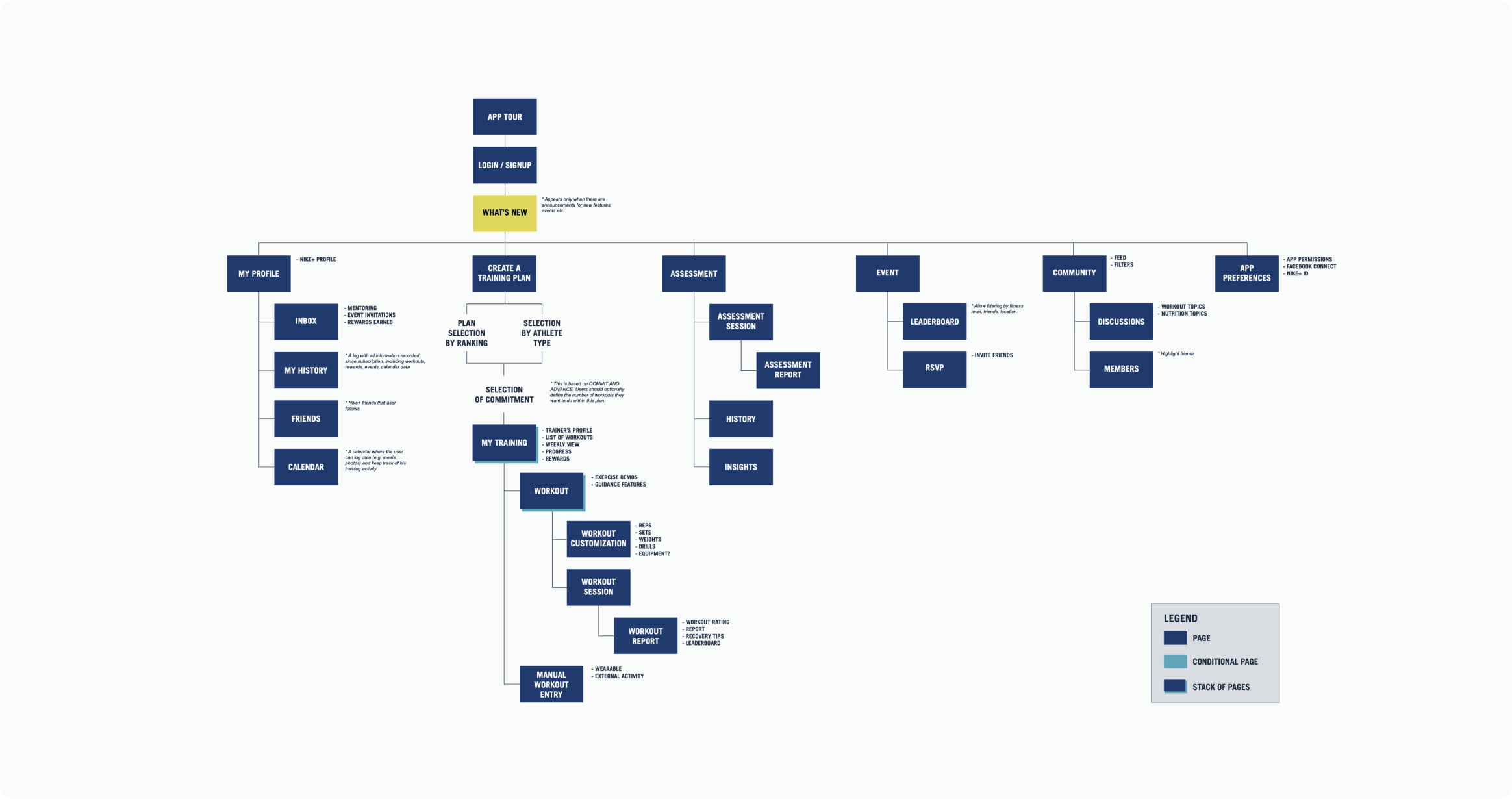
We then tested several content structures inspired by different creative concepts. One focused on a simple “workout of the day,” giving users a single entry point into their session. Another centered on personalized 30-day plans, offering multiple paths such as “Feed,” “Find a Workout,” “Calendar,” or “My Library.” Feedback from athletes helped shape the final information architecture.
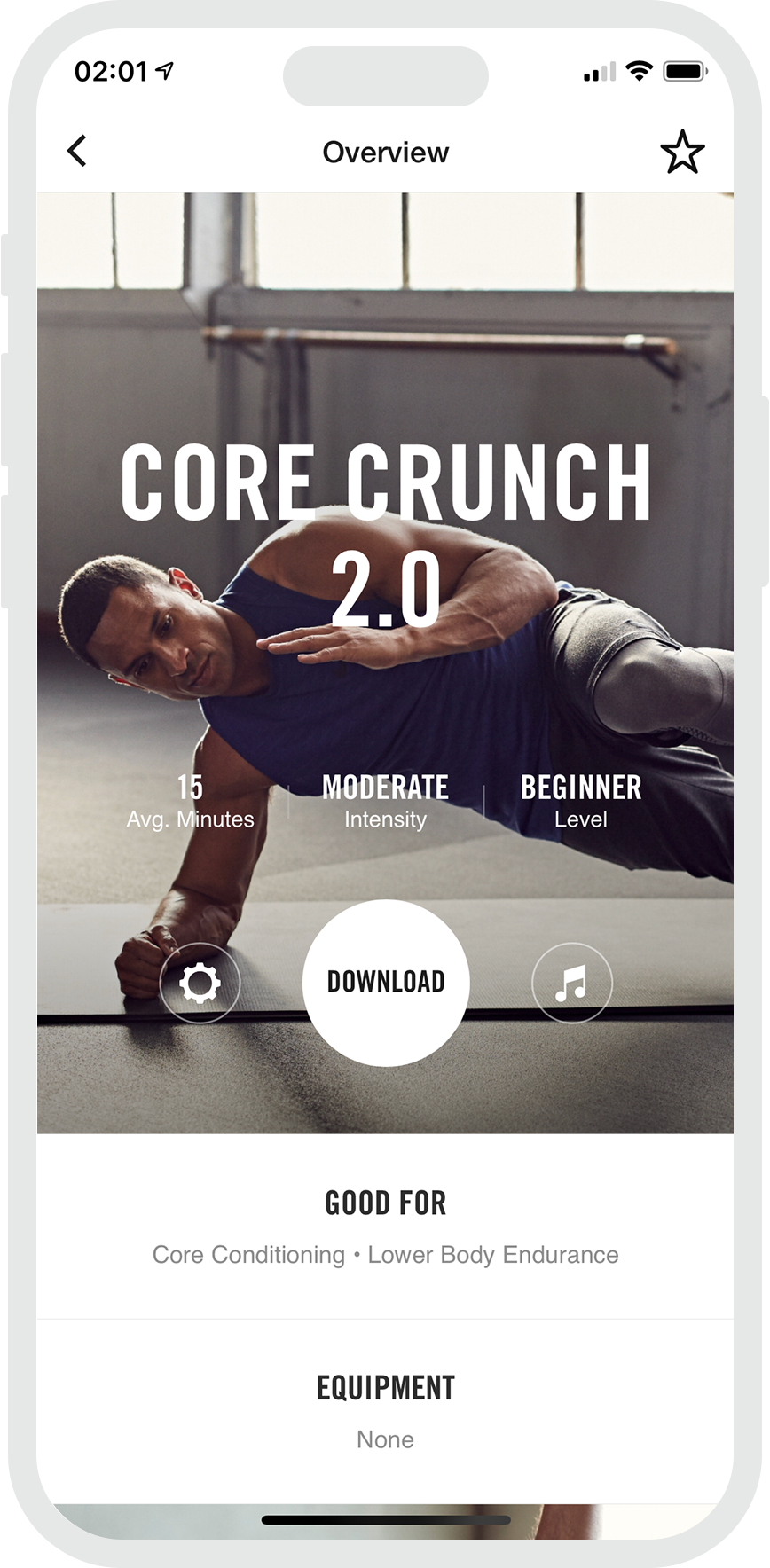
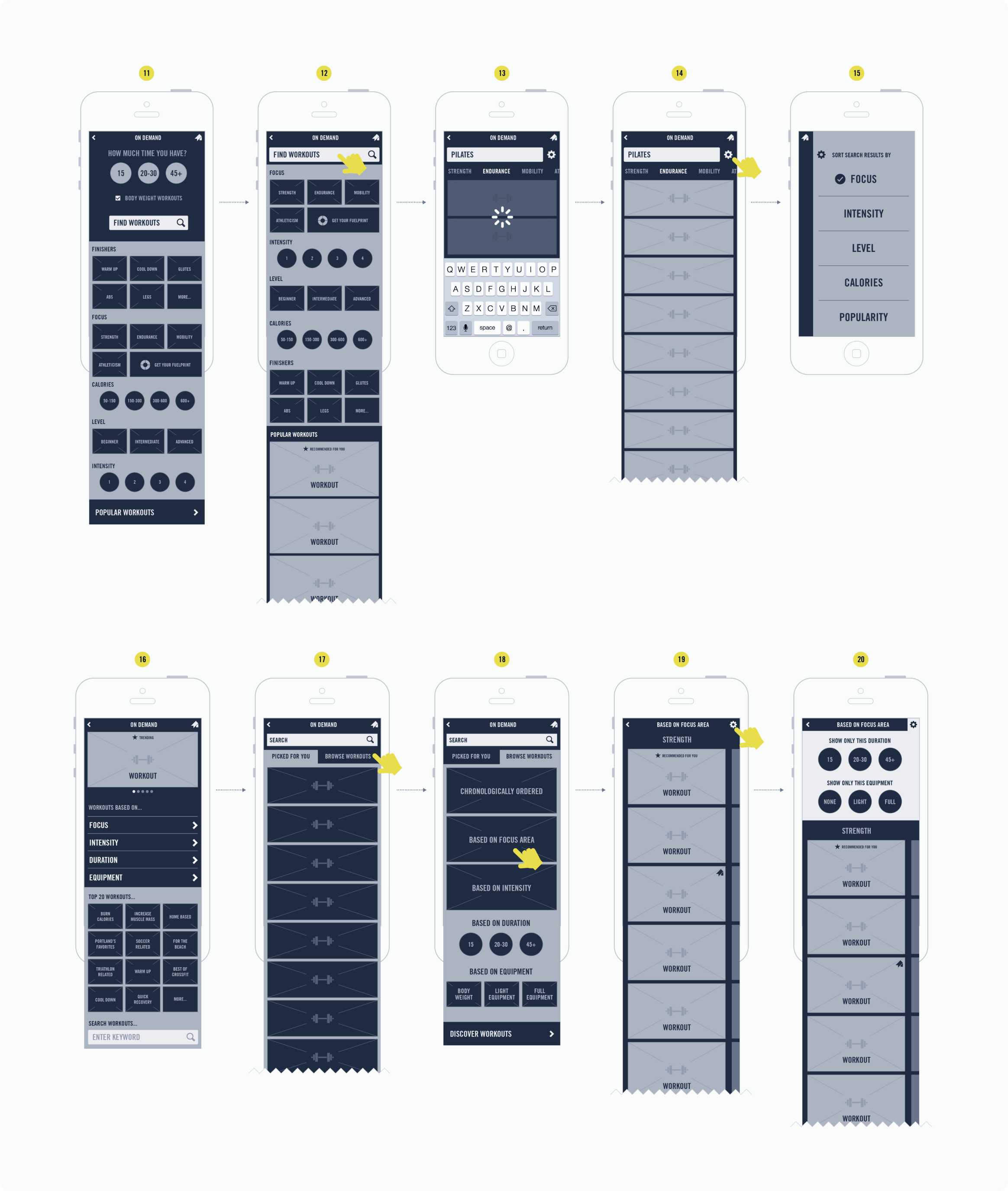
A key part of the experience was helping users easily discover, save, and track workouts that mattered to them. Below is one of the tested approaches for this functionality.
Designing the Nike Training Club web experience
The website was designed to promote the app and build a sense of community among athletes and trainers who shared Nike’s training philosophy.
We started by exploring different content structures and testing them against real use cases. The goal was to make the site intuitive for both first-time and returning visitors. It also needed to highlight the app without letting it overshadow the broader storytelling purpose of the platform.
Each page was designed to tell a focused story crafted by the creative team. Our UX work ensured these stories were supported through interaction and layout, using modular components from the global Nike.com design system. An example is shown below.
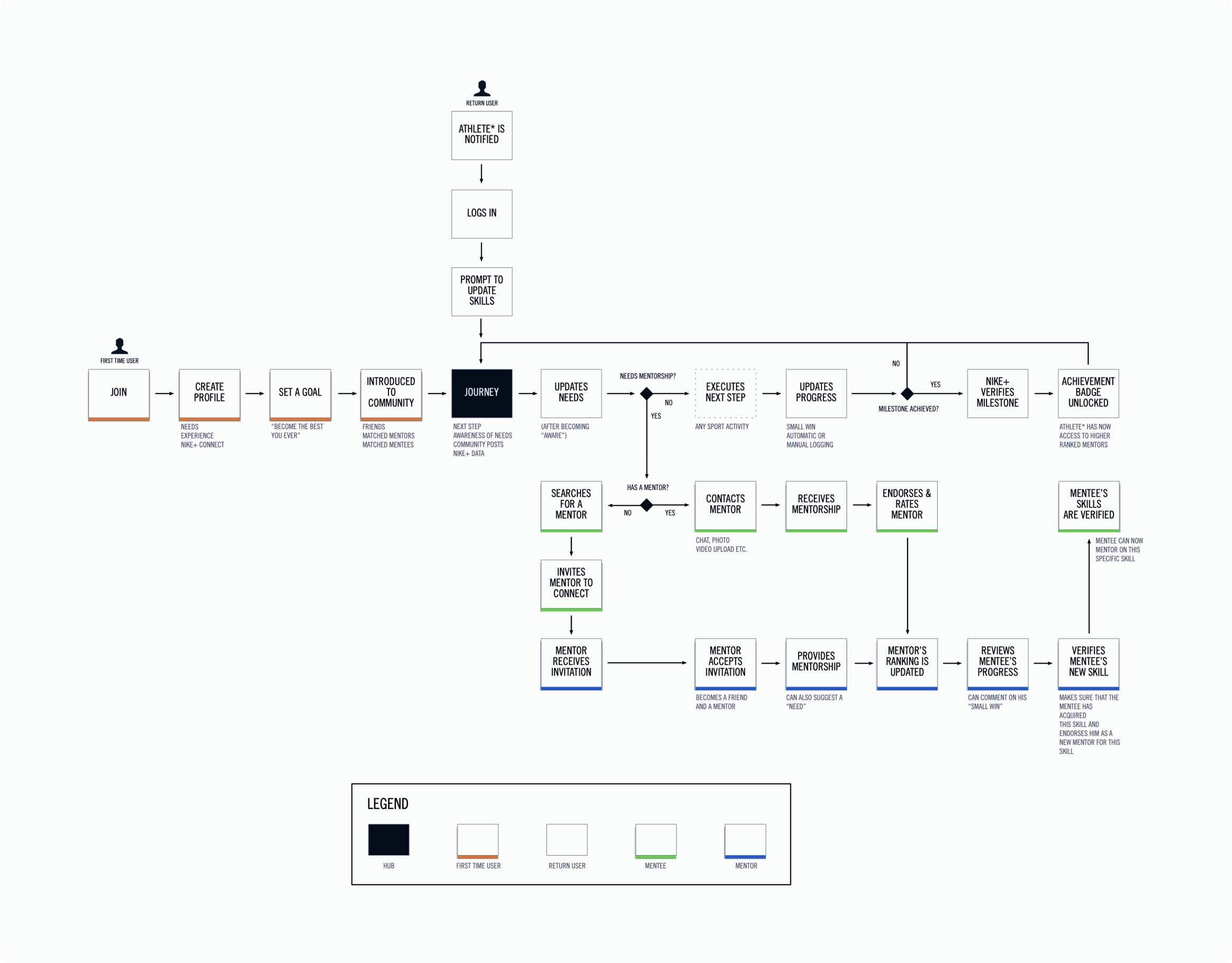
Another project we explored, though not released, was a mentorship app that helped users connect with trainers and mentors to achieve fitness goals. Users could create profiles, match with mentors, and get guidance through personalized sessions. We developed several concepts and detailed workflows, some of which are shown below.
We carried out research to understand how mentor-mentee relationships work in practice. These insights shaped a structured workflow that guided the design of the app experience.