Reimagining Priority Pass as a connected travel service
Priority Pass wanted to move beyond being just a lounge directory and evolve into a full travel experience service. The goal was to shift customers from using physical cards for lounge access to a digital platform that enhanced their airport experience with more useful features. I joined the team to support this transformation and lead the UX work to define and shape the vision of the new service.
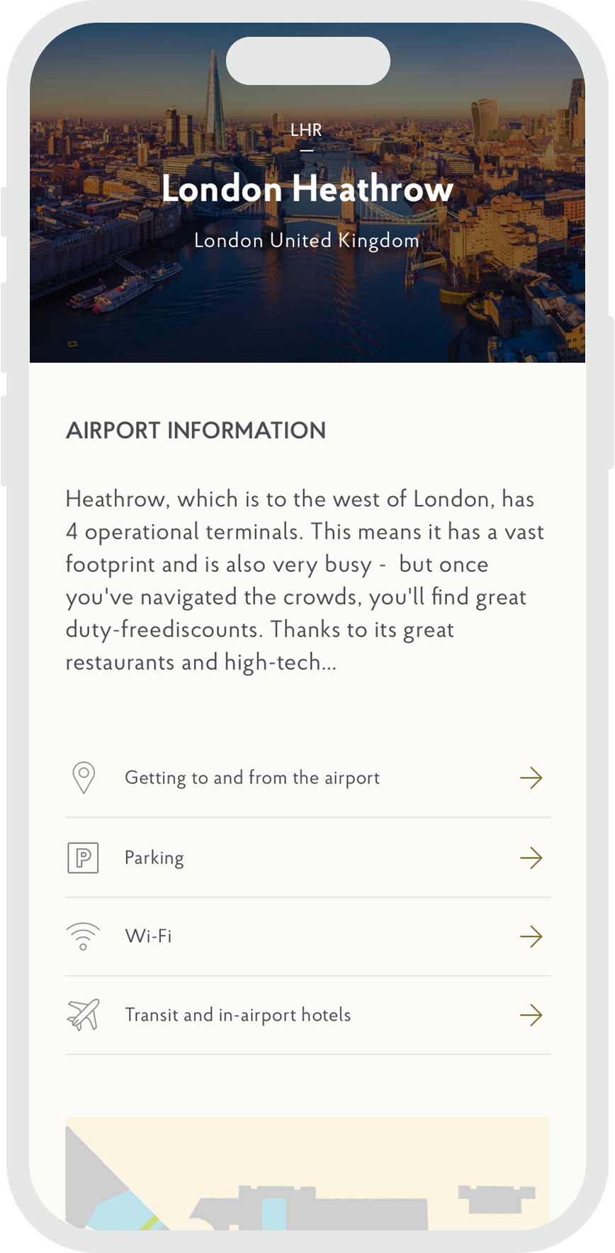
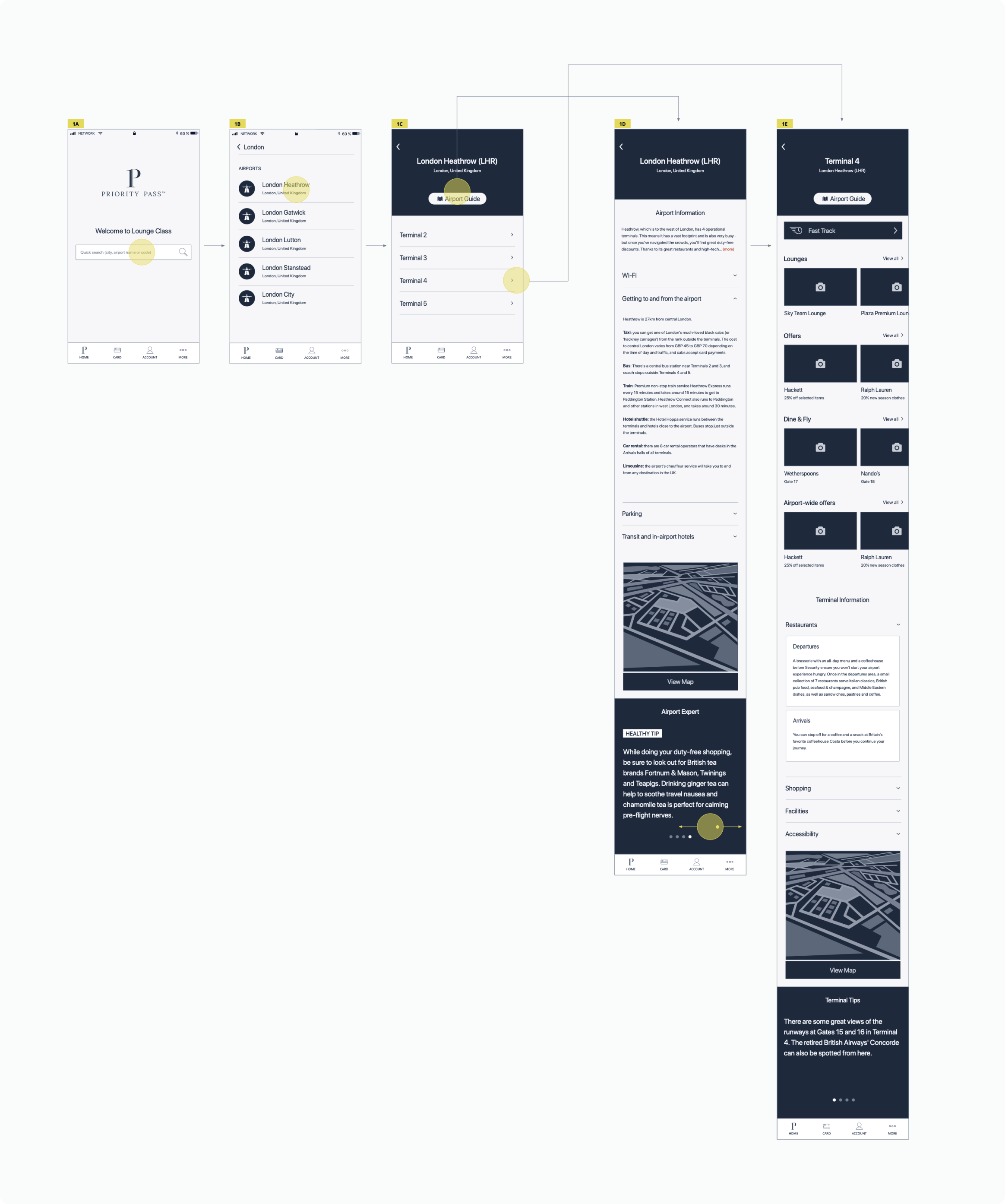
We began by bringing popular website features into the mobile app. One key feature was the airport guides, which provided practical details such as transport options, accessibility, parking, and activities. Through user research, we explored how people preferred to find and use this information. Our aim was to make it clear and easy to access without disrupting the booking or conversion flow. A sample flow we explored is shown below.
We also improved the lounge details page, making it more informative and engaging. Guided by analytics, we refined the content structure and added new elements such as highlights, testimonials, and special offers. These helped users make confident and informed decisions.
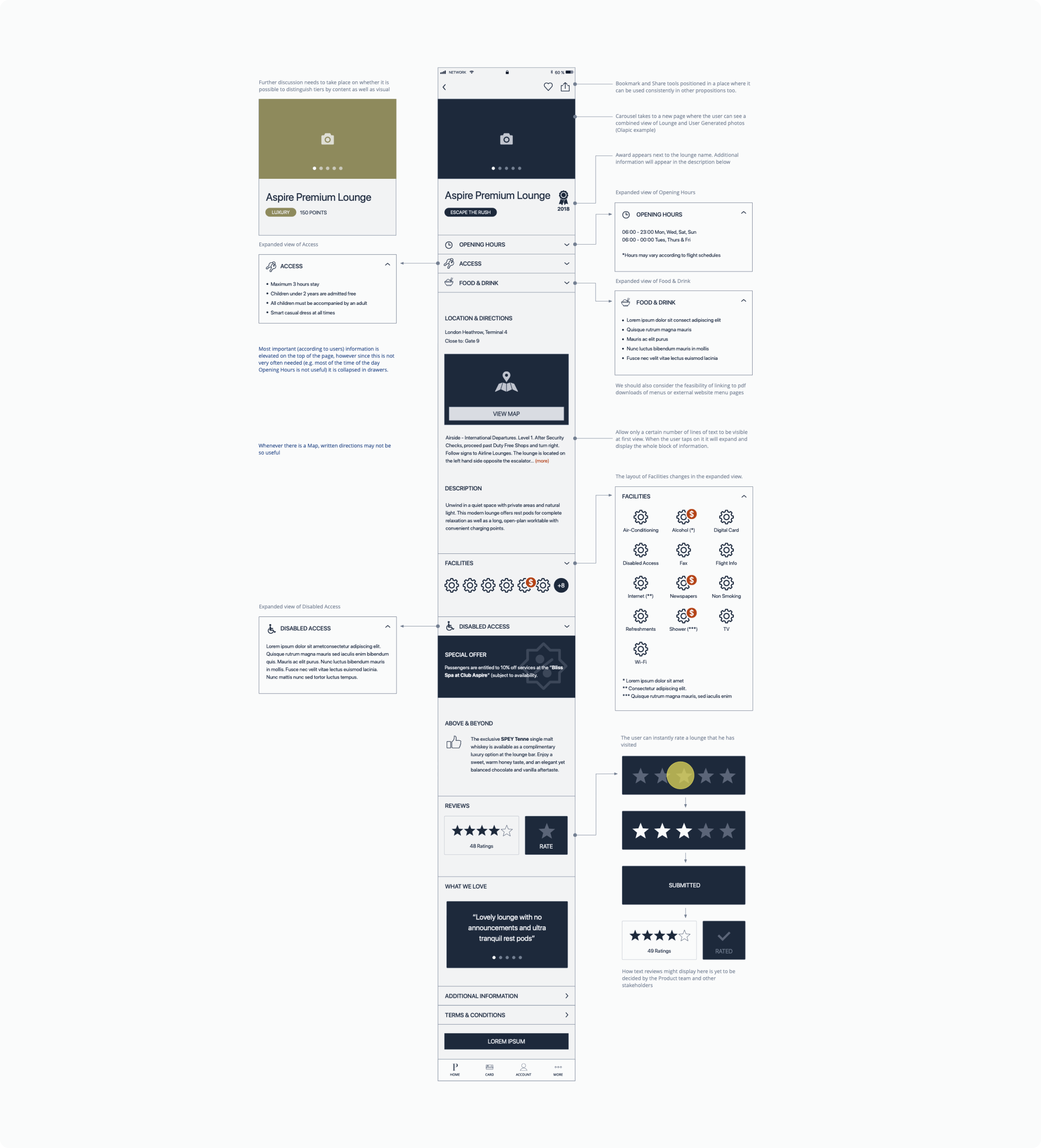
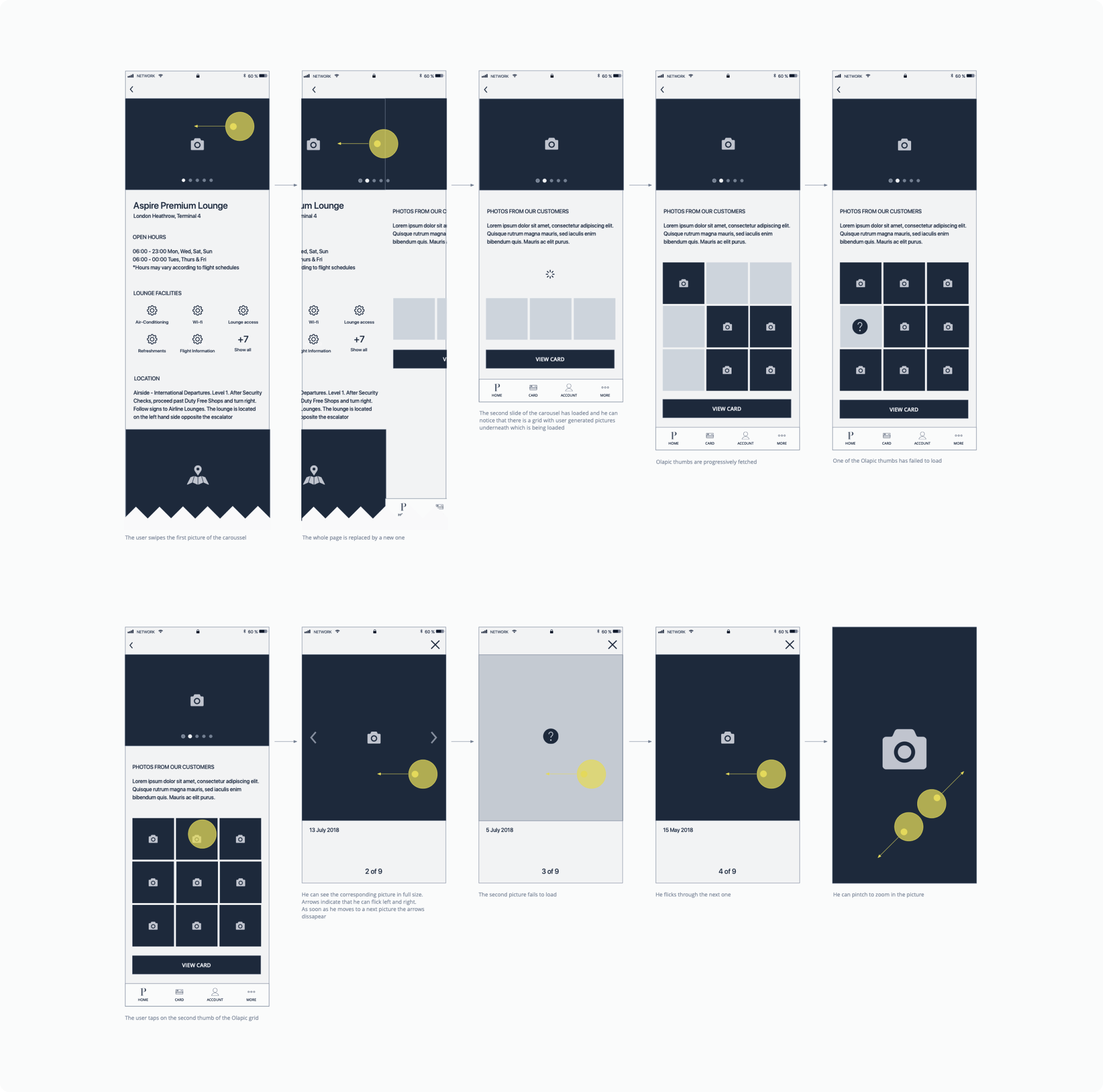
Many users asked for real photos of lounges to get a better sense of what to expect. Previously, this was difficult—some lounges used stock or outdated images. To fix this, we designed a pattern that combined curated lounge photos with a separate page for user-submitted images. This approach balanced the official presentation with a more authentic, user-driven view.
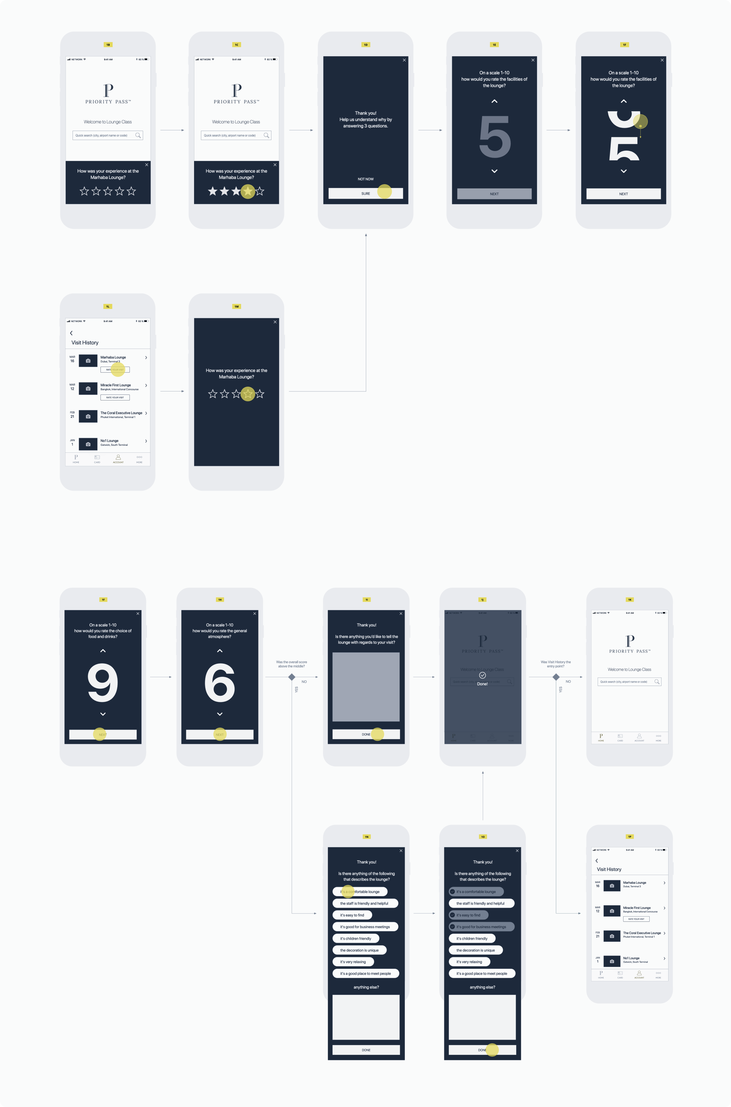
Reviews and ratings were another area of focus. Feedback was valuable, but most users didn’t want to complete a long survey. To encourage participation, we designed a more interactive experience that made the process feel quick and rewarding. One of the most effective ideas was a spinner animation with sound and visual cues, shown below.
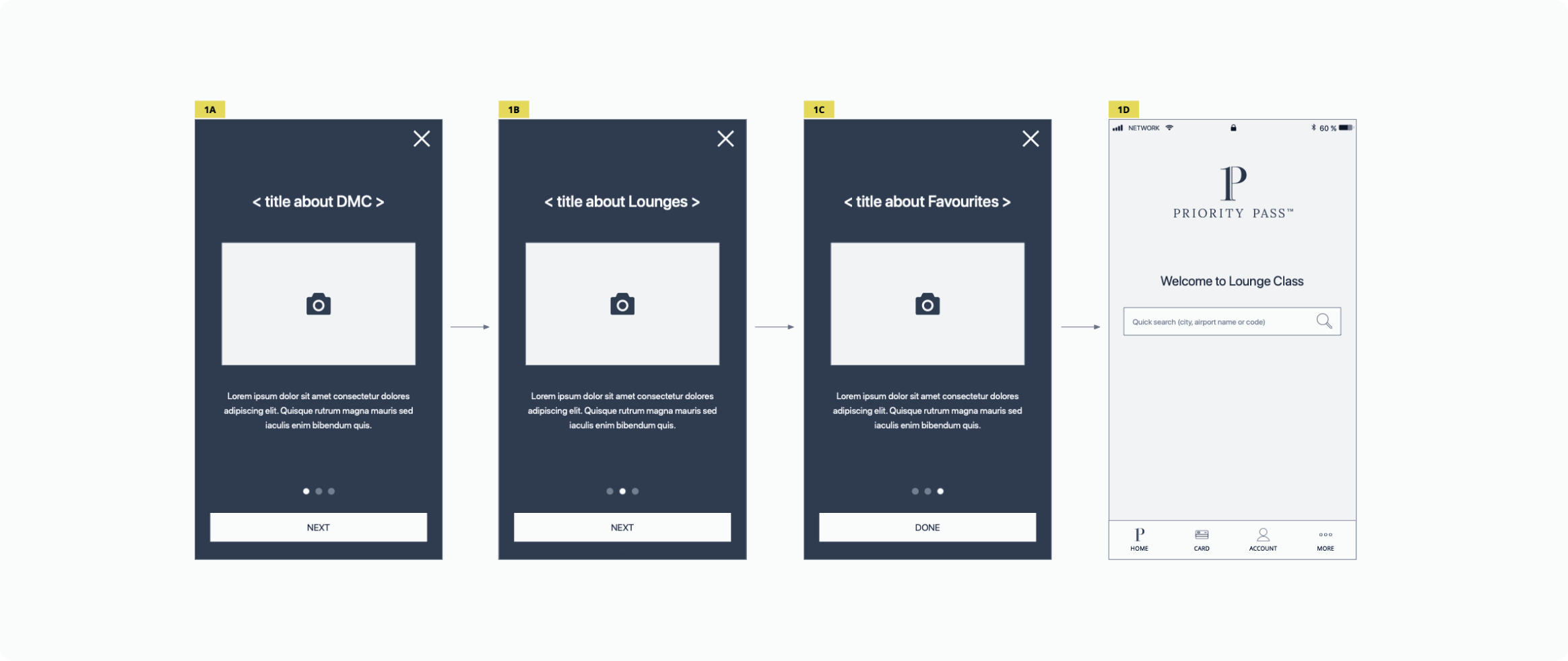
As new features were added, we needed to keep users informed while aligning with business priorities. We created a personalised onboarding flow that introduced updates through short, tailored slides based on what was most relevant to each user.
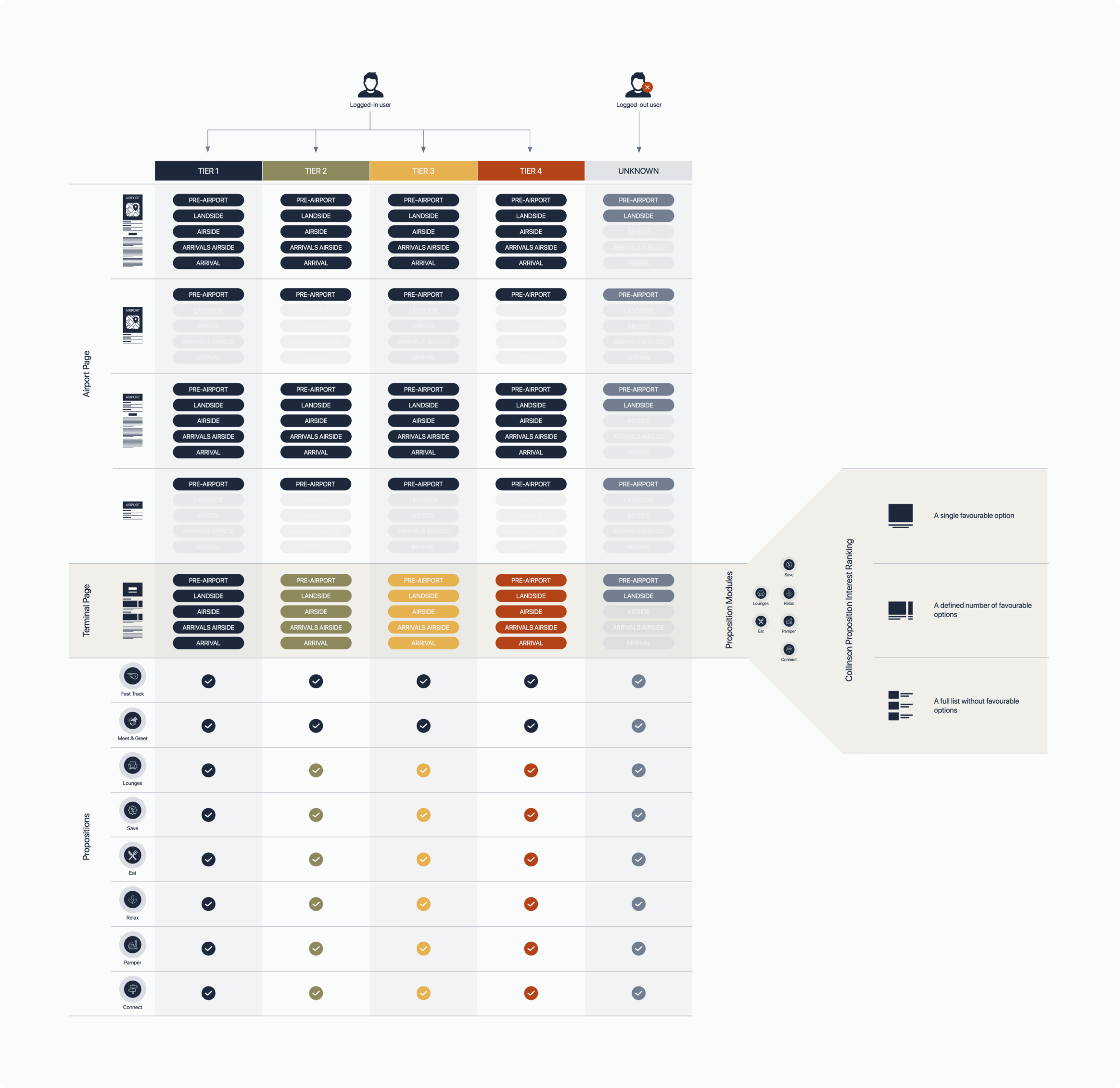
As the app grew, it became clear that we needed to address the full travel journey—from planning a trip to boarding a flight. The user base also became more diverse, with different membership tiers offering different benefits. This meant tailoring content and layouts to fit each scenario. For example, a ‘silver’ member checking Heathrow Terminal 5 before travel would need different information than a ‘gold’ member already at the airport. We mapped out these variations and created detailed diagrams to ensure a consistent and relevant experience.
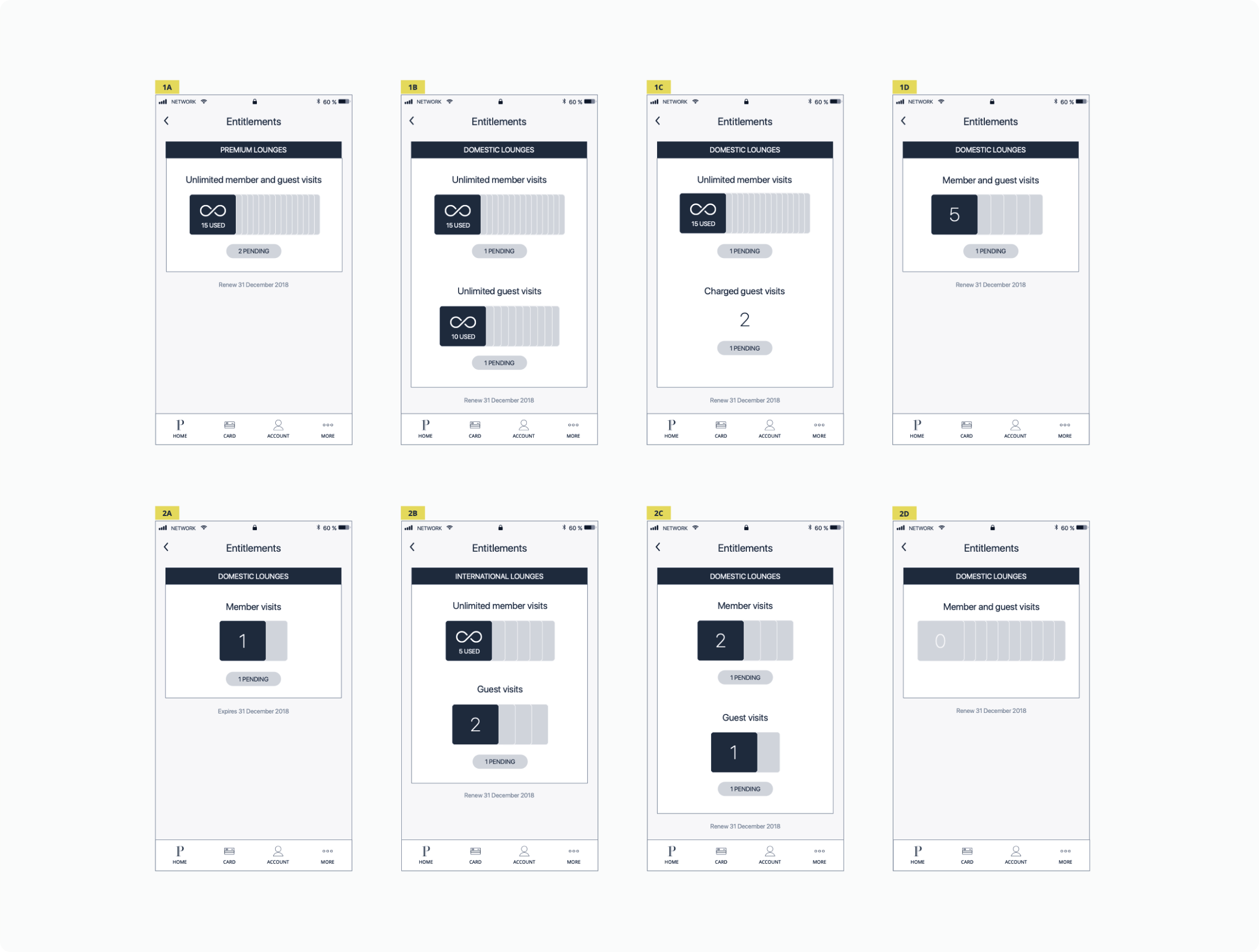
As new research insights emerged and the business evolved, some sections needed a full redesign to stay aligned with the updated service proposition. One example was the ‘My Entitlements’ page, shown below.
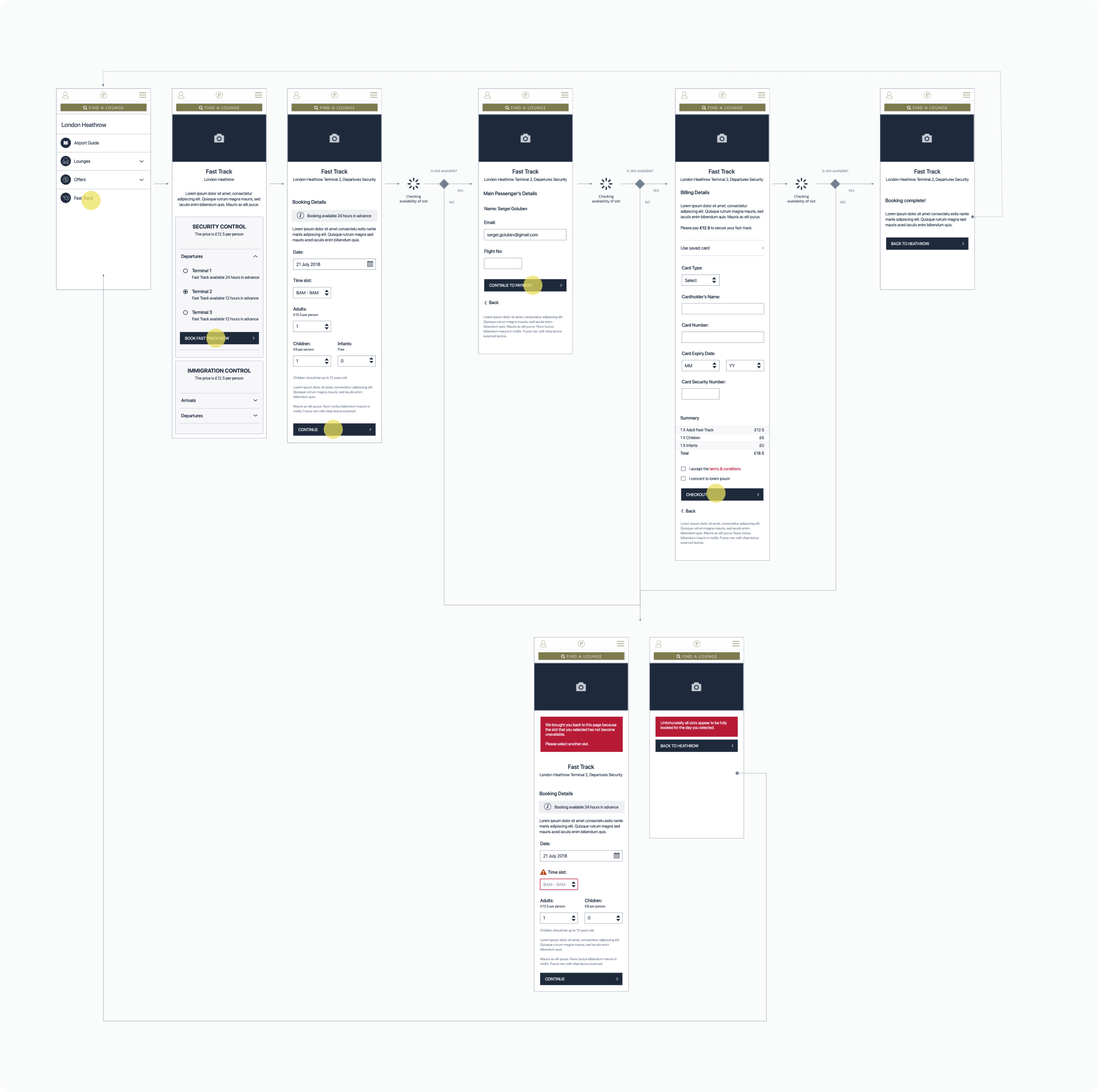
To explore potential new features, we used quick MVP launches to gauge user interest and gather feedback. This helped us assess which features were worth developing further. Many of these pilots relied on third-party APIs displayed as web views within the app. One example was the ‘Fast Track’ feature, shown below.