Designing a risk assessment dashboard for Arup
Arup asked our team to design a web-based dashboard to help senior project managers monitor multiple construction projects at once. The platform needed to give a clear overview of risks across all projects while allowing users to drill into details to identify specific threats and their causes. It also had to suggest practical actions and best practices for reducing those risks.
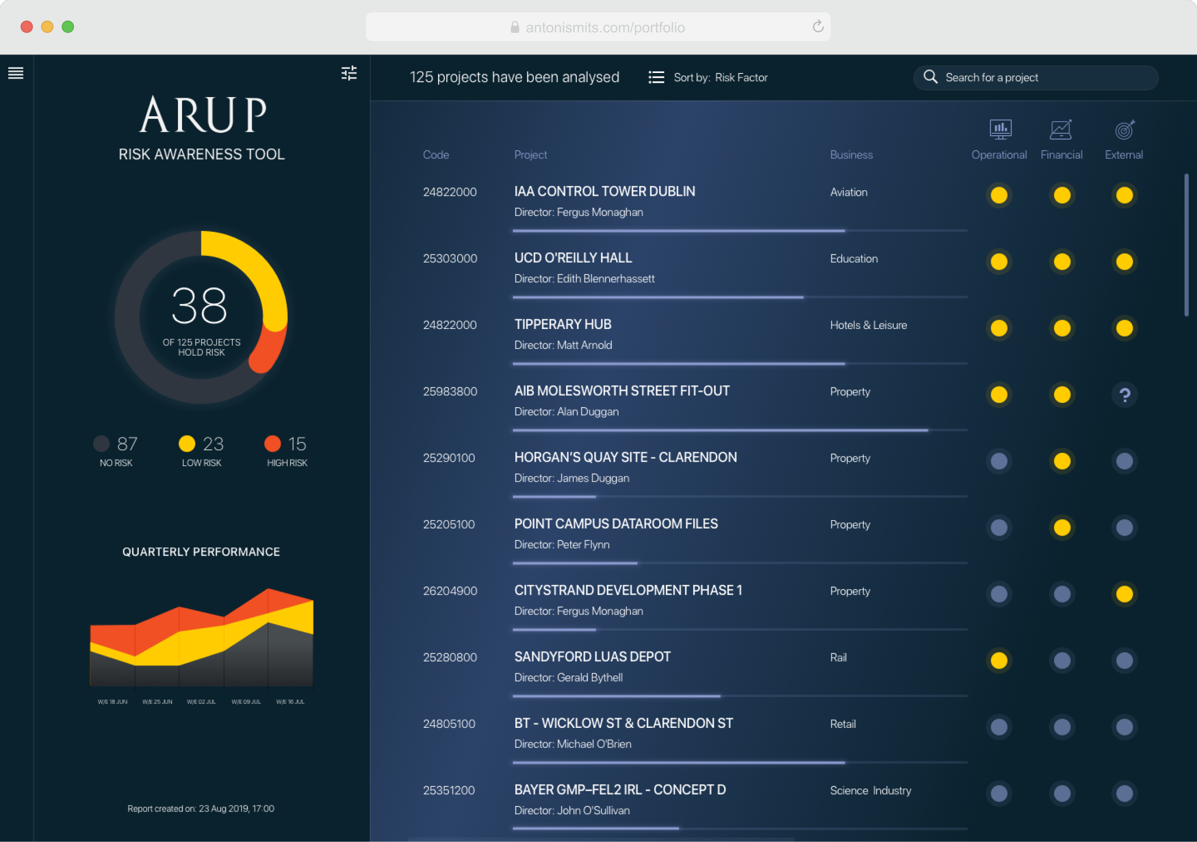
The top section of the dashboard includes two modules. The left module shows the total number of projects with identified risks and compares them with data from previous weeks. This helps managers see whether things are improving or getting worse.
The right module lists all projects accessible to the user and highlights any risks found. Risks are grouped into three categories: operational, financial, and external. Yellow markers indicate that the system has detected at least one risk. Users can also track each project’s progress against its target completion date.
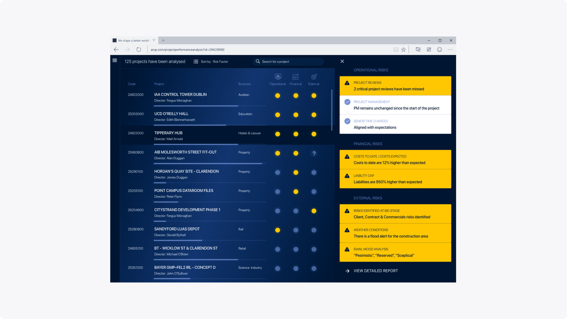
When a project draws attention, the user can click to open a side panel that slides in from the right. This panel shows a summary of all risk factors for the selected project. Yellow highlights indicate issues that differ from the expected norm and may need attention. A “View detailed report” button at the bottom lets users explore the data further.
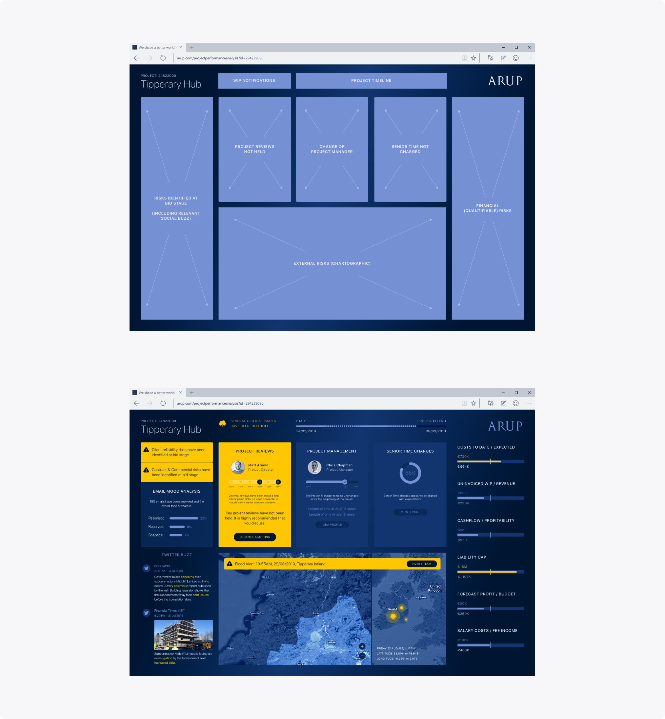
Inside a project view, users can see detailed information about its progress and assess the risk of delays. The top-left section features email sentiment analysis, social media mentions, and relevant tweets. Users can check whether key reviews have been completed, track leadership changes, and verify payment status. A map shows the project’s location and possible weather events that could impact it. On the right, financial ratios give a snapshot of the project’s overall health. As with other screens, yellow highlights call out critical risks or urgent issues.
Designing a mobile app for an executive leadership program
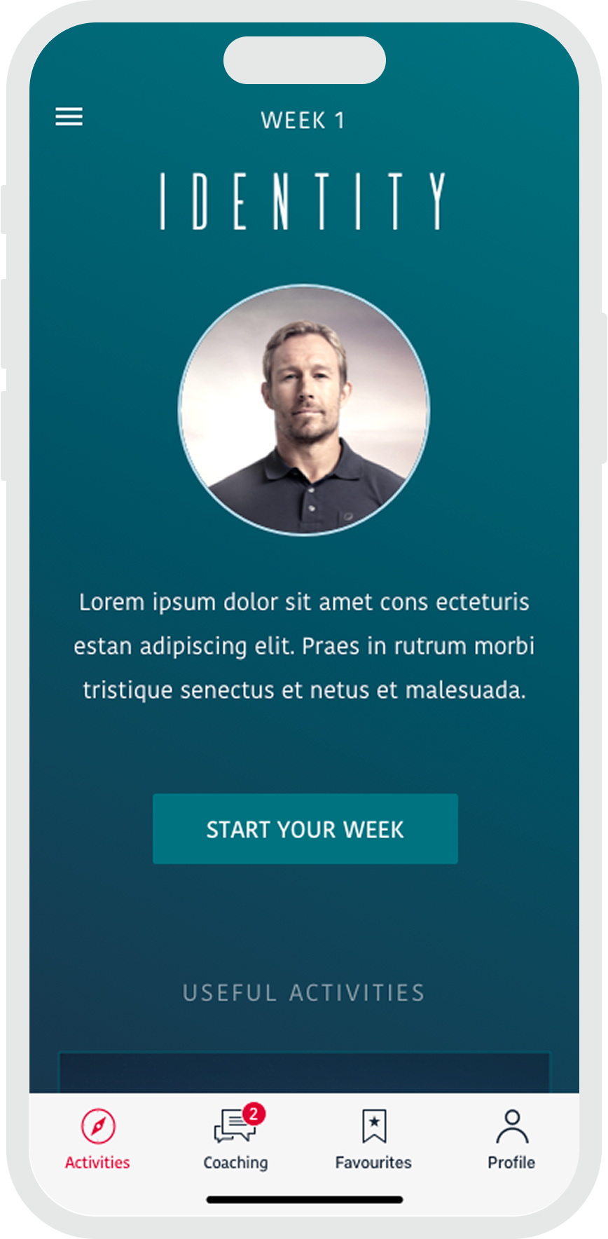
I helped design a mobile app to support a 6-week executive leadership program led by a British elite athlete. Participants received daily activities and weekly reflections through short videos, audio messages, or articles. The app also allowed them to give feedback on completed tasks and interact with other members of their group. The program followed a fixed schedule but could be adapted to match each sponsor’s culture and goals.
After several weeks of research, we defined what makes an online learning experience effective. Using these insights, we ran workshops to align the team and partners on priorities and the rollout strategy.
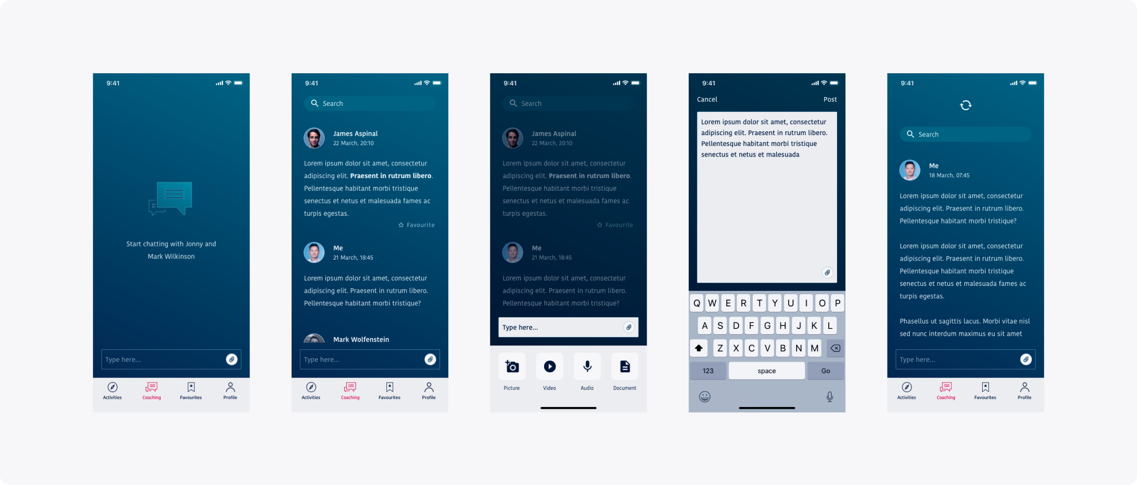
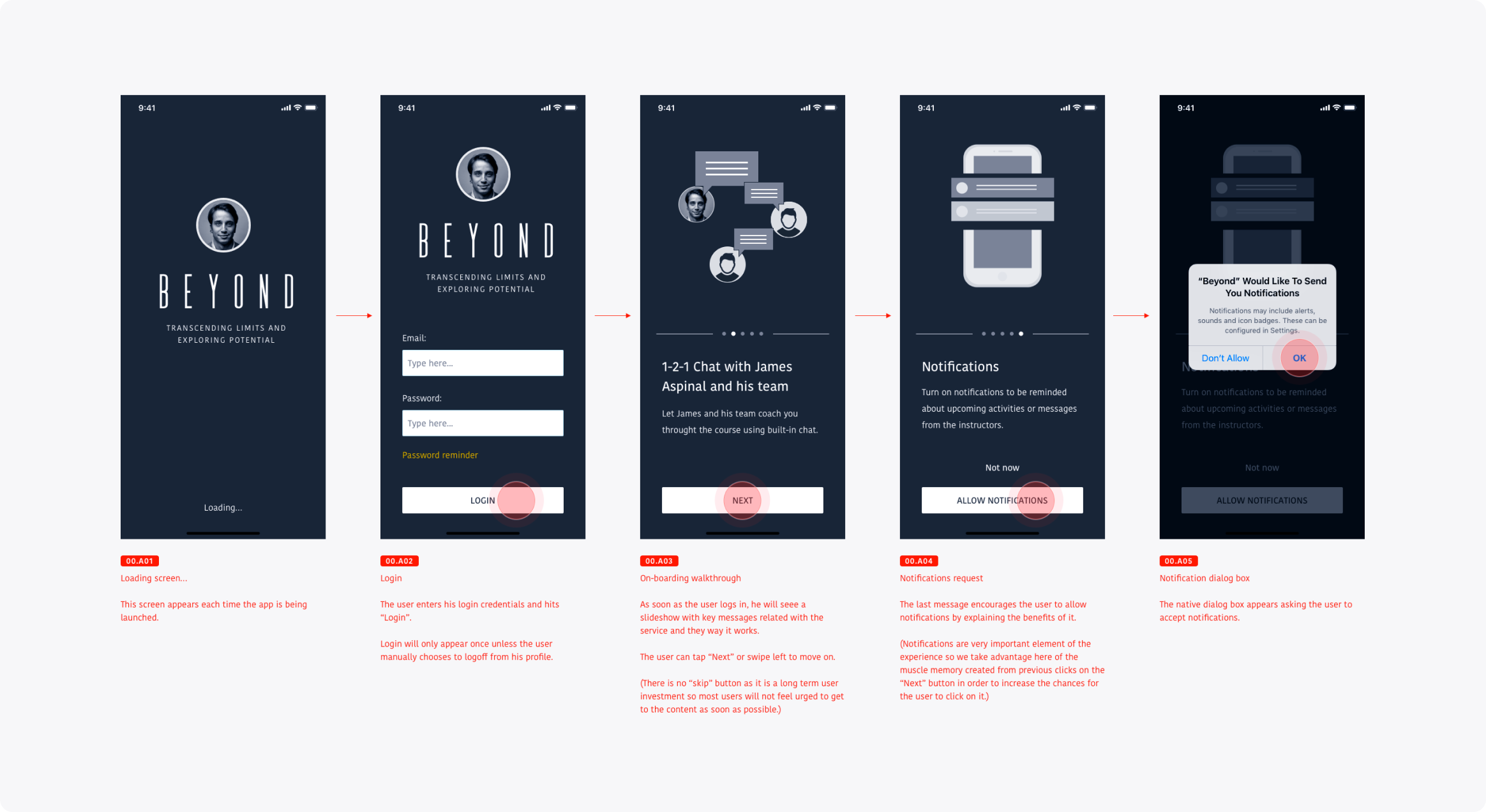
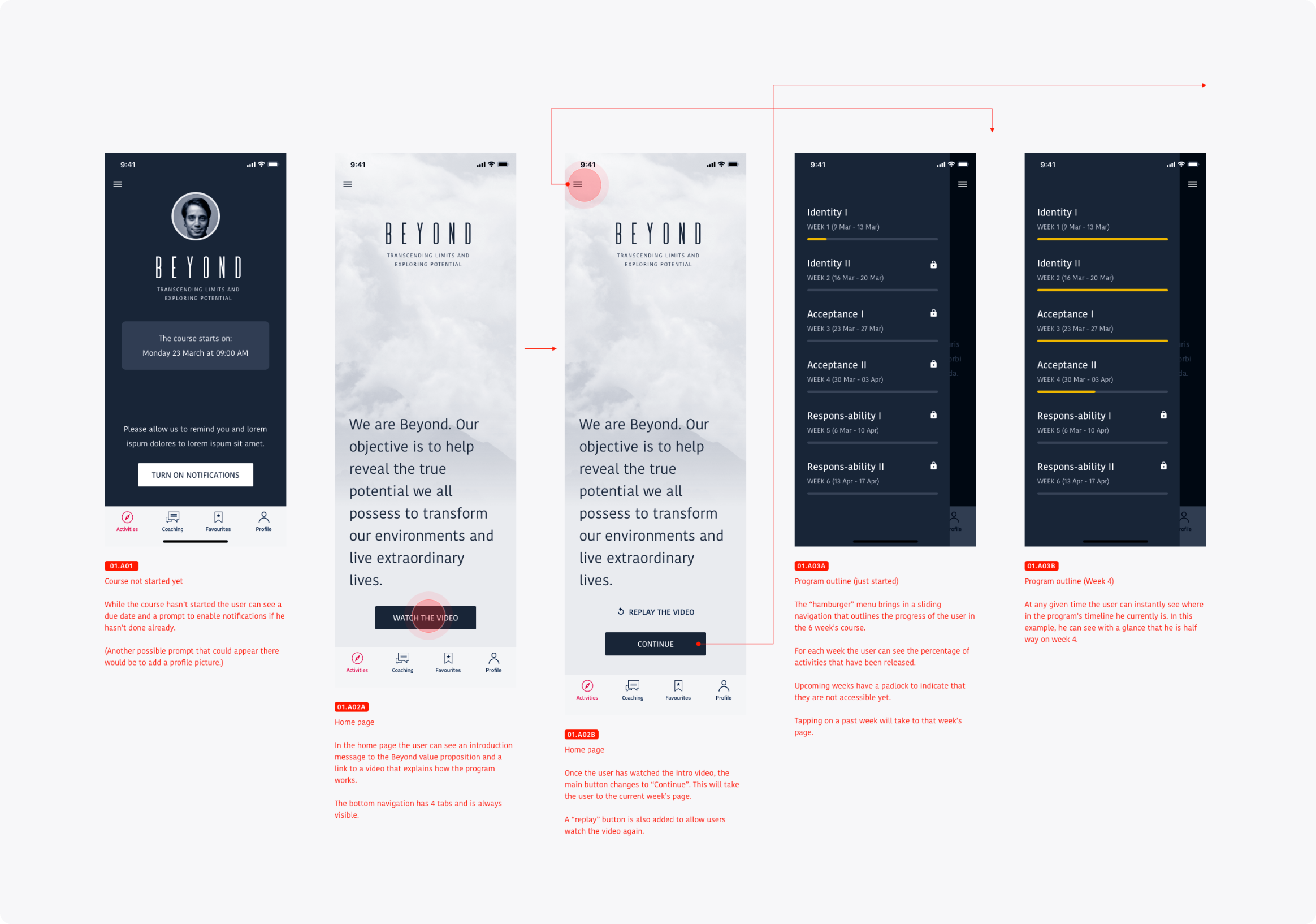
On the first visit, users see a welcome message and an introductory video about the program’s purpose. After that, they go straight to the Activities section. A slide-in menu gives an overview of modules and helps them track their progress.
We also created a visual identity and interactive prototypes so non-technical stakeholders could better understand how the final product would look and behave.
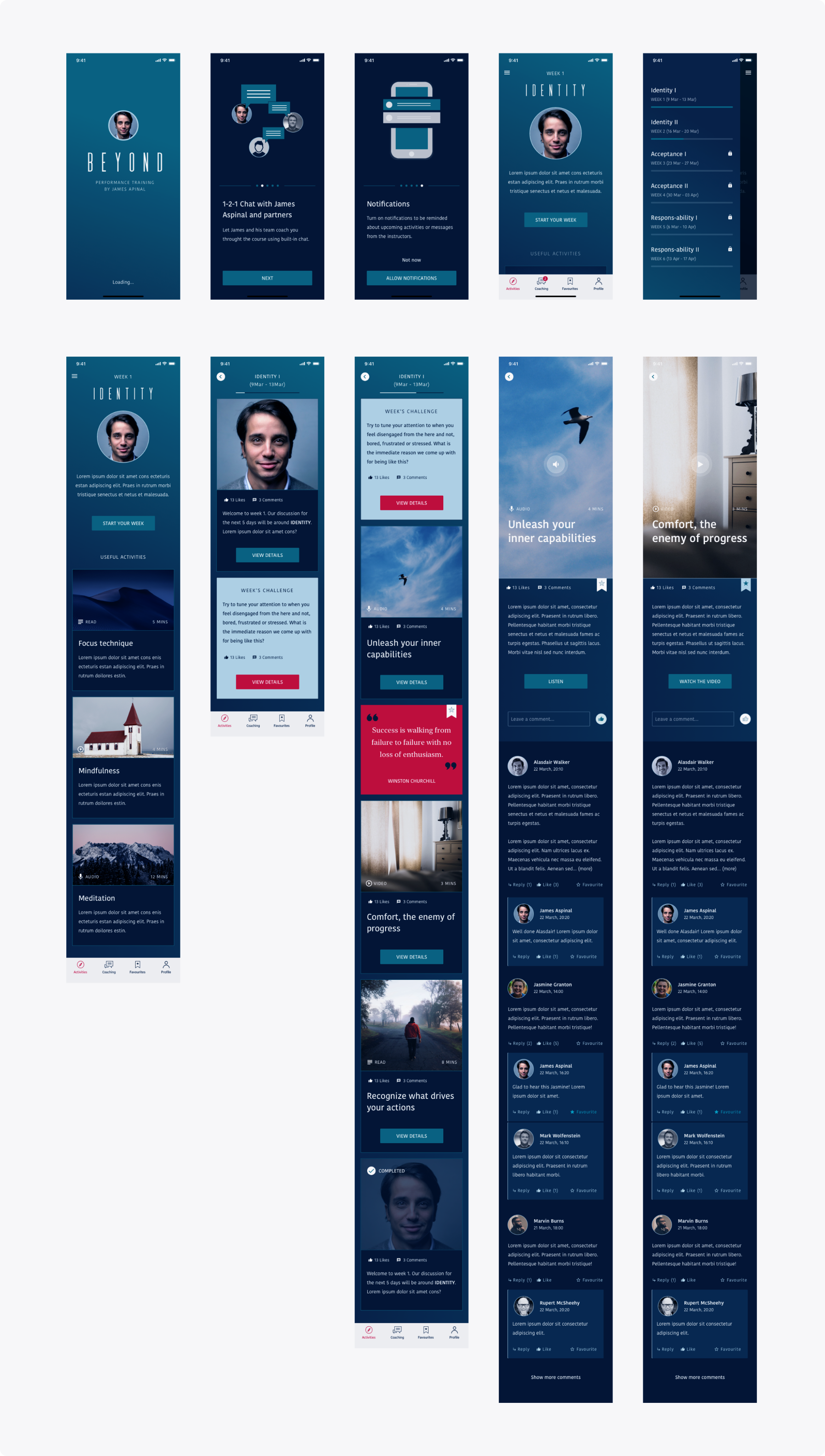
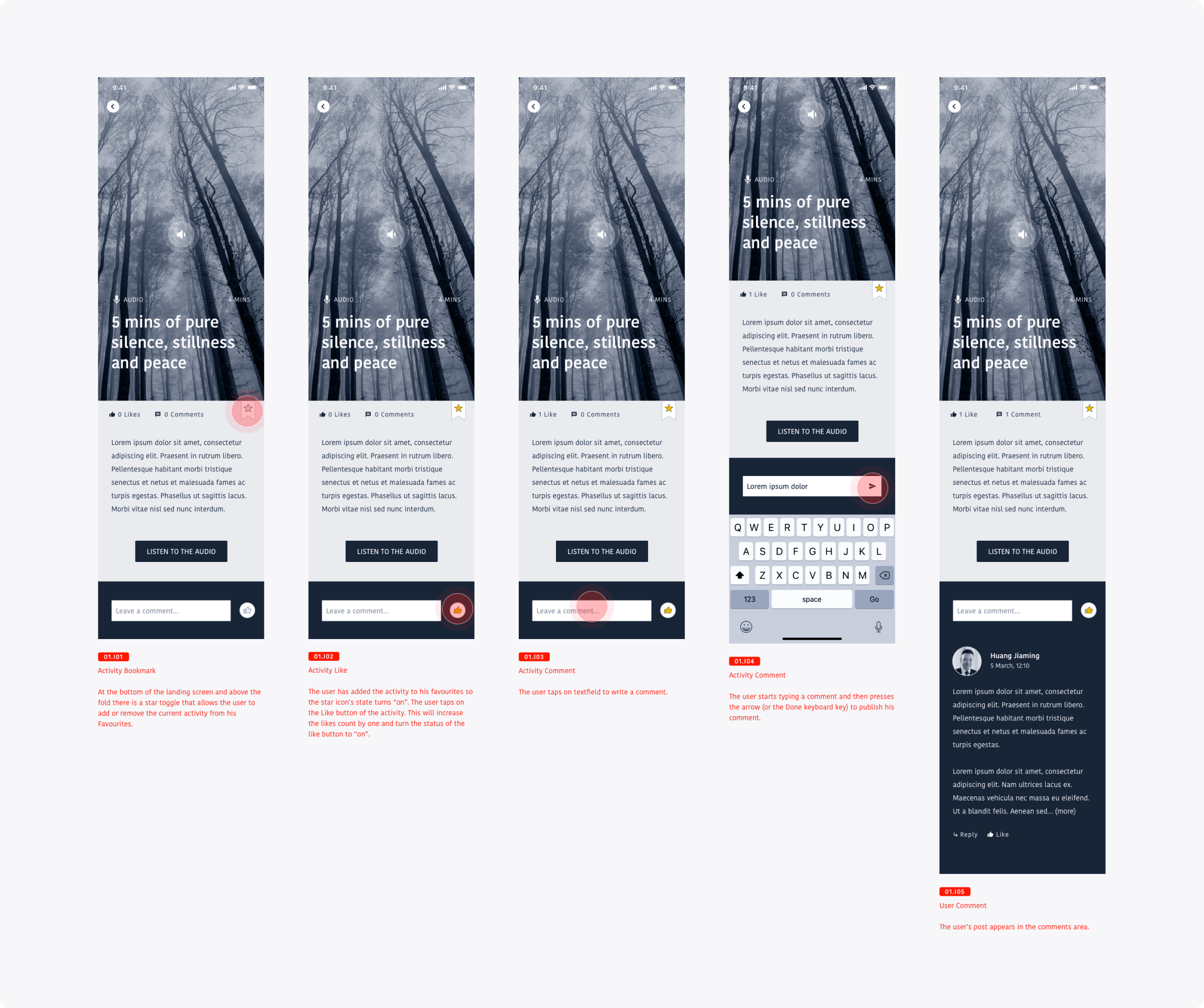
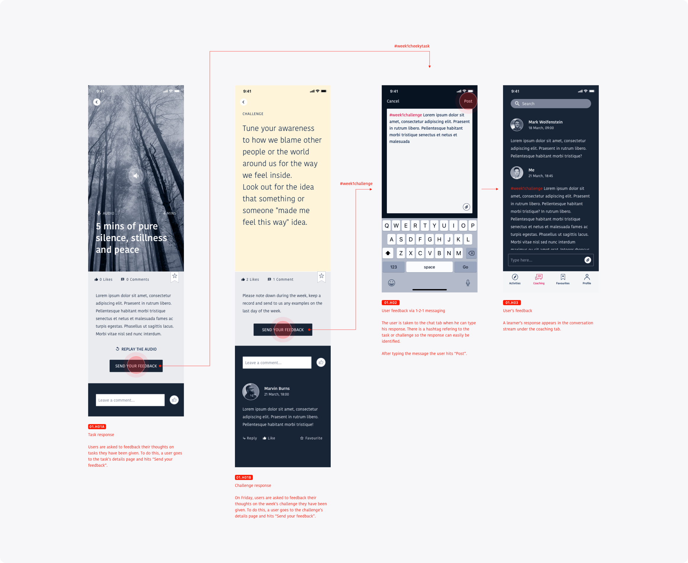
After each activity, users are encouraged to share feedback. Activities might include daily exercises, motivational content, or weekly challenges. Feedback is left through the Chat tab, where the instructor can respond later in a dedicated thread.
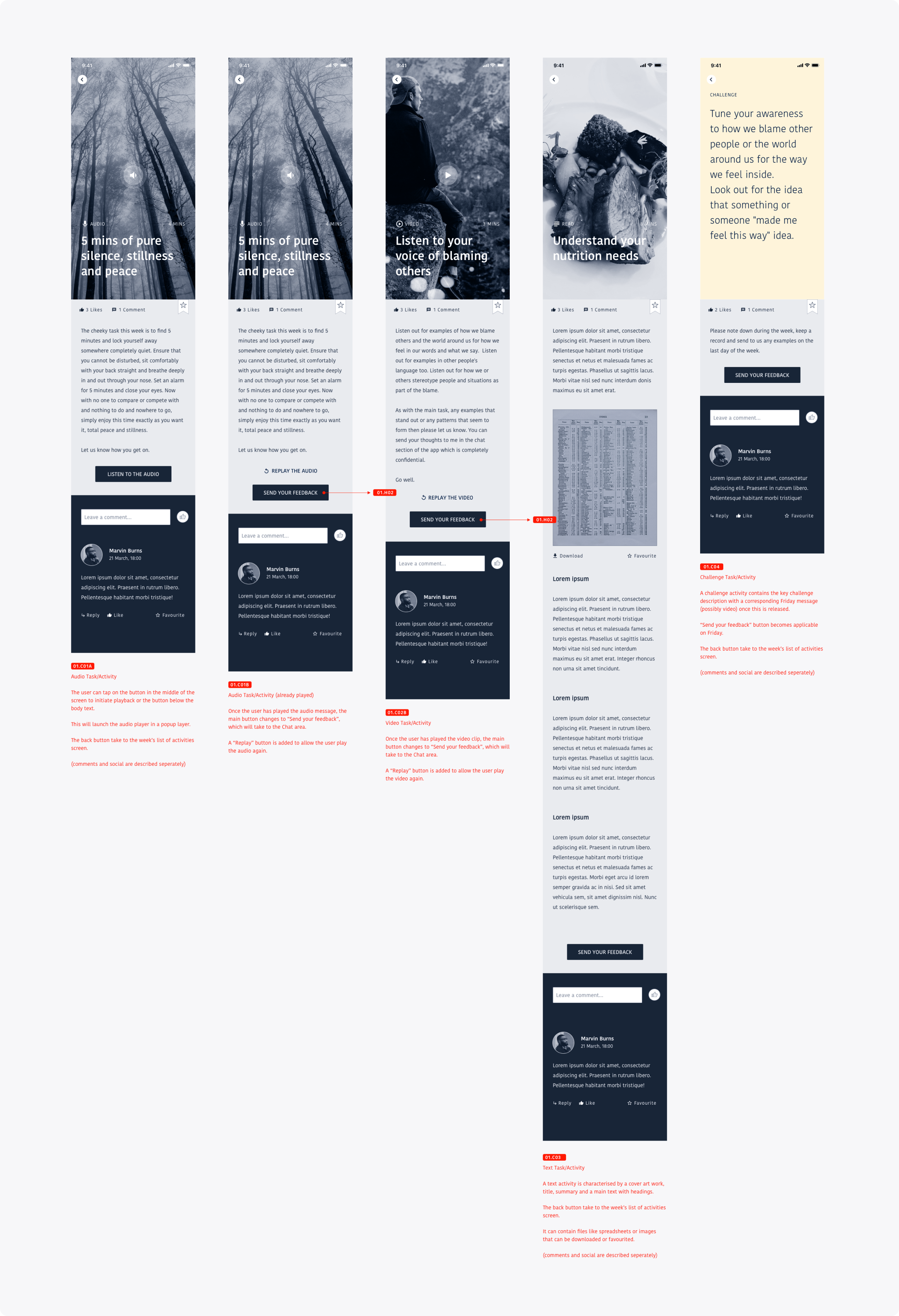
Users can save, like, or comment on activities to build a personal collection of favourites. This social layer kept participants engaged and gave the instructor valuable feedback to refine future content.
At the end of each week, users completed a challenge. Their answers were saved in their one-on-one chat with the instructor and tagged with a hashtag for easy tracking.
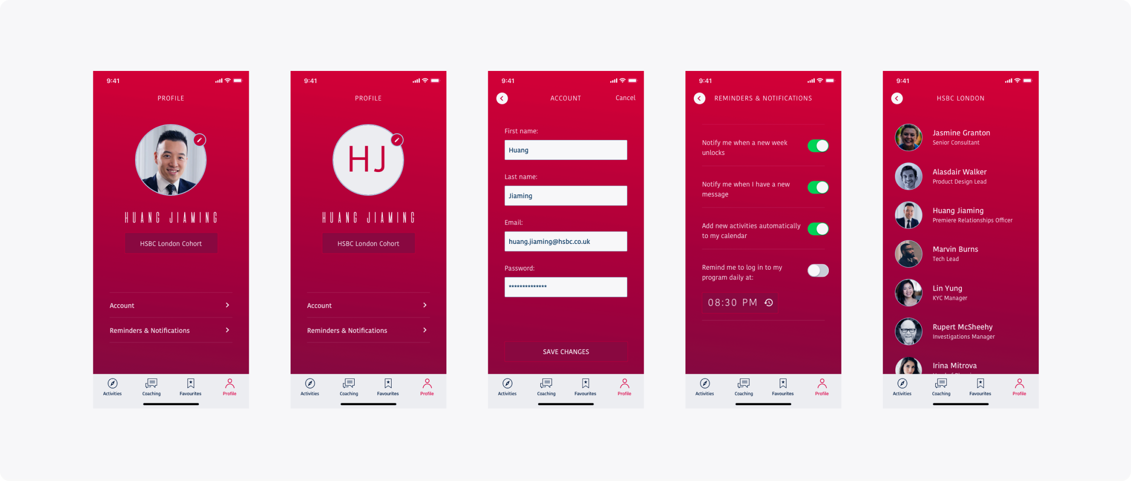
Each account was pre-created by the moderator, but users could update details like profile photos, login info, and notification preferences. They could also browse other members of their cohort, typically from the same organisation.
A key goal for the Chat module was to avoid making it feel like instant messaging since instructors couldn’t always reply right away. To manage expectations, we designed the chat more like a forum or Twitter-style feed, encouraging users to write longer, more thoughtful reflections and wait for feedback later.